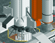
Can it get less cohesive? I like the red rocket, I like the archy, but what is it!? The archy looks like something post-apocalyptic, something from Mad Max or Waterworld, like a scavenger settlement made out of junk. But then the direct surroundings don't make sense, and the paths are way too clean... So what is going on? Keep experimenting and playing if that is your goal, but make up your mind if you want to get a 'good' end product.
I think it's supposed to be fallout themed. I haven't played it yet, so I can't say for sure, but that's the vibe I got. I agree that it needs to be made more cohesive though. There's nothing that ties these parts together right now. Consider building roads and a settlement, then having the coaster run through that, or otherwise have a more gradual transition from the woodsier coaster area to the more industrial looking rocket building.
@Liampie, fair points. I totally admit there isn't much cohesion. I'll probably get rid of the junior coaster and add a few buildings that would fit with the red rocket station.
@itm, I'll certainly retheme parts of the coaster. Now that I've read your guys' feedback, there is some ideas that I have to tie things together a bit more.
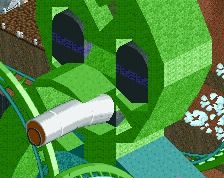
there's no immersion or composition here. as much as it kills me to agree with liam on anything, he's 100 per cent correct. having these harsh corners only to be adjacent to barren nothingness is bad. having really tall or big buildings with nothing to the sides to taper them off is also bad.
There's nothing constructive or helpful here. As much as it kills me to agree with shotguns on anything, he's 100% a dick. Having these harsh criticisms only adjacent to more criticism is bad. Having really condescending or negative comments with nothing to back it up is also bad.
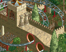
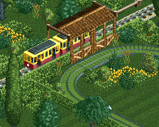
The path layout is a bit too structured, too square. You have a lot of organic landscaping going on but the path just squares it all off. Lose the grid.
Been trying to get some ideas onto a map. Project began out as a recreation of the Seven Dwarfs Mine Train and I just started to break away from that idea a bit.
 10-January 16
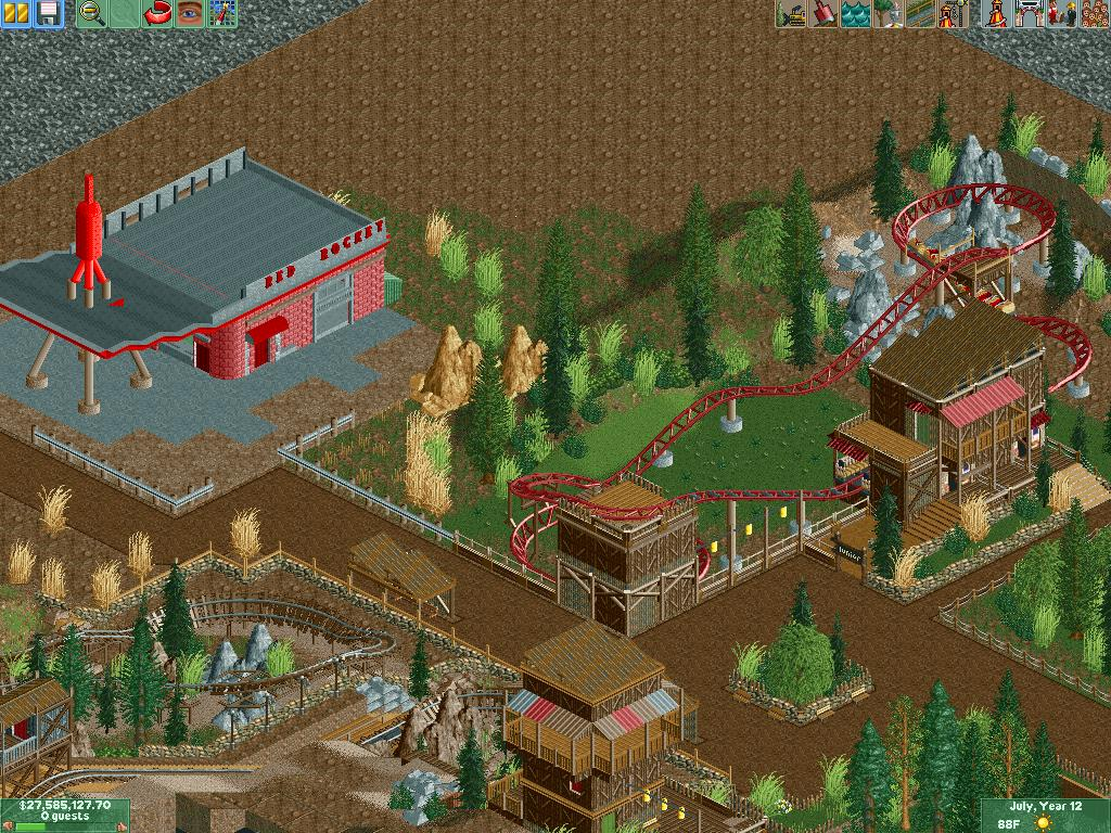
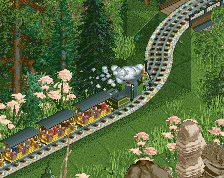
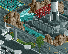
Not bad. I don't think I'd use a kiddie coaster in a wasteland landscape though. Seems out of place.
I think it's supposed to be fallout themed. I haven't played it yet, so I can't say for sure, but that's the vibe I got. I agree that it needs to be made more cohesive though. There's nothing that ties these parts together right now. Consider building roads and a settlement, then having the coaster run through that, or otherwise have a more gradual transition from the woodsier coaster area to the more industrial looking rocket building.
Thank you guys for the comments.
@Liampie, fair points. I totally admit there isn't much cohesion. I'll probably get rid of the junior coaster and add a few buildings that would fit with the red rocket station.
@itm, I'll certainly retheme parts of the coaster. Now that I've read your guys' feedback, there is some ideas that I have to tie things together a bit more.
there's no immersion or composition here. as much as it kills me to agree with liam on anything, he's 100 per cent correct. having these harsh corners only to be adjacent to barren nothingness is bad. having really tall or big buildings with nothing to the sides to taper them off is also bad.
40%
20% comment
The path layout is a bit too structured, too square. You have a lot of organic landscaping going on but the path just squares it all off. Lose the grid.