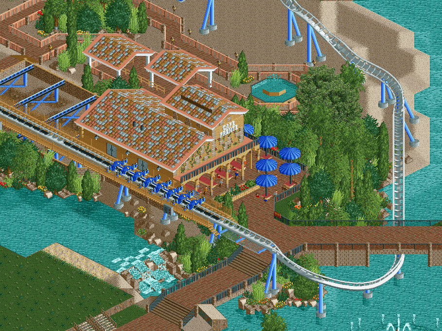
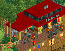
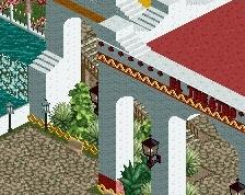
I love Mediterranean themes. Lovely terrace and very Furius Baco-ish. I'd change the coaster colour to dark blue though, it will stand out more in the environment. The white/gray pieces in the roof are also a bit disturbing, keep it with pastel colour! v
The roofs look too fake in their randomness. Make the colors clump a bit more so that it looks more organic. otherwise pretty nice, although not a whole lot going on in the screen.
The overall setting you're putting together here is awesome, the brake alongside the water, and the walkway is great! A more finished screen will show that of course. I agree with itm that a little change with the roofs would help. Exciting to see you working on this!
I don't really like the colours, especially on the fences around the path at the top, everyting blends in too much. I also think the umbrellas are a unit too high. I also agree with the rest about the roofs.
It's not all bad though. I like the coaster itself and the seating area under the building is pretty cool! Just a few colour changes could do wonders I think.
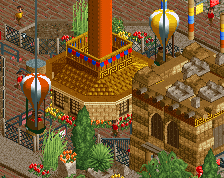
Good point, I changed the colors and this does look much better. Thoughts?
By the way, the walkway on the left (from this angle) will be part of the queue for the coaster. Once it's filled with peeps that should add a little color to the area too.
See, now that's popping. I'd change the white of the roof now though, as it makes everything too light. A darker accent would add even better contrast.
 23-January 16

Green is the color of hope. They look beautiful.
The roofs look too fake in their randomness. Make the colors clump a bit more so that it looks more organic. otherwise pretty nice, although not a whole lot going on in the screen.
The overall setting you're putting together here is awesome, the brake alongside the water, and the walkway is great! A more finished screen will show that of course. I agree with itm that a little change with the roofs would help. Exciting to see you working on this!
I don't really like the colours, especially on the fences around the path at the top, everyting blends in too much. I also think the umbrellas are a unit too high. I also agree with the rest about the roofs.
It's not all bad though. I like the coaster itself and the seating area under the building is pretty cool! Just a few colour changes could do wonders I think.
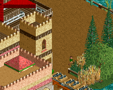
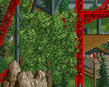
It's up to you, but I'd seriously get rid of those oaks, they're super distracting; they don't fit in with the lush foliage really.
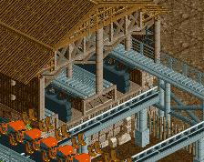
The tan catwalk to white track is kinda weird? All white would stand out a lot better against the tan building, landscaping, etc.
Good point, I changed the colors and this does look much better. Thoughts?
By the way, the walkway on the left (from this angle) will be part of the queue for the coaster. Once it's filled with peeps that should add a little color to the area too.
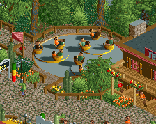
I'll work on the roof colors also.
Attached Thumbnails
See, now that's popping. I'd change the white of the roof now though, as it makes everything too light. A darker accent would add even better contrast.
yeh ditch the white roof tiles
I love this.