Screenshot / The start of something new
-
 03-February 16
-
Easkerton Towers
-
1 of 12
- Views 2,342
- Fans 2
- Comments 14
-
Description
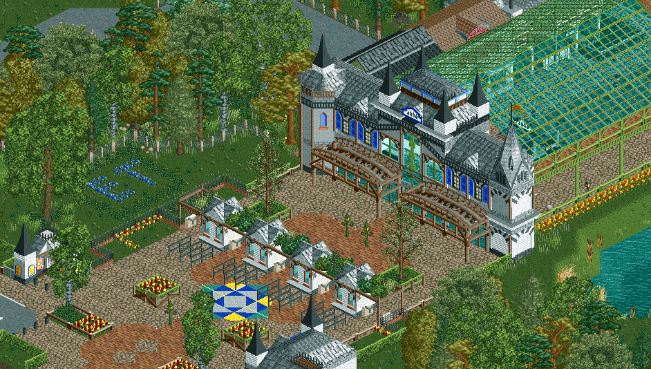
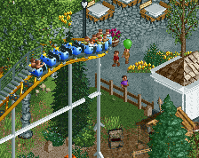
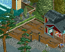
Something I already wanted to show last month, and I'm very excited about it. The entrance to my new project: Easkerton Towers! A park which is partky inspired by Alton Towers. It will feature rip-offs from The Smiler, Air, and the castle and gardens. Will include Wallace & Gromit dark ride, Doctor Who zone and Victorian Britain with Sherlock Holmes ride.
-
Full-Size
-
2 fans Fans of this screenshot
-
Tags
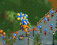
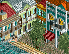
And because I'm so excited: the backside with restaurant and food court:
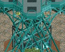
Not sure if I love or hate the trackitecture, but the upper part of the entrance looks great!
I think the trackitecture is unnecessary. Others are good, what an improvement!
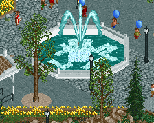
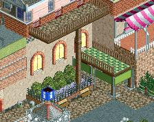
Looks great! A good take on 19th century architecture. Though I'm not totally convinced by that glass canopy... I'd say either enclose the are inside the entrance further, like make it a complete building, or remove the canopy. Also, it doesn't really connect that well with the entrance building itself. That coloured patch on the path in front of the ticket booths is a nice touch, though it looks a little crammed in a weird way where it is now. I think it would look better further back, or just inside the entrance. The food court is very nice!
I'll be following this with great interest.
I really like this screen a lot. I agree about the track. Also I wish I could see the facades of the buildings after the entrance, to bad that big green roof is in the way. I wonder if it would look better if it were a bit smaller. Nice work none the less.
I like how you're going bigger! Something seems a little off about some of the proportions though... I think the glass section is too long in proportion to the entrance building and the ticket booths too squat. Exciting project anyway, I look forward to seeing the castle/gardens.
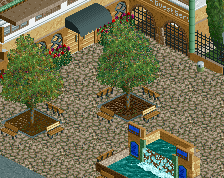
Thanks for the comments! For the trackitecture, I'm trying to get this look a bit:
Maybe if I change the colour to the same sort of green as the canopy, It'll look better.
As for the canopy itself, one says enclose it completely, the other says shorten it... I know how to keep everybody happy: I'm keeping it the way it is!
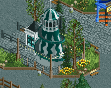
I think the tracitecture works well, and I imagine the building would look rather flat-faced without it. You could try tweaking it, I guess, but I'd suggest keeping it either way. Very nice work with that circular white canopy area.
I am not a huge fan of the trackitecture but the rest looks really interesting. Especially the huge glass roof looks pretty good. I am not sure about your path combination, the crazy and the brick path work not very well together.
I'd go with something glassy instead of track then you've got some cohesion with the big awning. You might need to change the front wall of the entrance afterwards though so it's not glass overkill.
I quite like the trackitecture. It all works really well together!
Not sure if I like the position of the pattern by the entrance booths though.
I love this entrance so freakin' much.