Screenshot / Mamba & Highway 55
-
 15-February 16
-
G Force's Worlds of Fun
-
4 of 13
- Views 4,822
- Fans 1
- Comments 33
-
Description
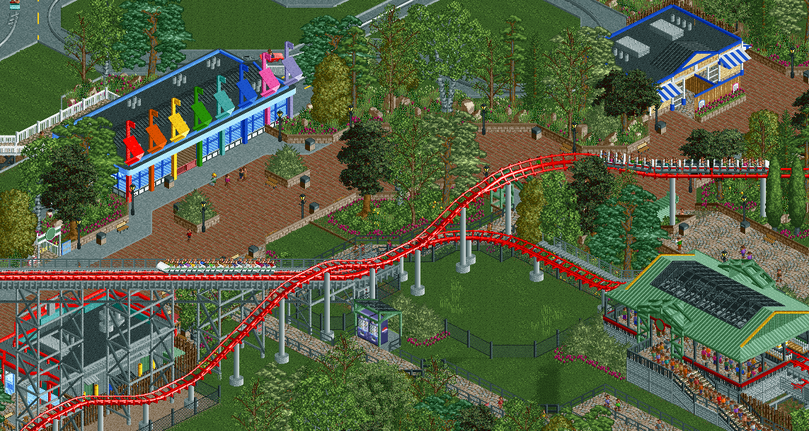
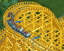
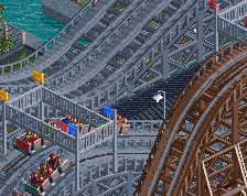
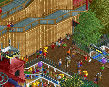
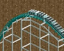
Located in the American area is the massive Morgan Hyper Coaster Mamba, a thrilling journey full of airtime and speed up to 75mph. Just across the midway is the 1950's car ride Highway 55 which departs from an awesome modern looking car wash straight from Southern California.
-
Full-Size
-
1 fan Fans of this screenshot
-
Tags
First of all you put "Redhawk" in the title and "Readhawk" in the description. I do like the highway being called 55 though, nice number. TBH I think Redhawk is kinda a boring name really, doesnt scream anything American to be. Fits the colors though. But it's fine.
Should've called it Patriot or something. And Six Flags only has six flags but your building has eight so it's pretty unrealistic. But it's fine.
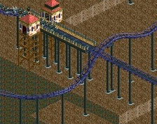
Yeah you can plainly see that the track glitches through the car ride path. There is a green train on REDhawk? also I think you forgot to fill in a patch of grass as well, but it's fine.
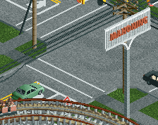
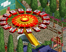
Nice to see a relatively unused coaster type. Hopefully you add some more surroundings to the car ride that isn't just mowed grass; gas station? motel? trees/foliage? billboards?
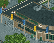
Any reason for the crown moulding for those flags? I'm not sure I understand the function.
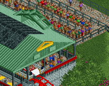
I like this man. Not sure about the yellow and red on the station though.
using mini suspended coaster track for a guide rail is so underappreciated.
I think the station for the car ride and the toilet building look phenomenal. Still not sure about the tree selection you are going for. Seems a bit messy and distracting to me, because of the many different textures you use. The foliage is an improvement of Westwinds for sure, though.
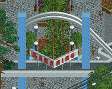
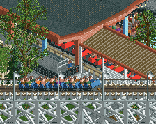
I know I'm not the right person to complain about the use of many fences, but I do think it looks a little bit weird with three different fences for the same queue line. Maybe you could find a better solution.
However, this looks really good. The station for the car ride looks amazing. It think the station roof of the coaster would look better with the same texture as the pieces used for the other buildings.
yep, that looks exactly like the mamba station. I even can see how you emulated the queue layout, vending placement, etc. It's weird because some of it is spot on recreation and other bits are very different here (not slabs of pavement, more foliage, different buildings around it)
I'll try to refrain from criticizing bits that aren't like worlds of fun because I know its not a recreation by any means. but I think you missed an opportunity by not doing a really nicely landscaped vintage car ride like le taxi tour at worlds of fun
I feel I will be both the biggest fan and biggest critic here, except maybe thatguy who also is from KC
also redhawk is a dumb name
I don't like the name though. I know you're playing off of Cedar Fair's (insert any word) Hawk naming frenzy but this would be a late 90's coaster so they weren't doing that back then.
the flags are too thick like ive said before, they just dont look right and the station still looks too off, it looks too blocky and square, and this is cause of the extra eaves on the front and back. i'd just leave the ends as standard gable roofs / \
+ I love the openness
- Hideous coaster station
- Car ride is not visible from path - blocked off by the same foliage you have everywhere in the park (although admittedly this particular patch looks really good, maybe create some sightlines in other places
I pretty much agree with what Liam has to say. Although, I don't find the station *that* hideous, but I do think it could use something. I think it's the corners of the roof, not sure. Everything else looks great and yeah that rainbow colored building is very cool.
In the late 90's Cedar Fair built 3 Morgan hypers with basically the same layout and the same station (Steel Force, Mamba and Wild Thing). Google them and you'll see how well done this is.
Thanks for the comments guys, I'll definitely change the name, as I basically came up with it on the spot just to have something to put on the screen title.
As for the station, I'll look at changing it, although I want to stay someone true to the original at the real WoF however its not a recreation by any means, rather an interpretation so maybe a slightly different roof will be a better fit.
When it comes to the foliage, I really enjoy the way it looks and its exactly what I envisioned it being. Perhaps its a little heavy in some places but I've always felt that tree density is sometimes under represented in RCT. And really, if you compare this to something like Thorpe park the density is pretty similar, there is just a bit more variety. Perhaps I can add some more sight lines in some areas and will refine it a bit as the park progresses.
Now for the car ride, this is the main reason I posted this as I felt it was a little underwhelming. Here is the reference picture I've been using:
Perhaps I can change the crown moldings to something a bit thinner and change the flags, although I'm running really low on SS object slots so I'll have to see what options I have. The ride itself will have some theming elements like a gas station and a few road signs and billboards, I'm just going to wait to see what kind of object space I have before I invest a bunch of theming into a minor ride like this.
Also, for the fences, I've been trying to use something to replace the 1k Queue fencing on slopes for a while, and this was an attempt at that. I guess it didn't really blend in that well, so I'll keep looking for some alternative. Although I will replace the small bit of balcony fence with 1k fence near the very end of the queue.
That reference image seems so much more excitingly sculptural than what's in the screen. I'd lower the emphasis on the glass walls, extend the roof with a more dramatic overhang, and really stretch those pillars up to be more spike-like.
The flags work, its the crown mouldings that are far too thick.
the black glass on the green roof doesnt work that well with those colors, other than that its fine. Also look into making that track invisible for the cars.