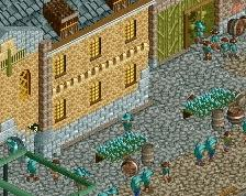
I agree with Stoksy, maybe raise it a unit or two. Layout of the seems a lot like Legacies, kind of wish it was a little different in that regard. Those large flags should be purple or red also.
Gorgeous archy. I do not think the foliage mix really suits the theming tbh. Agree with g force about the flags, could change the flower colours and canvas colours too create some contrast?
Awesome stuff, just I think those flags are a bad custom object, no matter what color they likely will not fit. The background landscaping does not look too good imo, but otherwise great stuff and clearly highly inspired by Roman Vice
I guess the flags could be changed, but they really don't bother me.
Really, nothing bothers me in this screen. Great forms and execution, detailing is spot on...the fact that any of you are finding things to dislike is rather surprising to me.
I think the arches are fine for this scale. I see what Liam was going for and I think he achieved it. And the foliage is solid. There's even new trees! Why's everyone so critical? This is easily 85%-90% work, at least for me.
This is certainly very interesting! Though I'm not quite sure what kind of look you're going for... I kind of like the low arches, they give a nice, kind of romanesque impression that fits well with the relatively heavy (despite the large windows) center building. On the other hand, if you're aiming for a kind of orthodox classicism (in the Palladio/18th-century-neoclassicism sense), they would be a bit of a problem. They're much more medieval than classicist. You'd also be hard pressed to find a collonade like that, that isn't supporting the roof of the building, in antiquity as well as in most classically inspired architecture since. Either way, it looks very good as it is and makes a lot of sense as a themepark version of antiquity, whereas if it's intended to be some sort of accurate interpretation it lacks a lot of colour. This might sound rather harsh but I really like this whatever the intent, looks like you had fun making it! (oh, and I agree about the flags)
Damn it, I wanted to do something Roman after FUCK since it's such an interesting theme and almost never done in RCT.
It's drop dead gorgeous... Lovely archy, only eyesore or those pink flags. Make them more red would be better, or chose a better flag object because the texture of it looks kinda weird.
I do not think the foliage mix really suits the theming tbh.
Why? The foliage resembles the Mediterranean foliage very well. Especially those new tall palm trees really add a lot to the screen! I do think you should add some rocks, though. And I have to agree with the flags. A different color could work a bit, but it doesn't give the object more textures. The architecture is superb. Is this for Port Aventura?
Fantastic. I would suggest adding a few more touches of colour in here to make everything pop though. I'd start by changing the flag colours for sure - purple would be a suitably imperial choice. Some tall hanging banners might work on some of the buildings too if you find a good way to execute them. A darker flower colour would also help I think.
Thanks for the replies everyone! I'll address some of your main criticisms in general first.
@Ground level arches being too low: it was a conscious decision to make the ground level very low (still relatively high compared to modern buildings, try to picture how high the ceiling would be), but I can see how raising the whole thing a single unit might look better. It's not impossible nor hard to try it, so we'll see!
@Flower and flag colours: the flowers are blue, not white. Again, a conscious decision to use very light and soft colours. I think it may end up looking different (better) in the end when the rest of the area has been built, otherwise it's an easy fix. But I want to hold on to this direction for a while longer.
@flag object: yes, it's not great... It doesn't bother me much in game, maybe because it is animated. The animation is exactly why I want this object, anyway. A static flag just wouldn't have the same effect for the atmosphere, textured or not.
@Foliage: I'm quite happy with the mix, I think it looks quite Mediterranean. Semi-arid. The foliage itself was partially just quickly plopped on the map to provide a background for the building, just for me and whoever I was sharing the screen with, but I decided to stick with it for now. I think I will revisit it later to refine it further. So yeah, it's not wrong to call it rushed.
This is certainly very interesting! Though I'm not quite sure what kind of look you're going for... I kind of like the low arches, they give a nice, kind of romanesque impression that fits well with the relatively heavy (despite the large windows) center building. On the other hand, if you're aiming for a kind of orthodox classicism (in the Palladio/18th-century-neoclassicism sense), they would be a bit of a problem. They're much more medieval than classicist. You'd also be hard pressed to find a collonade like that, that isn't supporting the roof of the building, in antiquity as well as in most classically inspired architecture since. Either way, it looks very good as it is and makes a lot of sense as a themepark version of antiquity, whereas if it's intended to be some sort of accurate interpretation it lacks a lot of colour. This might sound rather harsh but I really like this whatever the intent, looks like you had fun making it! (oh, and I agree about the flags)
What I'm going for is the capital of an ancient empire at the height of its prosperity, in a climactic celebratatory orgie of art and science. Inspiration does not come from history, but rather from how the ancient worlds were represented in romantic paintings. So I'm not depicting an actual real world place, but rather a nostalgic and melancholic dream I can personally identify with. Things like the columns and the mathematical ratios are off for that exact reason. Oh, and because accurate urban architecture never translates to themepark design well (I guess the struggle is obvious when you look at Legacies), sacrifices must be made. I'm not happy myself with the windows however, although they don't necessarily have to be glass and light-built, they do look quite anachronistic. I'll just admit here that I wasn't sure what to do inbetween the columns that only involved quarterblocks and not too many of them, and nothing touching the columns (they need some room to breathe). I'm open to suggestions.
Damn it, I wanted to do something Roman after FUCK since it's such an interesting theme and almost never done in RCT.
Haha, pay more attention dude! There's plenty of Roman themes out there, so don't let this one stop you. Especially since this is not really a Roman theme. If it was, I would sure your take on it would be different than mine.
You took my damn idea.
Which idea did I steal? I can't picture any of this stuff being in Worlds of Fun.
 23-February 16
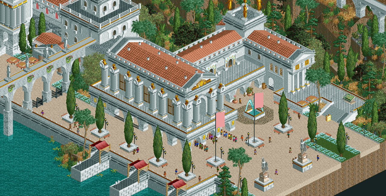
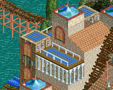
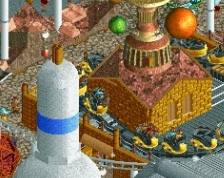
The ground-level arches seem a little low, the rest is phenomenal.
i would use different color flowers instead of white on white with the buildings, other than that its great.
You took my damn idea.
I agree with Stoksy, maybe raise it a unit or two. Layout of the seems a lot like Legacies, kind of wish it was a little different in that regard. Those large flags should be purple or red also.
I agree with Stoksy and G Force about the ground level arches.
The rest is simply brilliant!
Gorgeous archy. I do not think the foliage mix really suits the theming tbh. Agree with g force about the flags, could change the flower colours and canvas colours too create some contrast?
Awesome stuff, just I think those flags are a bad custom object, no matter what color they likely will not fit. The background landscaping does not look too good imo, but otherwise great stuff and clearly highly inspired by Roman Vice
Yeah thats another thing, the foliage could be a lot better. I feel like its rushed, I know you can do better.
Beautiful. The detailing is the perfect amount and looks really convincing.
Also agree about the height of the ground level.
I really dislike those flags, they are so textureless... is there another object you can use in place of those?
I guess the flags could be changed, but they really don't bother me.
Really, nothing bothers me in this screen. Great forms and execution, detailing is spot on...the fact that any of you are finding things to dislike is rather surprising to me.
I think the arches are fine for this scale. I see what Liam was going for and I think he achieved it. And the foliage is solid. There's even new trees! Why's everyone so critical? This is easily 85%-90% work, at least for me.
This is certainly very interesting! Though I'm not quite sure what kind of look you're going for... I kind of like the low arches, they give a nice, kind of romanesque impression that fits well with the relatively heavy (despite the large windows) center building. On the other hand, if you're aiming for a kind of orthodox classicism (in the Palladio/18th-century-neoclassicism sense), they would be a bit of a problem. They're much more medieval than classicist. You'd also be hard pressed to find a collonade like that, that isn't supporting the roof of the building, in antiquity as well as in most classically inspired architecture since. Either way, it looks very good as it is and makes a lot of sense as a themepark version of antiquity, whereas if it's intended to be some sort of accurate interpretation it lacks a lot of colour. This might sound rather harsh but I really like this whatever the intent, looks like you had fun making it! (oh, and I agree about the flags)
Are those real objects or did you just MS Paint those flags onto the screen?
Awesome stuff which looks awesome IS awesome.
The low arches work, they remind me of cellars or something like that. I do agree about the flowers, I suggest to make them one shade darker.
Damn it, I wanted to do something Roman after FUCK since it's such an interesting theme and almost never done in RCT.
It's drop dead gorgeous... Lovely archy, only eyesore or those pink flags. Make them more red would be better, or chose a better flag object because the texture of it looks kinda weird.
Why? The foliage resembles the Mediterranean foliage very well. Especially those new tall palm trees really add a lot to the screen! I do think you should add some rocks, though. And I have to agree with the flags. A different color could work a bit, but it doesn't give the object more textures. The architecture is superb. Is this for Port Aventura?
Fantastic. I would suggest adding a few more touches of colour in here to make everything pop though. I'd start by changing the flag colours for sure - purple would be a suitably imperial choice. Some tall hanging banners might work on some of the buildings too if you find a good way to execute them. A darker flower colour would also help I think.
Damn dude, very nice. I do like the foilage. Now I want to make custom tree's too, sadly your tutorial pictures are down.
This, so much this.
Rest of the screen looks great though.
@Ground level arches being too low: it was a conscious decision to make the ground level very low (still relatively high compared to modern buildings, try to picture how high the ceiling would be), but I can see how raising the whole thing a single unit might look better. It's not impossible nor hard to try it, so we'll see!
@Flower and flag colours: the flowers are blue, not white. Again, a conscious decision to use very light and soft colours. I think it may end up looking different (better) in the end when the rest of the area has been built, otherwise it's an easy fix. But I want to hold on to this direction for a while longer.
@flag object: yes, it's not great... It doesn't bother me much in game, maybe because it is animated. The animation is exactly why I want this object, anyway. A static flag just wouldn't have the same effect for the atmosphere, textured or not.
@Foliage: I'm quite happy with the mix, I think it looks quite Mediterranean. Semi-arid. The foliage itself was partially just quickly plopped on the map to provide a background for the building, just for me and whoever I was sharing the screen with, but I decided to stick with it for now. I think I will revisit it later to refine it further. So yeah, it's not wrong to call it rushed.
What I'm going for is the capital of an ancient empire at the height of its prosperity, in a climactic celebratatory orgie of art and science. Inspiration does not come from history, but rather from how the ancient worlds were represented in romantic paintings. So I'm not depicting an actual real world place, but rather a nostalgic and melancholic dream I can personally identify with. Things like the columns and the mathematical ratios are off for that exact reason. Oh, and because accurate urban architecture never translates to themepark design well (I guess the struggle is obvious when you look at Legacies), sacrifices must be made. I'm not happy myself with the windows however, although they don't necessarily have to be glass and light-built, they do look quite anachronistic. I'll just admit here that I wasn't sure what to do inbetween the columns that only involved quarterblocks and not too many of them, and nothing touching the columns (they need some room to breathe). I'm open to suggestions.
Haha, pay more attention dude! There's plenty of Roman themes out there, so don't let this one stop you. Especially since this is not really a Roman theme. If it was, I would sure your take on it would be different than mine.
Which idea did I steal? I can't picture any of this stuff being in Worlds of Fun.