Screenshot / The Midway
-
 27-February 16
-
Oakridge Acres (finished)
-
8 of 9
- Views 2,028
- Fans 0
- Comments 15
-
Description
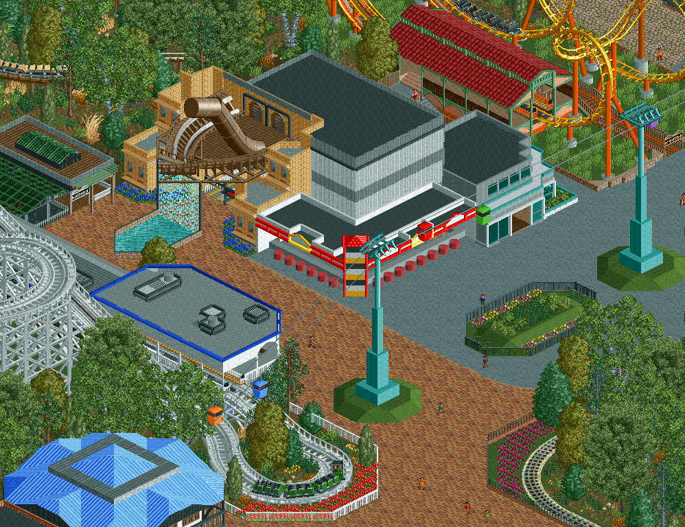
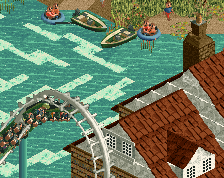
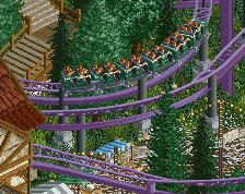
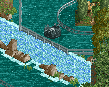
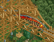
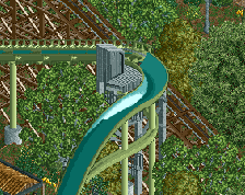
Here is the midway of the oakridge Acres (I know so many name changes). Here you can find Attractions such as The famous Comet the, park's oldest coaster, or The Skyway (Better take the Skyway or the Highway. To bad it's both) Hope you enjoy the screen. All we have left to finish is the back section of the park and the entrance.
-
Full-Size
-
No fans of this screenshot
-
Tags


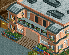
I agree with Faas. That building with the ship is a cool idea but feels very random in that spot. Also, the buildings are a little flat and featureless. If you get rid of the ship thing, turn that building into something else, and work on the textures of the buildings, maybe add some windows, it will probably look better, more lively. That woodie looks great though!
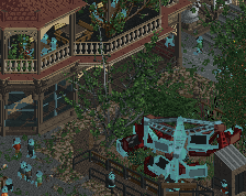
Woody and its station look great, that's the best part about this screen for me. Great job there.
I don't like how the blue building at the bottom looks, its way too much roof and is a weird shape.
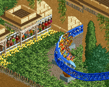
The train corner looks a little weird because its not symmetrical. Track is beside the fence for the straight leading into the corner, and then its one unit away from the fence on the next straight. In theory I guess there is no problem, but it would probably look a lot cleaner if it was symmetrical.
I dont like the ship at all, or the grey building beside it.
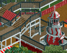
And lastly the boomerang supports station and queue are well done, but you need a second bush or something under there.
this screen is close to being good in my opinion, good job
Your missing some minor details, imo. Add some art deco or something to your aqua colored supports for the chair lifts, make it look more polished. Add a little fence around it too. Also I agree about the train tracks, leave some space for the train by the fences.
gave you a 85% b/c its a good screen but just missing a few things =)
I will go back and change many of the minor details of this screen but I'm probably going to keep a lot of it mainly because i'm just ready to move on to the next project. Call me lazy but If I put this down at all I'm not going to finish it because I'm more excited about what I have coming up than this.
Also I've gotten better while building this with ak (at least I think so) and I think you can see that in this project since this is probably one of the worst screens I have posted. Thanks for all the criticism and helpful tips.
Just remember that 85% is gold/spotlight quality.
Sorry if I came across as harsh in my first comment scoop. It's just a collection of random things more than a coherent screen. Try to think about that in your next project.
I love the framing of that woodie.
I think thats more of a opinion than fact.
Actually its not: http://www.nedesigns...park/accolades/
A 85% score is gold/spotlight there is no debating that.
Thats based off the whole park as a whole though. I'm just giving him a nice score bc i like the screenshot guys.
Nothing wrong with moving on from this screen to finish up your project. If you look at a lot of the impressive builders on this site, their work started off fairly simple. It's all part of the learning curve. My first few parks were quite atrocious, but with time, determination, finishing off parks and starting new ones, applying advice, learning from other builders, you'll do good things Scoop! You've got a foundation to be a great builder if you stick with it.
Oh don't worry I'm way past taking criticism harshly. I do agree with you on every point and I'm making it a top priority to make everything more cohesive in my next project/park
Thanks I'm not saying I'm amazing or anything after building on this park and moving on to other projects but I have seen a huge improvement in my skills as a builder. So hearing that just makes it even more clear.
Double post sorry :/
Agree with faas, I've never liked that brick path in large areas. Replacing it with the other brick path would look a whole lot better immediately in my opinion.