So refreshing to see this kind of stuff. It's a bit messy and unrefined but a lot more interesting than some of the hyper-realism we see here quite frequently.
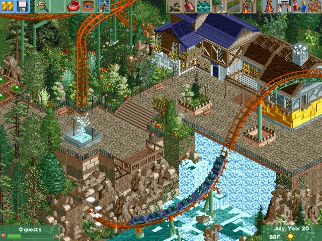
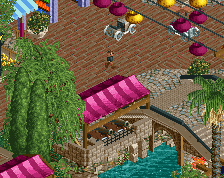
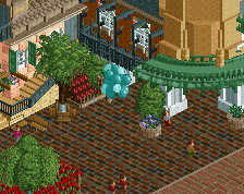
I like this. The spring of the waterfall is a bit unrealistic. Maybe you could add some space between the path and the waterfall and build some kind of drainage where the water comes from, just like G Force said. The two dull green long grass bushes' color is off. Try them in a different green. I love the overhang of path.
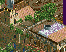
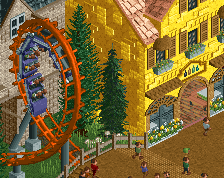
Definitely needs a bigger buffer between the cliff and the paths to avoid those sharp blocky corners. That corner on the bottom right is awful! Foliage is a bit messy too, everything blends together.
The foliage looks horrible..seems like no flow of it goin on, I love the coaster colors and also try to stay with a pattern with fences, alot of things goin on at once. Other than that, the buildings are pretty good and interesting waterfall.
Late to the party but I must say I agree with the 3 comments above. I really like the waterfall but I think it would be better if you made it start a bit below the path so it looks like a water system. Great screen btw!
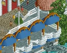
Really nice. I think the yellow is a bit too bright, but the purple-brown-white combo on the other building works well. That little balcony is cool too, and a great viewing spot.
 02-March 16
how on earth could someone vote this 40%
maybe 50 or 60 but definitely not 40
Maybe a bit to much brown, and some of the colors of the foliage are off. Stick to dark green, moss green, and olive green for your underbrush.
Maybe experiment with the colors in the buildings too, swap the brown for some red maybe. The roofs are a little distracting in their color variance.
I'm also a little unsure about the waterfall coming out of nothing, maybe drop it down a tile and show where the waterfall actually starts.
Rest is really good though, very solid start, really hope you guys continue with this.
The landscaping on the bottom left corner is really messy. Tilt those brown tiles and use more rocks perhaps, it's too blocky currently.
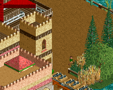
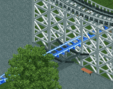
Love the foliage under the diagonal track, really lush.
Don't like the bright yellow on that house, it looks garish in comparison to the rest of the muted tones.
So refreshing to see this kind of stuff. It's a bit messy and unrefined but a lot more interesting than some of the hyper-realism we see here quite frequently.
Whitehawk Offline
^Feels likes someone was just playing RCT and happened to have CSO.
I like.
I like this. The spring of the waterfall is a bit unrealistic. Maybe you could add some space between the path and the waterfall and build some kind of drainage where the water comes from, just like G Force said. The two dull green long grass bushes' color is off. Try them in a different green. I love the overhang of path.
The positioning of the coaster element is great, but the waterfall could be done better (make it more natural, as Sulakke said) as could the rockwork.
The yellow on that building should be a duller colour I think (maybe try peach).
I'll definitely play around with the foliage. Also I totally agree with what you and Sulakke mentioned about the waterfall, that'll be fixed.
Thank you for the kind words I'll play around with the landscaping and the coloring of the bottom half of the yellow building.
Thank you guys the criticism is greatly appreciated. Thanks for all the kind words aswell.
Great interaction though
The foliage looks horrible..seems like no flow of it goin on, I love the coaster colors and also try to stay with a pattern with fences, alot of things goin on at once. Other than that, the buildings are pretty good and interesting waterfall.
6/10 from me.
You guys say the waterfall needs to be more natural but I don't know.. I kinda like that's just a wall of water coming from the path.
maybe make it look like it's not coming from the direct height of the path. other than that I agree with nin.
yeah make it look like a water system or something.
Late to the party but I must say I agree with the 3 comments above. I really like the waterfall but I think it would be better if you made it start a bit below the path so it looks like a water system. Great screen btw!
Really nice. I think the yellow is a bit too bright, but the purple-brown-white combo on the other building works well. That little balcony is cool too, and a great viewing spot.