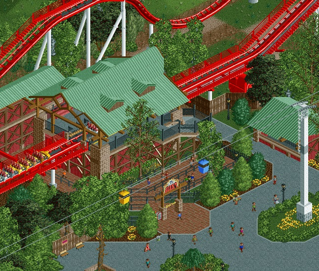
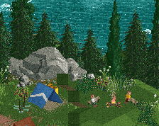
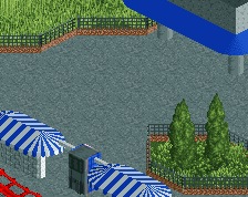
Quite nice, coaster looks like complete ass though, could be much better. Only other complaint is the leaves on the tree in the bottom left. Maybe one unit to high for my tastes, kind of looks awkward I think.
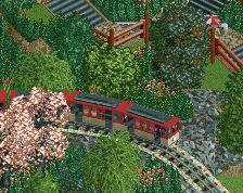
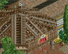
Nice screen, but I agree with G Force. The pieces of the layout that can be seen in this screen look awful.
I also think that you used too many kind of black fences, which makes it look a bit messy. You could easily stick to three sort of fence objects instead of five.
Sometimes you just have to get things out of your system, Liam. This was pretty spur of the moment and didn't take too long to build.
I can definitely sympathise with that! Most of my releases are getting things out of my system. Old parks and iressistable but only half-serious urges.
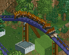
The long section of chain seems a bit redundant if you don't have the transfer section there, maybe it would make more sense to have some brakes to simulate tire drives, but this is just me being picky.
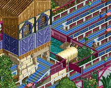
Really love how clean this is and it's very well laid out. If you could just get an angled fence instead of the kong deco pieces on the exit stairs you'd be good to go.
Love the roof and the colors. And how clean it is. Took me a moment to realize what was off about the mulch beds - it's that it's flat to the path with no real border. Add in a little curb or solid fence and it'll look right. Also I agree with Maverix about the straight chain section.
I really like that. Somehow it doesn't just look copied from other realistic parkmakers or even copied straight out of a real park. maybe its rare to see 'original' realism...
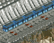
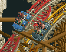
Not sure why people are confused about the "layout". Aka Brake run.
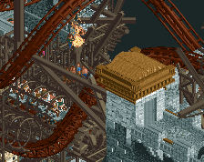
It's entirely accurate. B&M's modern brake runs usually contain a downward slope and are way too long / generally look like shit. I avoid them and try to make my B&M hypers an older style because of how fucking ugly they are now but this is entirely accurate.
Ugly as shit... but accurate
I mean look at this fucking thing...
So saying it's ugly is a valid point but he's not wrong...
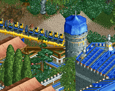
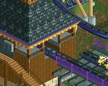
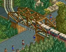
Yeah the (very little bit we can see of) the layout looks fine. I really like the rich and dark colors used here, it feels very warm. Reminds me of parts of Diamond Heights. Love the atmosphere, it's very pleasant. As Liam said, hoping to see more creative ideas from you though. Especially with that micro space station that you made, I'm still waiting for the day you apply your talents and imagination to something completely left field fantasy
 14-April 16
Clean and simple. Very good kyle.
Me gusta, muy bien.
Gorrriath? I like that roof construction.
Geronimo!
Awesome coaster, interested to see where this is going.
Now this looks great.
nintriguing!
Nice screen, but I agree with G Force. The pieces of the layout that can be seen in this screen look awful.
I also think that you used too many kind of black fences, which makes it look a bit messy. You could easily stick to three sort of fence objects instead of five.
wow this looks realllllllllllllllly familiar.
I can definitely sympathise with that! Most of my releases are getting things out of my system. Old parks and iressistable but only half-serious urges.
The long section of chain seems a bit redundant if you don't have the transfer section there, maybe it would make more sense to have some brakes to simulate tire drives, but this is just me being picky.
Really love how clean this is and it's very well laid out. If you could just get an angled fence instead of the kong deco pieces on the exit stairs you'd be good to go.
I really like that. Somehow it doesn't just look copied from other realistic parkmakers or even copied straight out of a real park. maybe its rare to see 'original' realism...
Geronimo?
It's entirely accurate. B&M's modern brake runs usually contain a downward slope and are way too long / generally look like shit. I avoid them and try to make my B&M hypers an older style because of how fucking ugly they are now but this is entirely accurate.
Ugly as shit... but accurate
I mean look at this fucking thing...
So saying it's ugly is a valid point but he's not wrong...
Yeah the (very little bit we can see of) the layout looks fine. I really like the rich and dark colors used here, it feels very warm. Reminds me of parts of Diamond Heights. Love the atmosphere, it's very pleasant. As Liam said, hoping to see more creative ideas from you though. Especially with that micro space station that you made, I'm still waiting for the day you apply your talents and imagination to something completely left field fantasy