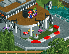
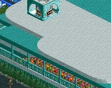
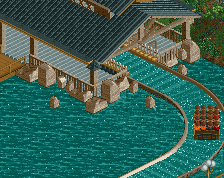
Not sure about that long shallow slope at the top left.
Liking the purple quite a bit. It's broken up enough to not be overbearingly one or two colors, and I get that the objects and style are a throwback, but even still - would be nice to see a building or two in some complementary colors.
Loving the foliage. Checkerboard path is a nice subtle effect. No transfer track?
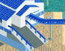
Those colours are just a pure mess. The architecture is quite nice, especially the station, but most of it loses it's function due to the colouration you've got going on.
The coaster is looking great though, that's definitely moving into the right direction.
I'm so confused.... :/ I may throw in a bit more gold/yellow, but otherwise I personally love this area too. If you peak at my two other screens I've posted in this tropical/pirate section I have a purple area, orange area and aqua area. Perhaps I'll need to make some overall adjustments since each color champions those 2 or 3 rides and surrounding buildings, but personally I think they look pretty damn cool!
I agree with Steve, this could be the best screen yet you've posted from this park. It's something about the colours I think, that purple works so well here and contrasts nicely with all the earthy tones and the foliage. I like the checkered path too, mainly the way it's two tones of brown instead of something more heavily contrasting. It adds some nice variation to what could've been just a huge blob of path, while still retaining the over-all feel of the area. Maybe add some railings to the catwalk on the lift hill?
I love the colours of the coaster as well, gorgeous! That slope on the left can and should go more fluent though. Overall one of your best screens Gill, that queue going around that island is so fucking atmospheric! Keep it up, you're going strong.
I like the checkered path too, mainly the way it's two tones of brown instead of something more heavily contrasting. It adds some nice variation to what could've been just a huge blob of path, while still retaining the over-all feel of the area.
 26-April 16
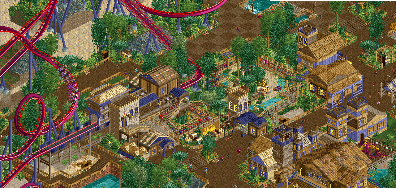
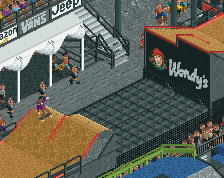
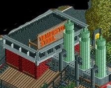
It's quite busy but I like it. The part I like the most are the little islands of green in the upper left. They're such a neat-looking feature.
Not sure about that long shallow slope at the top left.
Liking the purple quite a bit. It's broken up enough to not be overbearingly one or two colors, and I get that the objects and style are a throwback, but even still - would be nice to see a building or two in some complementary colors.
Loving the foliage. Checkerboard path is a nice subtle effect. No transfer track?
Are purple and gold not complementary colors already?
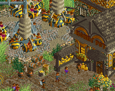
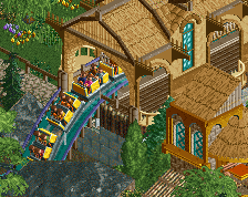
Good stuff bsg, the sand makes for some great negative space complemented by those rock cliffs.
Those colours are just a pure mess. The architecture is quite nice, especially the station, but most of it loses it's function due to the colouration you've got going on.
The coaster is looking great though, that's definitely moving into the right direction.
^ I disagree, I think this is a pretty tight colour scheme.
Looks really good bsg, my favourite screen you've posted so far.
I'm so confused.... :/ I may throw in a bit more gold/yellow, but otherwise I personally love this area too. If you peak at my two other screens I've posted in this tropical/pirate section I have a purple area, orange area and aqua area. Perhaps I'll need to make some overall adjustments since each color champions those 2 or 3 rides and surrounding buildings, but personally I think they look pretty damn cool!
mmm I love the colours.
I agree with Steve, this could be the best screen yet you've posted from this park. It's something about the colours I think, that purple works so well here and contrasts nicely with all the earthy tones and the foliage. I like the checkered path too, mainly the way it's two tones of brown instead of something more heavily contrasting. It adds some nice variation to what could've been just a huge blob of path, while still retaining the over-all feel of the area. Maybe add some railings to the catwalk on the lift hill?
I love the colours of the coaster as well, gorgeous! That slope on the left can and should go more fluent though. Overall one of your best screens Gill, that queue going around that island is so fucking atmospheric! Keep it up, you're going strong.
75%
Love this screen! Colours are spot on.
And this is very true: