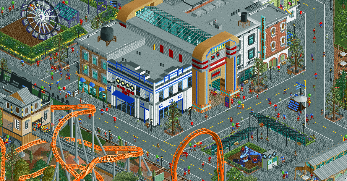
Screenshot / Rock Town USA
-
 01-September 16
-
Piano Park
-
5 of 12
- Views 2,267
- Fans 3
- Comments 16
-
Description
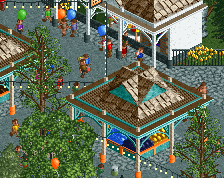
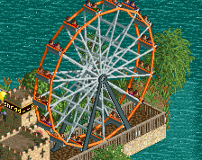
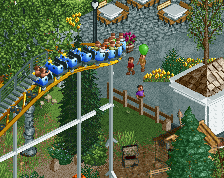
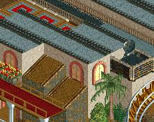
Bring out the amplifiers and tune your guitars! Piano Park rocks! Take a daring ride in our coaster Highway To Hell, our discover the origin of rock in Rock Around The Clock. Take a walk through Jukebox Promenade or have a nice meal in the Hard Rock Cafe and Cheeseburger In Paradise.
-
Full-Size
-
3 fans Fans of this screenshot
-
Tags
I'm really excited for this park. Great stuff!
Your work is fucking amazing dude. My criticism is that the station to the left is a bit messy, too many textures. Also not a big fan of grey path and grey roofs, you could change one up a bit?
Wow.. this is your best screen yet by far I think. The jukebox facade is inspired.
I'd consider using a more leafy tree in those planters, maybe a silver birch. Just so it adds a bit more contrast to the urban colours.
Amazing, Jappy. There is so much charm in your work. Lovely.
I would consider removing the fences around the trees on the sidewalk. I think they block too much of the path, if that makes any sense(?). Not everything needs to be surrounded by fences.
Anyway, good job. I'm exited too for this park!
Love the structures, hate the grey crazy path. I feel like the original color (Jukebox interior) would add much more warmth to the area.
Only thing that really concerns me is the coaster station, but I'll wait till we get a more focused view on it.
I'd experiment with the path colors like disneylandian said, maybe the roof colors as well. Nice work, though, feels fresh and different compared to your older stuff.
I'd consider changing the grey crazy paving to brick, and making the roads closer to black. Would give you a better contrast and wouldn't suck so much life out of the screen. Unfortunately the station architecture is not nearly as good as the rest.
I really like this screen, really fresh and good vibes
Wow! I didn't expect people to like this that much! Thank you all!
@Everyone... I changed the path to the normal crazy path, and you were all right, it made it feel a lot more warm. I'm thinking about changing some of the roof colours, but I'm not sure what to change them into. Ideas?
The coaster station... Yeah, well... That was a hard one. But after lots of tinkering, rebuilding and tearing it down again, I've come up with something I'm happy with. It feels like it fits the area a lot more now.
This is simply your best work yet. Beautiful screen, though I still think that flatride needs to be in the center of the square
Station looks better now as well, only thing I'm not 100% on is the color. Might look better with a bit more contrast to the surroundings.
Thanks all!
@G Force: I know, it blends a bit too much with the surroundings now. Might change some of those actually.
@FredD: still? I understand your feelings but I'm going to leave it there. 1) Otherwise I can't have those Hard Rock Park-inspired awnings which I love 2) I'll have to do the weird invisible huts hack again, and I'm in no mood to do it again at the moment
You just keep improving with every park (if not every screen!). I echo Poke's comment on the grey, though, and I also think the Hard Rock Café-building and that jukebox-arcade-thing beside it seem a little flat, texture-wise, compared with the other more textures buildings, due to the choice of walls. But that's not a major criticism.
Lots of positive though, really enjoy the gray colored crazy pathing. It comes very close to being to much gray though. But well balanced. Nice work really curious where this gos.
You know AC/DC is Australian, right?