Screenshot / Wastin' Away
-
 22-October 16
-
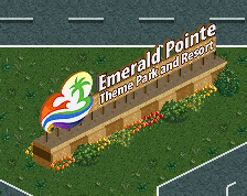
Emerald Pointe
-
8 of 23
- Views 2,096
- Fans 1
- Comments 18
-
Description
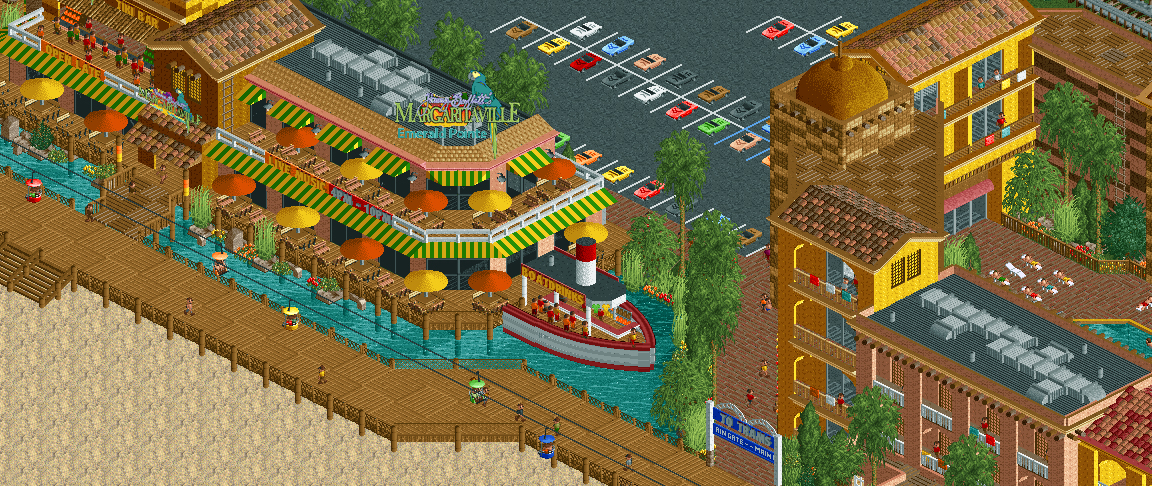
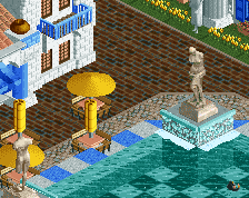
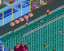
Emerald Pointe is much more than just a theme park. Inspired by Universal Citywalk, The Emerald Point Boardwalk is home to exciting themed dining experiences, a beautiful sandy beach and classic boardwalk food. The boardwalk is easily accessible from Emerald Point's two resort hotels as well as a rear entrance of the theme park and a tram that runs from the main gate.
-
Full-Size
-
1 fan Fans of this screenshot
-
Tags
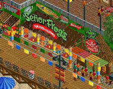
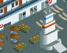
The actual architecture is fantastic, but that sign is horrific. I think if there was something to indicate some horizontal support on it (like it was a billboard or at least had something to hold the letters together) it would look less photoshopped-in.
lol yeah I did mess around with the aesthetic of the sign for awhile until I eventually had an "oh fuck it it's fun and I don't care" moment. I'll see what I can do about some bracing though, that's a very good point. lol
Another issue with the sign is that it's leaning back/facing upwards. The verticals need to be shortened and you need to be able to see the top edges of the letters for the perspective to make it appear upright.
I think the screen also suffers from too many patchwork-y textures in the rooves and walls. The roof-tiles work well on the top right actually, where you have a main colour and a sparse scattering of another colour. I would try and have a similar balance with the other rooves. With the different coloured brick blocks have you considered just using a different textured block but in the same colour?
Pretty nice screen otherwise and I like how the park has a cohesive colour palette of warm, sunny colours.
I think having the sign be in isometric perspective would improve it a lot too. At the moment it looks like a bad pixelated 'shop.
wow I really love this. I'm so keen for this project, you have such an eye for atmosphere.
I honestly thought the sign was added post-screen in paint, so if there's any way to make it look more 'in-game' then I'd definitely recommend doing that.
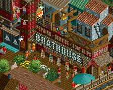
The boat drinks is a lovely touch
Has a bit of a K0NG aesthetic
I can render that sign in 3D and convert to a bmp (pixelate) if needed? It'd actually match the color palette/look of the game as opposed to this. I like actual branding in parks but the objects always are terribly done.
Lol this is so sick man. I'm the Recreation Manager at the Margaritaville Resort in Hollywood, FL, so this makes me smile haha.
I absolutely love this.
I'd definitely say that you have the atmosphere right. Although they've been sticking more to a white / green / light blue-ish color palette for their resort / restaurant properties lately. But I could definitely see this as a part of a larger complex, etc.
Really can't wait to see more from this project!
Kosherboy35 Fan Offline
If you imported the sign it looks good just seems a bit out of place with the sprites of the game but sticks out, wasn't the first thing I saw but I am intrigued on how you got it in the game (I'm guessing). Maybe try some vintage CSO cars in the parking lot too idk unless it's just for a total beach/party all night hangout. Haha.
Just a heads up for the future or changes to this Park. Good luck and keep up the great work!
- KB35
I'm in love with this screen <3 So beautiful!
Two suggestions: I think the green-yellow for the awnings is a terrible choice, don't like that color combination. And I think you can cosy up that wooden boardwalk, only by placing lantarns, benches etc would do a lot more.
I like it, but I agree with Fred... There's a little too much yellow in this screen. Changing the colours of the awnings might help.
I love the colour choices, so warm and welcoming.
love this!
Thanks for the feedback everyone!
I'm all for this. I actually like the angle that it's at now since it makes sense with the boardwalk but if you can make the colors match the game aesthetic a little better I'd be incredibly grateful.
Awesome! Yeah I'm undoubtedly a bit of a Parrothead so when I had the idea to create a Citywalk inspired boardwalk area this was the first thing on the list.
Thanks! Yeah I'm using a space saving object since I'm going to have a battle with the object limit at some point, but the building has a ton of food stands inside so I like the look of peeps actually using the benches which is why I went with real ones. It really livens up the deck when it's all peepable.
Everything you post with this park is awesome Bill! Really nice work, I especially like peepable parks, the more that guests can do the better!
Along with what others have said, I personally like the look the fringes add to the awnings, but perhaps you like the straight look over the alternative the fringes add, probably personal preference.