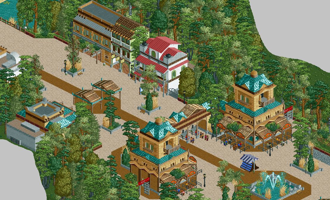
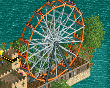
Screenshot / The journey of a lifetime
-
 12-December 16
-
Jappy's Wildland Adventure Kingdom
-
1 of 14
- Views 2,900
- Fans 5
- Comments 23
Community Forum Software by IP.Board
And for the other side....
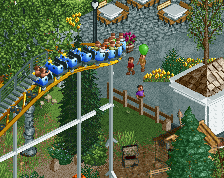
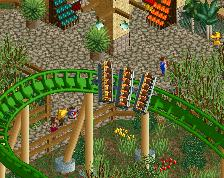
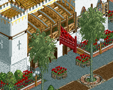
Damn, you're working fast! I just checked out Piano Park (which was lovely btw!) and you've already started a new park! Looks wonderful so far, nice to see you varying your usual style a bit. I think the light path works really well with the theme. The foliage is maybe a bit dense.
I don't think the teal roofs work. I'd try either the dull red or maybe one of the darker browns. The teal makes it look more like an Atlantis theme
Lovely start! Could be the makings of my favorite park from you... even though it's only the first screen .
.
Based on your last few parks, I'm still getting a, "this is Jappy foliage" vibe from this screen. I think perhaps you need to have more purpose when planting trees and bushes. Maybe find some other parks that you could study a bit to see how they had foliage that could be implemented in this zoo setting.
Looks like we're going to have foliage disagreements again haha
Archy is nice though, decent start. Agree with trav and bsg's second point
Foilage doesn't work at all with the architecture. Rest of the screen is pretty cool.
Very happy to see you varying your style. Steve would be proud
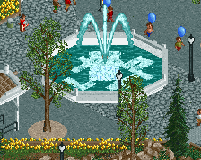
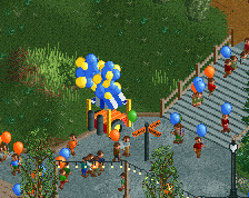
I quite like the brown path from the fountain to the gazebo and beyond, it creates a nice flow.
Surprised I'm in the minority here... I think this is absolutely incredible work. The dirt path line does a strangely compelling job of tying the screen together.
Thanks everyone! Glad to hear you like most of it.
@bsg, Stoksy, Tom_Dj: Well, in that case consider me foliage-blind, I don't see anything wrong with it. Can you tell me what exactly bohers you? Is it the mix, the combination of colours, the placement. I wanted a different mix from my usual palette, although some of them I've used before. I want to mix different colours, not a single forest is just one tone of colour or leaves. The placement: I want a dense forest feel, later at some areas to evolve to downrigth jungle. I want to improve foliage, since that's the thing everyone says I'm worst at but I just don't get what I'm doing wrong.
@Liampie: doesn't sound like fun but if you say so... Might do that for my next project, this one has already started. Do you have any park examples to look at?
I think in this case because the archy has such a variety of colours and textures you're better off using only 2 colours of foilage. Makes the archy stand out a lot more.
I disagree, even if it does do the Atlantis thing (and I didn't have that) for me the teal roofs work perfectly with the buildings they are on which I really like, please leave them as they are. Changing them may make the colour feel a bit dull. So far I like, another project I'll enjoy watching develop.
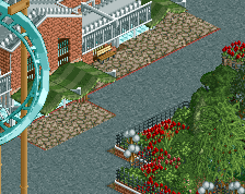
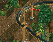
On the foliage front I like the greens on these buildings but the surrounding trees merge into this a bit, I'd say keep it on these buildings but avoid green trees so close as they create that odd effect.
Here's some screens and parks with some different mixes you might learn from. The foliage palette doesn't have the wide variety of colors you employ for most of your parks. There are shades of greens, but not as much drastic changes. Those changes are good in some parks, but I don't think it fits a zoo theme very well. And the use of dry grasses are more purposely placed.
http://www.nedesigns...h-park-studios/
http://www.nedesigns...lanet-entrance/
http://www.nedesigns...038/pridelands/
http://www.nedesigns...s-sylvan-realm/
If others know of another park or two that might show some more zoo-like foliage, please post it below.
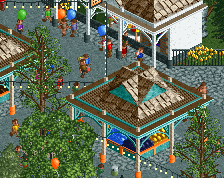
Example of foilage i'm using in a park i'm building right. Chose two base colours and one other for the small stuff. Think something like that (or even less colour variation) might work in your park as well.
edit: can't get the ss uploaded right for some reason.
Attached Thumbnails
For foliage, I'd look at basically anything that nin has built (Tahendo Zoo, DAK, Pridelands).
It's about colour and environment. All your parks seem to have the exact same tree selection rather than you trying to get the foliage to fit the theme. It's a zoo, okay great, where is it? Africa? Europe? Is it in a tropical setting (palms and full greens)? Desert (avoid the darker greens of eg pines)? You suffer a bit from the MCI problem where you seem to select as many different trees as possible rather than a complementary set of a few.
Tom's post is a fair representation of colour but not of tree selection. Just because trees are colourable doesn't necessarily mean they should be coloured differently to their defaults just to fit. Also, you probably don't even need that many different types.
With respect to bsg I'm not convinced any of those posts (bar Pridelands, and maybe Sylvan Realm [the problem with the latter being the sheer amount of it]) are excellent representations of what I would consider 'good' foliage. Look at RRP, Xophe, Pac, Rob, etc. What trees do they select together to represent a particular theme? How do they utilise underbrush? Are trees on every tile or are they clumped together in 'patches'? Where in the park are the heavily treed areas?
I don't have much to add to be honest. It looks good, but I agree there are too many textures, and the foliage still needs work. I really hope you take the time to experiment a bit and not rush things.
It might be due to the lack of peeps, but it's not as atmospheric as your usual stuff. Hopefully that'll change along the way.
I would still recommend to look at the foliage in Faas' Vitaminland. What strikes me when I look at it, is how organic and natural it looks, while the foliage in your screen looks like it was placed without much thought. Since the park is still in an early stage it shouldn't be a problem to go back and redo stuff.