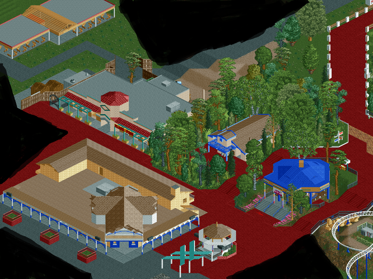
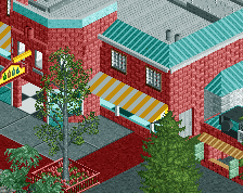
Screenshot / Entrance Plaza Buildings
-
 23-January 17
-
Six Flags Magic Mountain 2022
-
3 of 9
- Views 2,316
- Fans 0
- Comments 5
-
Description
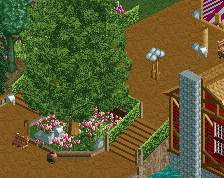
Here are 6 new buildings from my SFMM recreation. The carousel, stage gazebo, bathrooms, picnic shade, lockers/flash pass, and the major gift shop. I'm pleased with most of this except for the large gift shop. While it isn't done, I already am finding it ugly to look at. There are large flat sections with a cross shaped roof starting from the main entrance like I already have. Plus a 2 story L shaped building that runs along the back also like what I have. I built the cross roof too high though, and don't want to rebuild it lower if you guys think it looks bad with the techniques I used. But I don't know how else I can build that part without taking away from realism which is the main priority with this build. Also note foliage in this area isn't complete. That includes the red planters which will be lowered.
-
Full-Size
-
No fans of this screenshot
-
Tags
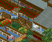
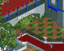
Pretty cool, but I think there is too much path, it is really overwhelming. But maybe its better with peeps. I also think some of the walls are very bland and could maybe use some more detailing. The roofs are also very big and could use some more detailing.
Hmm, I know this is rather standard, but using black for the flat roofs almost always works best. As well as using the same texture for all buildings. Otherwise the roofs become the focal point and distract from the rest of the area.
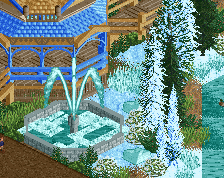
Also, the fencing is a bit lackluster, same goes for the foliage. Based on what you've shown in the past, this feels super rushed. Try spending more time around the paths and foliage to really give it that complete feeling. Don't just plot stuff down randomly around the paths and expect it to look nice.
Its a good start though, just need a bit of cleaning up and smoothing out.
I agree with G Force and Recurious. Though I don't think all the roofs have to be the same, the large brown roof is very distracting with the different texture and the color contrast.
The path again is the problem, because like before, the architecture is also weak, and in combination with the path it becomes poor quality.
Improve the buildings, make them more detailed, choose the right textures, have more care over them.
Then it will come together well.
I was trying to put my finger on what it was missing; and I think that's it. The building detail level. I know it will be tough to make a full recreation with all the little details, but it will look really good.