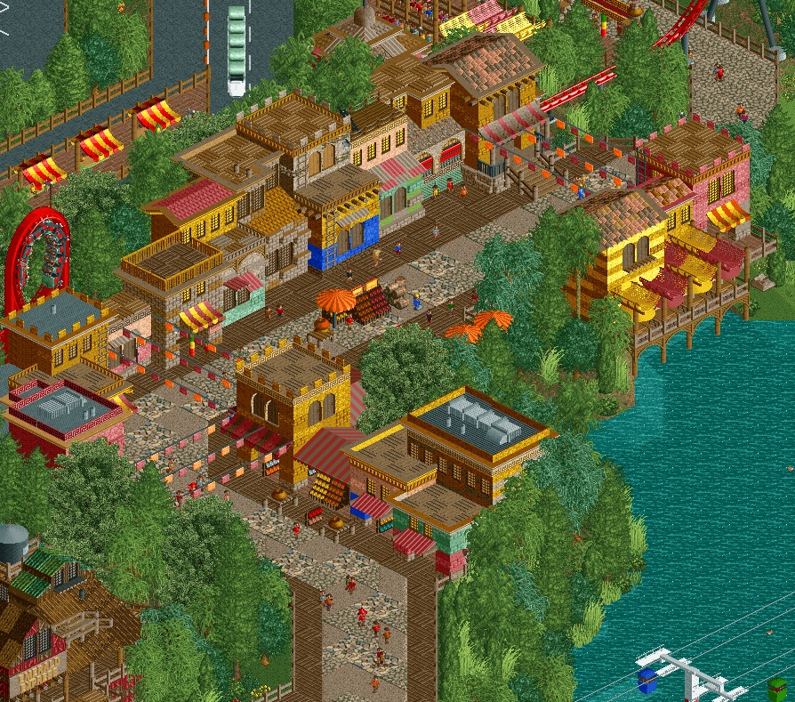
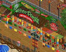
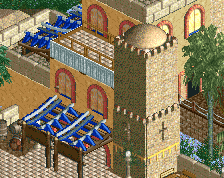
Not sure about the path type, I'd just swap it out for the regular crazy path. Could use a bit more color too, everything is brown and orange/red/yellow. Which isn't that bad in small amounts, but like this its a bit overload and makes me feel a bit uneasy.
Perhaps using a simpler roof texture would help save objects as well, unless you've made the checkerboard texture into a full tile object?
I feel like this is a step down from the other screens in this project. It feels as if it's too fabricated and not smooth (archy that is) enough to be at the same level. It kind of looks like there are a bunch of colors that are just there to be there and not really serve a purpose on contextual level. I do like the bobsled awnings and the Schwarzkopf is always a winner. I think you can do better and should spend a bit more time on the area on a micro level. (P.S. I also agree with the path) It is good don't get me wrong just not as good as I would like it to be. 70%
The general thrust of the screen is pretty good. It's too bad you're fighting the object limit, those buildings could use more details, they look too basic for my taste. If you have object space left over you could come back to them.
The path is ugly. I think you need to get rid of the wooden blocks, they don't match. I think a mix of a lot of crazy path with some touches of another not too different path could work. Buildings need more details too but I understand that's a problem when you've hit the limit, sadly...
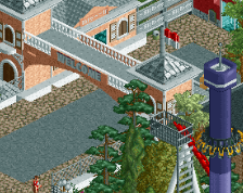
I didn't even notice the shuttle looper, and I think that says a lot of this area's composition. Overall this is definitely not *bad* by any means, but it's certainly not as good as other parts we've seen throughout this park previously. I agree with all the suggestions that've been said, but I definitely think you could consider opening up the area with more "theme park" areas, like tables and a viewing area for the loop. Keep going!
LOL, nobody on NE remembers Sunset Lake. Thanks though.
I was actually a big fan of Sunset Lake.
And I'm a big fan of this park as well, but as others have pointed out, this area definitely seems the weakest. It doesn't both me how hidden the shuttle looper is, in fact I like how the only exposed bit is the reverse spike, but like Steve mentioned it's starting to lose the theme park feel. Just add in more theme park stuff and you should be fine.
The path is awful tho. I think you should stick with one crazy path type and use sand-colored tiles to blend it more. The grid is hurting you here.
That's a gorgeous shuttle loop, can't help but think a different colour might make it pop more.
My issue is that everything is very 2x2, and some of the colours and textures are a bit all over the place and crazy, making it hard to focus, but nice all the same.
 11-March 17

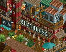
Not sure about the path type, I'd just swap it out for the regular crazy path. Could use a bit more color too, everything is brown and orange/red/yellow. Which isn't that bad in small amounts, but like this its a bit overload and makes me feel a bit uneasy.
Perhaps using a simpler roof texture would help save objects as well, unless you've made the checkerboard texture into a full tile object?
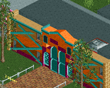
I agree with G on the colours, there is too much yellow, orange and brown, especially too much brown. Other than that it looks good though.
You wouldn't believe the shit I've made into singular objects. There are entire buildings in this screen that are now singular objects. lol
You should change the flag colors.
Nah please don't change anything it looks good enough because of the schwarzkopf shuttle looper! Also is this a remake of Sunset Lake?
LOL, nobody on NE remembers Sunset Lake. Thanks though.
Okay but is it like sunset lake?
I feel like this is a step down from the other screens in this project. It feels as if it's too fabricated and not smooth (archy that is) enough to be at the same level. It kind of looks like there are a bunch of colors that are just there to be there and not really serve a purpose on contextual level. I do like the bobsled awnings and the Schwarzkopf is always a winner. I think you can do better and should spend a bit more time on the area on a micro level. (P.S. I also agree with the path) It is good don't get me wrong just not as good as I would like it to be. 70%
The general thrust of the screen is pretty good. It's too bad you're fighting the object limit, those buildings could use more details, they look too basic for my taste. If you have object space left over you could come back to them.
The path is ugly. I think you need to get rid of the wooden blocks, they don't match. I think a mix of a lot of crazy path with some touches of another not too different path could work. Buildings need more details too but I understand that's a problem when you've hit the limit, sadly...
Looking out for this project!
And I'm a big fan of this park as well, but as others have pointed out, this area definitely seems the weakest. It doesn't both me how hidden the shuttle looper is, in fact I like how the only exposed bit is the reverse spike, but like Steve mentioned it's starting to lose the theme park feel. Just add in more theme park stuff and you should be fine.
The path is awful tho. I think you should stick with one crazy path type and use sand-colored tiles to blend it more. The grid is hurting you here.
That's a gorgeous shuttle loop, can't help but think a different colour might make it pop more.
My issue is that everything is very 2x2, and some of the colours and textures are a bit all over the place and crazy, making it hard to focus, but nice all the same.
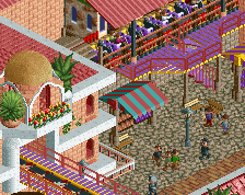
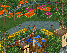
Alright, I've taken a lot of your suggestions to heart and done a lot of work on this area. Thoughts?
Better. Nice play with colours. Still looking a bit too linear and "hardcoded". Somewhat too strong 2x2ism going on, too.
I'd go back to the wooden path along the buildings in the original post and use the stone pathing in the middle.