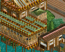
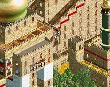
this is for sure your best work by far. Your scale seems to be a bit off from building to building. Mainly when comparing the buildings on one side of the path to the other. I think if the station were a tiny bit shorter than it would fix this buuuuut..... it's kind of late for that Otherwise great work. 70%
Path is really dull, maybe some planters or the usual features could help.
Also feels like the entrance to the coaster could be featured better, just feels like its positioned for convenience and not optimal aesthetic or attraction. Archy is solid though, definitely an improvement from your past work.
@Stoksy: Yeah, I kinda thought that too, will do planters for sure.
@nicman: I appreciate that you have finally accepted that I'm not gonna support the roofs
@Scoop: While I do agree with you, I kinda like the idea of the station and transfer track buildings towering over the others. I'll keep this in mind for later buildings though.
@G Force: Do you think it'll look better if I place the entrance where the green building is now? It's currently just a filler building TBH.
Yea, that would probably be a better place. Maybe you could keep the exit where it is and add a little gift shop structure there, then move the entrance to the green building.
I love this a lot actually, though, I agree with the lot here, the path is kind of bland. Adding planters and the usual trinkets kittered amongst it would help.
I have to agree though, it's your best work by far!
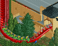
That path is huge! I'd place a fountain on the left, some planters on the right. I also echo what G force said about the entrance. Archy is good, but a bit too big in my opinion.
Too many different roof colours. Especially the blue one bothers me. Change it to gold or red. Other than that (and the path of course) this looks good!
This is, from what I've seen, your best work yet. I'll echo what others have said about the blue, and adding planters as well. This is design quality in my eyes, I'm hoping the rest looks just as good.
 11-March 17
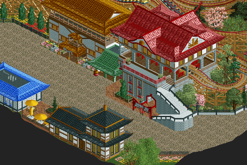
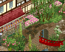
Needs planters or something to break up the path, otherwise solid.
roofs look.......Great!
this is for sure your best work by far. Your scale seems to be a bit off from building to building. Mainly when comparing the buildings on one side of the path to the other. I think if the station were a tiny bit shorter than it would fix this buuuuut..... it's kind of late for that Otherwise great work. 70%
Path is really dull, maybe some planters or the usual features could help.
Also feels like the entrance to the coaster could be featured better, just feels like its positioned for convenience and not optimal aesthetic or attraction. Archy is solid though, definitely an improvement from your past work.
Thanks for the feedback everyone!
@Stoksy: Yeah, I kinda thought that too, will do planters for sure.
@nicman: I appreciate that you have finally accepted that I'm not gonna support the roofs
@Scoop: While I do agree with you, I kinda like the idea of the station and transfer track buildings towering over the others. I'll keep this in mind for later buildings though.
@G Force: Do you think it'll look better if I place the entrance where the green building is now? It's currently just a filler building TBH.
Yea, that would probably be a better place. Maybe you could keep the exit where it is and add a little gift shop structure there, then move the entrance to the green building.
I have to agree though, it's your best work by far!
meh
That path is huge! I'd place a fountain on the left, some planters on the right. I also echo what G force said about the entrance. Archy is good, but a bit too big in my opinion.
Great work, but path needs something extra. Entrance could also be better placed. But promising!
Path ruins it, otherwise not bad, you're definitely starting to improve! Keep it up!
Too many different roof colours. Especially the blue one bothers me. Change it to gold or red. Other than that (and the path of course) this looks good!
tdub96 Offline
This is, from what I've seen, your best work yet. I'll echo what others have said about the blue, and adding planters as well. This is design quality in my eyes, I'm hoping the rest looks just as good.
nice work, good to see you stepping up your game
I loved the houses, good imagination