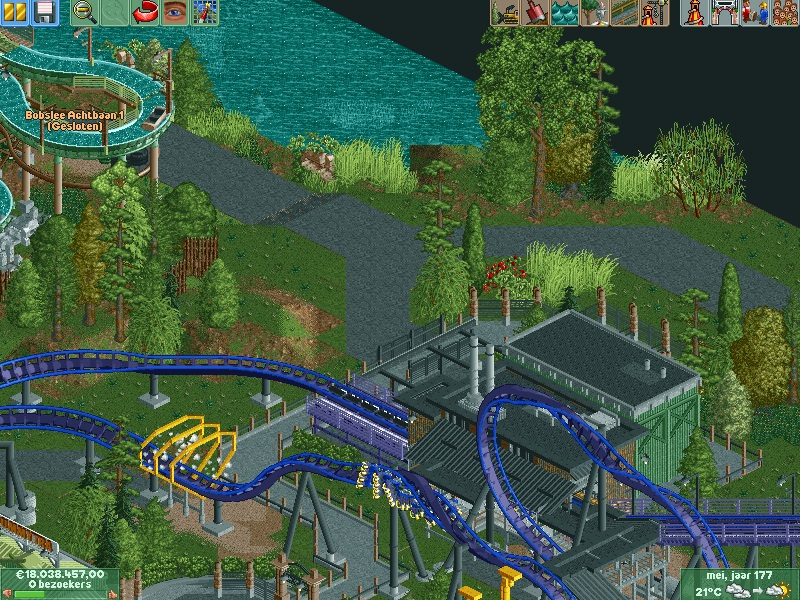
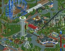
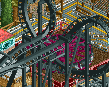
Not sure if I like the colors on Bizarro (?), it makes everything a bit too dark. I think the standard Six Flags color scheme would suit it better even if the regular purple and blue is a bit obnoxious. I don't know, it just suits it and makes the thing pop very well. Maybe that will work here, too.
Other than that, it looks really good. All the technical ideas are spot on as usual, i'm just afraid that it may all be a bit too technical and therefore you won't finish it. Hopefully you prove me wrong though as I'd really like to see this.
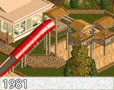
 10-November 13
Not sure if I like the colors on Bizarro (?), it makes everything a bit too dark. I think the standard Six Flags color scheme would suit it better even if the regular purple and blue is a bit obnoxious. I don't know, it just suits it and makes the thing pop very well. Maybe that will work here, too.
Other than that, it looks really good. All the technical ideas are spot on as usual, i'm just afraid that it may all be a bit too technical and therefore you won't finish it. Hopefully you prove me wrong though as I'd really like to see this.
Airtime Fan Offline
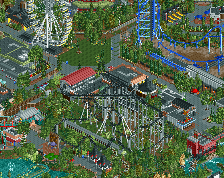
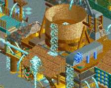
Is this all one project with all the other screens? I'm loving it Gijssie, one of the more exciting builders for sure.
it is indeed one project airtime
nin. i understand your opinion about the colors, But in the surrounding there are some very col-loured rides.
That's why i give the coaster a more neutral lay out. I think this fits to the style of my park.
You don't have to be afraid if i will finished it, Cause theres already 60% build !
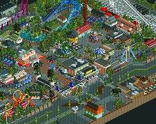
Why have I not commented on this before?
This is incredible!