Wow, this is good! Very good reflection of those stereotypical English/Dutch townhomes (don't know if that's intentional, but I'll take it for granted). The roofs seem to be a bit too red, if you get what I mean, of course. Try to adjust that, and you'll be golden!
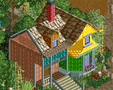
Colors and and composition are pretty good here. Perhaps the only thing that is a bit distracting is the black flat room on the garages, just a bit of a contrast to the rest of it.
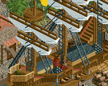
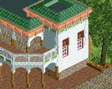
I love all the details you put into this area (the ball on the roof!). The architecture could use some improvements, though. I still think you should make all your floors/buildings one clearance higher. The lamp posts should definitely be taller. The buildings themselves are a little bit plain and flat. They consist out of one wall texture, some windows and a roof on top of it. Another wall texture or some ornaments would help making it a little more interesting. You would add some more color to this if you repaint the waste containers black, green and blue. Would make more sense as well. Especially black would help solving the problem G Force pointed out.
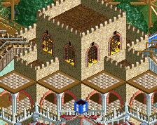
You are making a lot of progress! So much better than the first screens of this project.
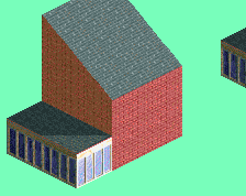
Please for the love of god do NOT use brown. No idea what Impulse or mintliqueur are talking about. Dark orange, bordeux red, saturated red, or peach would work much better.
 23-May 17
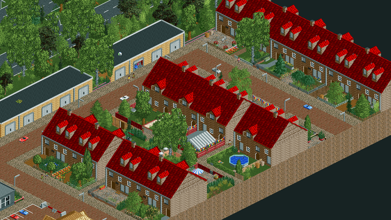

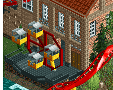
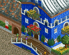
Wow, this is good! Very good reflection of those stereotypical English/Dutch townhomes (don't know if that's intentional, but I'll take it for granted). The roofs seem to be a bit too red, if you get what I mean, of course. Try to adjust that, and you'll be golden!
Colors and and composition are pretty good here. Perhaps the only thing that is a bit distracting is the black flat room on the garages, just a bit of a contrast to the rest of it.
I think the garage roofs are fine, but the dark red for the houses is too much. Try dark orange or drab red instead (or maybe even black).
I love all the details you put into this area (the ball on the roof!). The architecture could use some improvements, though. I still think you should make all your floors/buildings one clearance higher. The lamp posts should definitely be taller. The buildings themselves are a little bit plain and flat. They consist out of one wall texture, some windows and a roof on top of it. Another wall texture or some ornaments would help making it a little more interesting. You would add some more color to this if you repaint the waste containers black, green and blue. Would make more sense as well. Especially black would help solving the problem G Force pointed out.
You are making a lot of progress! So much better than the first screens of this project.
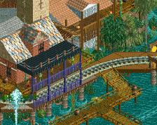
the garden with the party tent is sick
Awesome - it's like a 10x better rendition of the town houses on the outskirts of the original RCT1 scenarios (Bumbly comes to mind).
Some wonderful details, the open garage, party tent, swimming pool etc - great work!
Thanks a lot for the tips. I've been experimenting and came to this selection of colors:
I still like the saturated red I used in the original screen, but I think I'll go for bright red then. Good choice?
I think the Bordeaux red and the Dark brown works best here.
Bordeaux or either of the browns. Just now noticed the ball on the roof after Sulakke pointed it out - that's genius!
If you use the brown one, you can add the tag 'brown is a theme' to this screen.
Please for the love of god do NOT use brown. No idea what Impulse or mintliqueur are talking about. Dark orange, bordeux red, saturated red, or peach would work much better.
Sulakke has a point with the tag.. hmm, difficult choice, but I'll go for bordeaux red lol