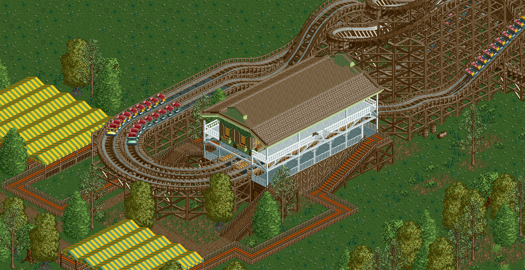
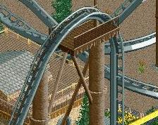
Screenshot / Dueling saloon woodie
-
 02-July 17
- Views 1,306
- Fans 0
- Comments 7
Community Forum Software by IP.Board
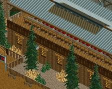
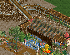
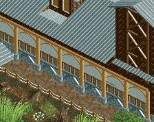
The station building isn't bad, but the queue covers don't fit at all. If you're going for a "non themed" queue cover, you need to establish that. On top of that the whole cover is a bit low, I'd use 5 units of clearance not 4, its important to keep scale consistent across buildings and areas.
Agreed with G; but a pleasant first post none the less!
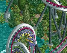
A pleasant debut. The station itself is quite good, though I'd paint the flat roof black or use another texture of roof. The environment around the station needs more work, more love, more detail. Get rid of those awful queue awnings and rethink the queue lay-out more.
I like this but if I were you I would completely redo the queue area. I think the queue path type is terrible, as is the whole layout of the queue area.
It looks nice in my opinion. Good for a first post.
For your next screens, I would say to finish and polish your stuff a bit more before posting it here (environment, foliage, details, etc..).