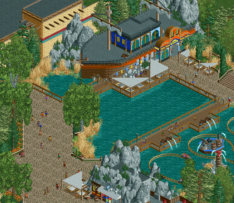
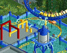
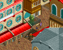
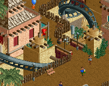
It all looks very nice. But I feel it all looks like it could come from JWAK. Still means its great stuff, but not as new and exciting as it could have been.
Lower part of the screen looks amazing. Top part not so much. Boat location looks a bit wierd and the boat could definately be improved. Didn't you say you built the little boat in that Riverland screen? I know you can do better than this. Take your time. Don't rush it. Keep working hard.
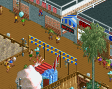
Hmmmm.... TBH the boat didn't turn out the way I wanted it. I based it off a concept art I found online, but looking back, I don't think I pulled it off just the way I wanted it. Back to the drawing board! Any tips on how to improve it?
Boats are about form, Heaven's Atlas reached new heights in H2H7 because the form of all the boats built were completely on point. They considered the tapering of the bow, mast and sail detailing, an interesting stern [all of which are present in your posted concept art but not in your screen]. Some other examples are the Queen Mary in DAW, and Loopy/Louis/Pierrot boat screens.
That's one fat pirate boat! Yeah, the theme here really needs to pushed a lot more. However the object you used for the mast, imo, works very well, nice choice! In addition to the shape of the boat needing to be improved, the deck needs more details, and simply the various details of a pirate ship facade are lacking.
I think you're running into some of the trouble I have in that my object choice became rather formulaic and it sort of makes it seem a bit dull after a while.
It seems basically like an extension of JWAK in terns of object choice and despite being a different style of parkmaking it feels like the same sort of work.
It's nice but it also feels very empty (particularly the paths). I'm not very sure of the grey on the boat. I would also change the brown NCSO fences, I don't think they work great with the CSO ones.
I would also add more details to the splash battle.
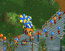
On the other hand, I like that small shop on the bottom of the screenshot and I love the entrance archy of the boat.
 18-July 17
It all looks very nice. But I feel it all looks like it could come from JWAK. Still means its great stuff, but not as new and exciting as it could have been.
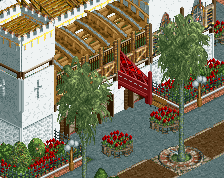
Not convinced the boat is good enough, nor does this area read 'pirate theme'. Bit of a weak screen imo, nice positioning of the cannons though
I don't really care for the boat either, I see more a Jesus theme than a pirate themed tbh. Although that water ride looks nice.
Lower part of the screen looks amazing. Top part not so much. Boat location looks a bit wierd and the boat could definately be improved. Didn't you say you built the little boat in that Riverland screen? I know you can do better than this. Take your time. Don't rush it. Keep working hard.
Hmmmm.... TBH the boat didn't turn out the way I wanted it. I based it off a concept art I found online, but looking back, I don't think I pulled it off just the way I wanted it. Back to the drawing board! Any tips on how to improve it?
Boats are about form, Heaven's Atlas reached new heights in H2H7 because the form of all the boats built were completely on point. They considered the tapering of the bow, mast and sail detailing, an interesting stern [all of which are present in your posted concept art but not in your screen]. Some other examples are the Queen Mary in DAW, and Loopy/Louis/Pierrot boat screens.
That's one fat pirate boat! Yeah, the theme here really needs to pushed a lot more. However the object you used for the mast, imo, works very well, nice choice! In addition to the shape of the boat needing to be improved, the deck needs more details, and simply the various details of a pirate ship facade are lacking.
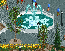
Maybe start with a different bench?
I think you're running into some of the trouble I have in that my object choice became rather formulaic and it sort of makes it seem a bit dull after a while.
It seems basically like an extension of JWAK in terns of object choice and despite being a different style of parkmaking it feels like the same sort of work.
It's nice but it also feels very empty (particularly the paths). I'm not very sure of the grey on the boat. I would also change the brown NCSO fences, I don't think they work great with the CSO ones.
I would also add more details to the splash battle.
On the other hand, I like that small shop on the bottom of the screenshot and I love the entrance archy of the boat.
You should make the deck of the ship more interesting. Surprised I see no barrels up there