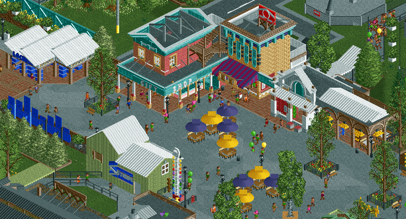
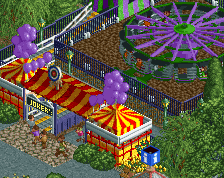
Ugh, so good. Path details are ridiculous, not sure if the glitches are too much to warrant cutting back even though the texture and form added by them are sweet.
Most impressed by the subtle use of those insanely small gee objects from Raptor, really effective on the hammer game.
also not keen on the random benches in the middle of the path, they don't seem well organised or thought out, they look like you've just put them there to break up the path, they don't feel like they have any meaning.
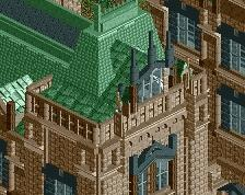
the buildings seem really tall too, out of scale, i think this is because you've given them flat roofs that are sunk 2 units and it makes the whole building look off.
"Really though, this is all quite nice. Great detail. Love it!"
"Most impressed by the subtle use of those insanely small gee objects from Raptor, really effective on the hammer game."
"nice hammer game."
Thanks! I really wanted to see how good and detailed I can make something while still being readable and, at least compared to my other stuff, clean.
"Path details are ridiculous, not sure if the glitches are too much to warrant cutting back even though the texture and form added by them are sweet."
I might consider taking out the roof tiles and the saftey nets off of the path, I dont think they glitch too much though. Most people rarely follow peeps enough to see if one slightly clips when walking over an object. Maybe I can fix with tile inspector.
"yeah seems like good realism. what are the grey things on the brick roof though?" "the buildings seem really tall too, out of scale, i think this is because you've given them flat roofs that are sunk 2 units and it makes the whole building look off."
I was trying to replicate buildings from SFOT's Gotham here and from what I saw most of the upper portions of the building was facades. It might not translate well into RCT though. I'll consider either making the roof flush with the top or making the facade aspect (being supported by the "grey things") more convincing.
"everything feels so 2x2."
I think that's largely blamed on the source material, but I felt as though I've done a good job tapering it off so it doesn't read as awkward in-game.
"also not keen on the random benches in the middle of the path, they don't seem well organised or thought out, they look like you've just put them there to break up the path, they don't feel like they have any meaning."
Do they really need to be totally organized though? I mean you are right that they are there to break up path, but I think making them look too orderly instead of how they are currently would hurt more than help. I am trying to go for this imperfect, but believable feeling you get from a rec albeit not being one.
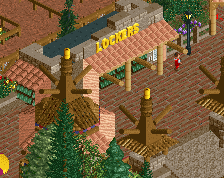
The paths are really good. I like the lockers and their building as well. The other buildings could be cleaned up a little, I think. Especially the one with the Coca-Cola sign (?) looks messy.
i think with the roof issue, just 1 unit sunk would be enough to give the effect you want rather than 2 units.
with the umbrellas, i just think you could do with them being a bit more organised in terms of having them grouped better together, rather than a random 5 in a random shape here and there. i think it would give them more purpose.
I love this so much. A concentration of perfection. It's really different from the other classic american parks we can see here, there's so much atmosphere, and the colors are fabulous. And the umbrellas in the middle are really the perfect touch to it.
 13-August 17


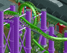

Nice pic of the invert. ....of which I assume those supports are for...!
Really though, this is all quite nice. Great detail. Love it!
Name and description would be better if you actually showed the coaster.
Maybe it's intentionally teasing the viewer ... who knows? I do, but you (likely) do not.
Ugh, so good. Path details are ridiculous, not sure if the glitches are too much to warrant cutting back even though the texture and form added by them are sweet.
Most impressed by the subtle use of those insanely small gee objects from Raptor, really effective on the hammer game.
yeah seems like good realism. what are the grey things on the brick roof though?
everything feels so 2x2.
also not keen on the random benches in the middle of the path, they don't seem well organised or thought out, they look like you've just put them there to break up the path, they don't feel like they have any meaning.
the buildings seem really tall too, out of scale, i think this is because you've given them flat roofs that are sunk 2 units and it makes the whole building look off.
nice hammer game.
"Really though, this is all quite nice. Great detail. Love it!"
"Most impressed by the subtle use of those insanely small gee objects from Raptor, really effective on the hammer game."
"nice hammer game."
Thanks! I really wanted to see how good and detailed I can make something while still being readable and, at least compared to my other stuff, clean.
"Path details are ridiculous, not sure if the glitches are too much to warrant cutting back even though the texture and form added by them are sweet."
I might consider taking out the roof tiles and the saftey nets off of the path, I dont think they glitch too much though. Most people rarely follow peeps enough to see if one slightly clips when walking over an object. Maybe I can fix with tile inspector.
"yeah seems like good realism. what are the grey things on the brick roof though?"
"the buildings seem really tall too, out of scale, i think this is because you've given them flat roofs that are sunk 2 units and it makes the whole building look off."
I was trying to replicate buildings from SFOT's Gotham here and from what I saw most of the upper portions of the building was facades. It might not translate well into RCT though. I'll consider either making the roof flush with the top or making the facade aspect (being supported by the "grey things") more convincing.
"everything feels so 2x2."
I think that's largely blamed on the source material, but I felt as though I've done a good job tapering it off so it doesn't read as awkward in-game.
"also not keen on the random benches in the middle of the path, they don't seem well organised or thought out, they look like you've just put them there to break up the path, they don't feel like they have any meaning."
Do they really need to be totally organized though? I mean you are right that they are there to break up path, but I think making them look too orderly instead of how they are currently would hurt more than help. I am trying to go for this imperfect, but believable feeling you get from a rec albeit not being one.
The paths are really good. I like the lockers and their building as well. The other buildings could be cleaned up a little, I think. Especially the one with the Coca-Cola sign (?) looks messy.
i think with the roof issue, just 1 unit sunk would be enough to give the effect you want rather than 2 units.
with the umbrellas, i just think you could do with them being a bit more organised in terms of having them grouped better together, rather than a random 5 in a random shape here and there. i think it would give them more purpose.
I love this so much. A concentration of perfection. It's really different from the other classic american parks we can see here, there's so much atmosphere, and the colors are fabulous. And the umbrellas in the middle are really the perfect touch to it.
I'm submitting this tomorrow. Thanks!
I know it's all 2x2 but I really love that 2x2 tan brick building. Inspiration is instantly recognizable.