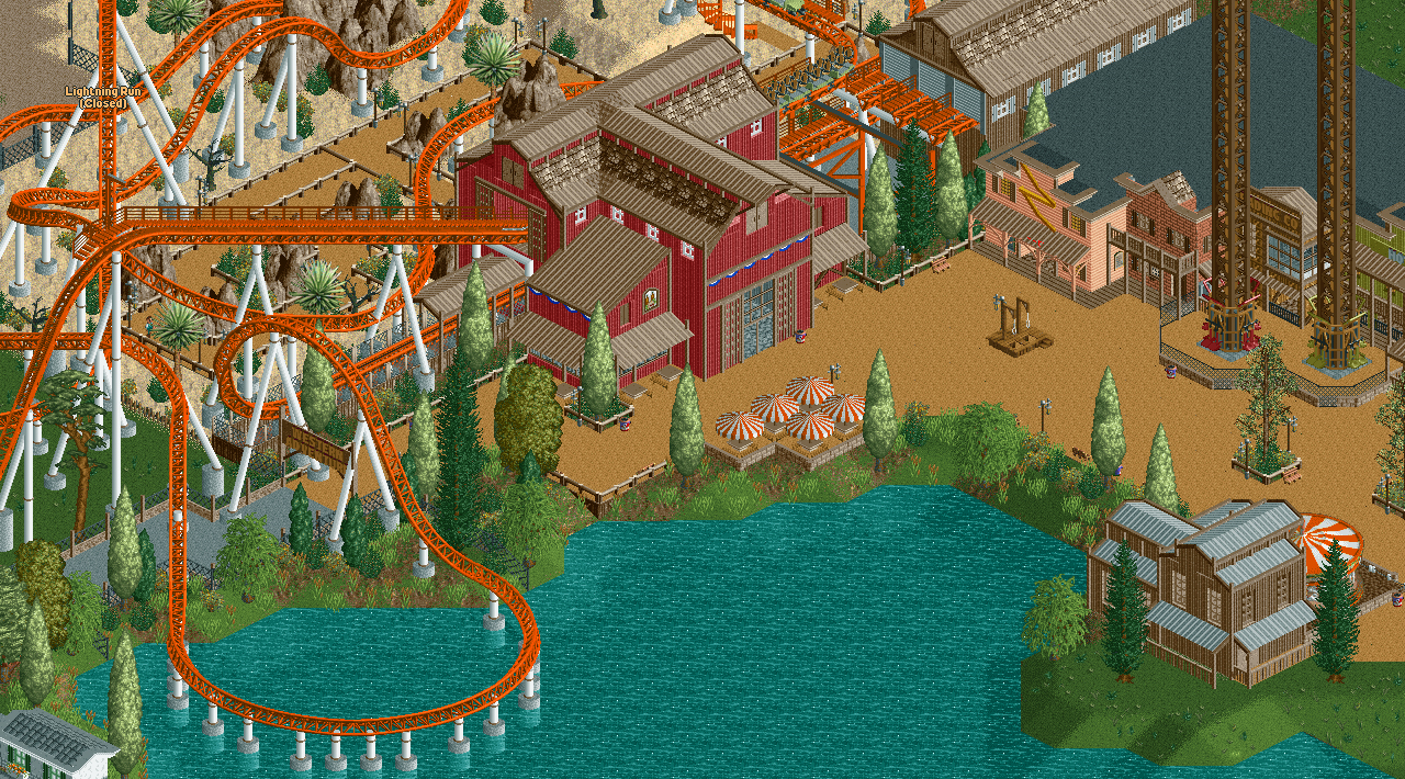
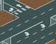
You've got some oddly placed stuff. Carousel placement and the bottleneck created by going underneath the coaster aren't great. I'm not too convinced by the fences or by (the lack of) things to break the path, especially from the fences of the launched freefall. Overall I think it's lovely though.
This awesome and incredibly unique. A few things I would personally change:
1. Different path choice for the launch towers
2. Put the carousel directly on the peninsula, I agree that it's in an awkward bottleneck placement. Maybe even change the color so it contrasts the color of the coaster better (or change the color of the coaster)
The coaster layout is nice, but it's oversupported in some places, as CC9 pointed out. The archy here looks allright, but I would suggest you rely less on the corrugated roofs. Even if you sue of the Dach (Bretter) pieces in some places it would look better. And your paths feel too monotonous, are you using quarter tile objects? Use something with a less repetitive texture, like a full-tile object. Also, I agree with sneakyfrankie that the launch towers need a different base.
What's more important for me here is to change the coaster's colors, that orange doesn't really fit with the sand texture of the LOTR rocks or anything else.
Rest is very nice and coaster's layout looks awesome!
Thanks for all the comments so far. I will look into making some small changes, I already did some path tests. Landscaping is stil my weak point but I'm trying to improve. I still feel rusty at RCT2, but trying new things and improving the old.
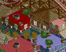
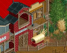
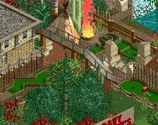
This wild west area has a Mack/Intamin style coaster, two tower rides and a carrousel. (There's a little bit of unfinished stuff in the upper left and right corner.)
 26-August 17
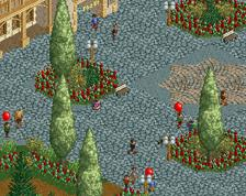
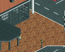
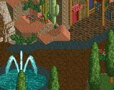
This is pretty great except for the tan path. I feel this would look fantastic if there was brick or crazy/cena path in its place.
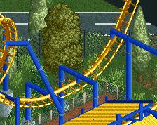
A very small nitpick might be the brown rings on the toon supports, they would look better just white in my opinion.
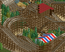
That turn is way oversupported, and the pathways could use some life, but otherwise this looks very interesting.
I agree with G-Force and CC9 on both accounts.
Other than that, this is a lovely lively screen. Interested in seeing more!
Sven is back!
Wow, this is nice. The path makes sense because of the theme? I don't have a problem with it.
I don't care for the path but the rest is great.
RMM Offline
where's the beyond vertical drop? the fountains around the turn after the launch?
c'mon!
You've got some oddly placed stuff. Carousel placement and the bottleneck created by going underneath the coaster aren't great. I'm not too convinced by the fences or by (the lack of) things to break the path, especially from the fences of the launched freefall. Overall I think it's lovely though.
This awesome and incredibly unique. A few things I would personally change:
1. Different path choice for the launch towers
2. Put the carousel directly on the peninsula, I agree that it's in an awkward bottleneck placement. Maybe even change the color so it contrasts the color of the coaster better (or change the color of the coaster)
The coaster layout is nice, but it's oversupported in some places, as CC9 pointed out. The archy here looks allright, but I would suggest you rely less on the corrugated roofs. Even if you sue of the Dach (Bretter) pieces in some places it would look better. And your paths feel too monotonous, are you using quarter tile objects? Use something with a less repetitive texture, like a full-tile object. Also, I agree with sneakyfrankie that the launch towers need a different base.
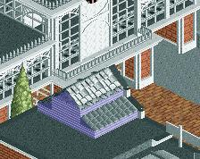
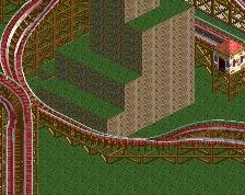
I really dig that station. one of the better and more interacting barns I've seen!
What's more important for me here is to change the coaster's colors, that orange doesn't really fit with the sand texture of the LOTR rocks or anything else.
Rest is very nice and coaster's layout looks awesome!
architecture and coaster are really well made, landscaping could use more thorough work though, and blend a lot better...