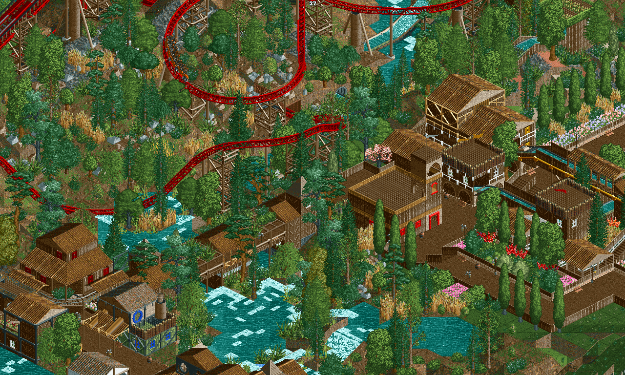
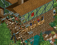
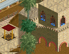
Screenshot / Redlynch Heights - Montanhoso Falls + Shot of Montanhoso
-
 11-September 17
-
Redlynch Heights
-
1 of 12
- Views 1,511
- Fans 0
- Comments 8
Community Forum Software by IP.Board
Good job man! GOOD JOB!!!
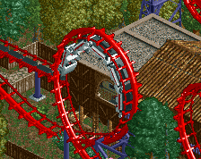
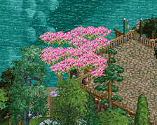
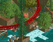
Foliage is a mess, with a mixture of plants coming from all over the world, but suprisingly, it kind of works here. I like the composition of the screen. Especially the bridge is very nice.
I agree with Sulakke. Chaotic, but still readable. Adventurous. You should cut this part loose from the rest of the park, it's too far ahead of for example the Egyptian part.
Like others said, it's chaotic, but it works perfectly here. Keep it up!
It's a bit chaotic and very brown, but otherwise it's quite nice. Maybe use some awnings or trim to break up the brown.
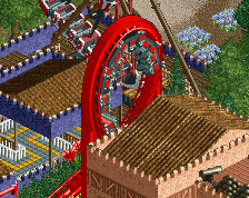
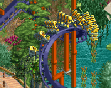
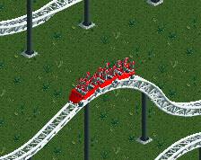
I agree with YoloSweggLord. Maybe some more yellows or blues would work nicely in? I do love the red color of the coaster.
Thank you all for the lovely comments! I have done a bit of reform in the likes that I removed a couple types of trees as I felt there were too many.
SpiffyJack - Thanks man! It took me ages to get even this far. Plus the fact of several reduxes.
][ntamin22 - It is chaotic indeed. That is one of the primary goals for this other than being a vastly terrain/rivery area with several terrain invested rides in it. As I have said, some tree species have been removed. Maybe that will cut down on the craziness? Thanks, man!
Sulakke - Thanks! I tried to get a very atmospheric screen, and I feel I have finally pulled that off. With a bit of refinement, I feel as if this could get better.
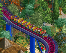
The bridge seems to be the highlight of the screen according to you and a few others; along with the logflume crossing atop the pathway. Thank ya for the comment!
Liampie - It is good that this is still readable. ;) Was the last 'versions' not?
Impulse - Thank you very much. I am certainly going to keep this up.
YoloSweggLord - I can give a pop of colour in the detail side of things a try.
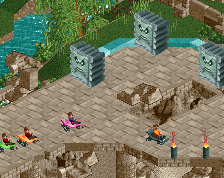
Saxman1089 - There is a decent bit of red, a lot of green. Even some orange. I can try to add more subtle colours and see what comes of it.
I am so glad that this screen has been remarkable positive, at least for to consider my other screens being less..loved, per se.
Thanks for all the comments here, lads! Expect to see another update/screen within the coming week! :)