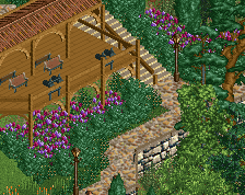
I think it looks like a mess too. While it has a great sense of theming, i do think it's not very fleshed out.
I don't like the buildings at all. I don't think i've ever seen a facade that just consists of crazy high-contrast balconies and open archways like that. And in comparison, i feel like the roofs are really out of place because of how flat and simplistic they are. In a lot of places there's almost nothing to look at and the fences don't do all that much to me. Why not add more smaller towers or chimneys here and there? The oddly shaped dump of abstract stations for a building looks really weird next to the larger scale buildings with the balconies, too.
The foliage looks fitting but it also looks very randomly scattered around the map with all the bare sections where there's no bushes under the trees for instance. I also don't understand the fence gates everywhere - what's the point if you can just walk right behind them everywhere? The sand underneath the small palm trees looks kinda boring too, why not add a clock object underneath them? There could be a lot more objects here and there, and a lot less objects here and there too.
Now i do have to say that it has a strong vibe with all the colours and the foliage types, but it's not executed as well as it could be. I'd just really like to see some more details worked into this.
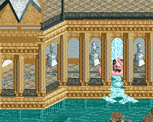
I am unfortunately not a huge fan of this screen. Like Wouter said, this is very distracting, and perhaps a bit too ambitious.
I feel that a simple redo of certain things in this could make it better. That being said, I get the vibe, and it is shaping up to be amazing - fix the red checkerboard paths and you have insta love from me.
I really like the modernist boat hire building, the path work (love the sand/pink flowers/palms) and the area around the Go-Karts in the top. But I agree with others about these 3 buildings - they're too open and path-y. (I think I've said this before when you've shown it) The structure gets lost. Maybe you could use track underneath the paths for some thickness, or fences. Or perhaps you lose the path balcony, keep the archways and use railings to create a 'juliette'.
I agree with everyone, this screen does not have the high quality of your usual work. The row of buildings are the main problem. They are too open and the checker path distracts.
Is there room for one more Monaco theme on the site?
edit: posting screens is great for many reasons. One of which is that I ALWAYS notice an object missing as soon as the screen is live. Thanks for pointing it out, me.
 14-September 17
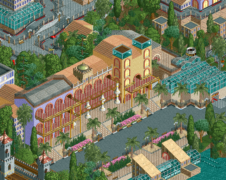
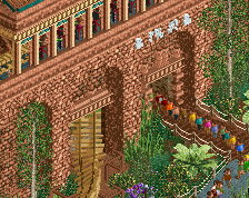
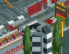
this looks like a bit of a mess to me. the checkerboard red is really distracting
I think that you're distracting from the checkerboard red
I feel like the entrance area of Escapist Experience had a similar vibe to this, but much cleaner.
I'm really not keen on the glass building on the right either. I do quite like the checkerboard red though.
The buildings feel a bit dull to me, I think you can spice them up a little. Perhaps the same can be said for the path.
Sort of feels a bit rusty though, perhaps a re-imagining of the structures and area would be advantageous.
I think it looks like a mess too. While it has a great sense of theming, i do think it's not very fleshed out.
I don't like the buildings at all. I don't think i've ever seen a facade that just consists of crazy high-contrast balconies and open archways like that. And in comparison, i feel like the roofs are really out of place because of how flat and simplistic they are. In a lot of places there's almost nothing to look at and the fences don't do all that much to me. Why not add more smaller towers or chimneys here and there? The oddly shaped dump of abstract stations for a building looks really weird next to the larger scale buildings with the balconies, too.
The foliage looks fitting but it also looks very randomly scattered around the map with all the bare sections where there's no bushes under the trees for instance. I also don't understand the fence gates everywhere - what's the point if you can just walk right behind them everywhere? The sand underneath the small palm trees looks kinda boring too, why not add a clock object underneath them? There could be a lot more objects here and there, and a lot less objects here and there too.
Now i do have to say that it has a strong vibe with all the colours and the foliage types, but it's not executed as well as it could be. I'd just really like to see some more details worked into this.
I am unfortunately not a huge fan of this screen. Like Wouter said, this is very distracting, and perhaps a bit too ambitious.
I feel that a simple redo of certain things in this could make it better. That being said, I get the vibe, and it is shaping up to be amazing - fix the red checkerboard paths and you have insta love from me.
I really like the modernist boat hire building, the path work (love the sand/pink flowers/palms) and the area around the Go-Karts in the top. But I agree with others about these 3 buildings - they're too open and path-y. (I think I've said this before when you've shown it) The structure gets lost. Maybe you could use track underneath the paths for some thickness, or fences. Or perhaps you lose the path balcony, keep the archways and use railings to create a 'juliette'.
I agree with everyone, this screen does not have the high quality of your usual work. The row of buildings are the main problem. They are too open and the checker path distracts.