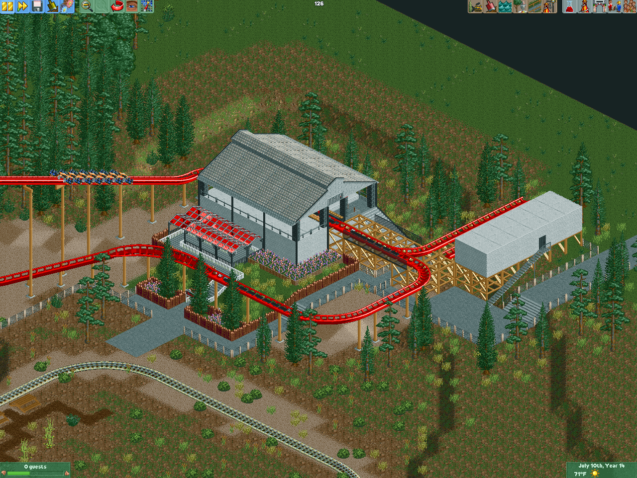
Screenshot / B&M Wing Coaster Station
-
 28-September 17
-
My slow process of building a somewhat ok-park
-
5 of 6
- Views 1,989
- Fans 0
- Comments 11
Community Forum Software by IP.Board
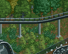
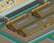
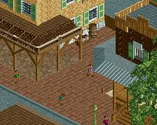
those pilar posts must hurt when the cart moves through... usually Wing Coasters have a 3 tile or at least 2 tile cleareance thus 0.5 more on both ends.?
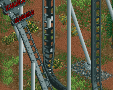
What even is that transfer track? How would you get a train into that building? Inquiring minds want to know.
Also yeah, those posts are way too close and so if the fence.
Here...
https://www.youtube.com/watch?v=AWUC2kNCK34
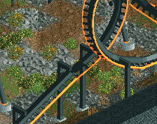
It's not entirely crap, but it definitely needs some refinement. Definitely increase the station clearance by 1/2 tile on each side, as has been suggested. Coasterbill is correct about the transfer track. B&M coasters always use a sliding track for their transfers. And it looks like the diagonal track on the left touches the ground before it comes up to the brake run. Don't ever put track on the ground unless it's for a very good reason, irl this would be close enough for plant matter to interfere with the coaster.
This has a nice classic RCT feel to it. Some more detail wouldn't hurt, but looks pretty good as is. Definitely make the changes to the transfer track/building as others have said though.
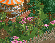
Again, looks promising, with good leads for improving your work. For example you have a ton of empty space, and a short zigzag queue. Use that space to make an interesting queue, exploring the landscape a bit and interacting with the ride.
Also, crop your screens. The top and bottom thirds of the screen don't add anything but unfinishedness, emptiness and the game's buttons. Crop!
Good start. You're a lot further along in terms of landscaping and foliage than a lot of players who post ride stations like this.
i really like how its completely disconnected from any main pathway. idk, makes it quite mystical and interesting.