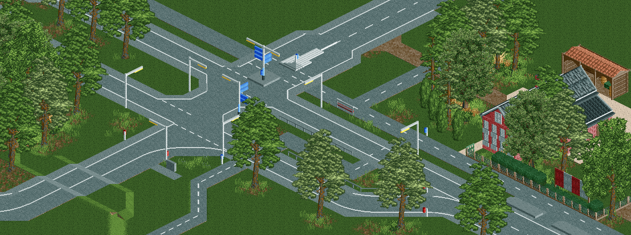
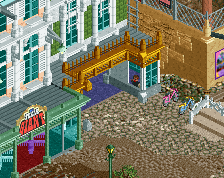
Seems like a typical boring Dutch road. So good job with that.
Not at all, actually. I've never seen a crossing like this. I've neither seen any hills. The cycle lanes would look better in red, to break up the grey.
Not at all, actually. I've never seen a crossing like this. I've neither seen any hills. The cycle lanes would look better in red, to break up the grey.
Well, scuuuuuuuuuuse me for not being an expert on Dutch road infrastructure
Not at all, actually. I've never seen a crossing like this. I've neither seen any hills. The cycle lanes would look better in red, to break up the grey.
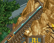
It's basically an exact copy of this road here (as far as RCT2 can go), and it happens to have grey cycling paths. The hill on the left is purely there because the highway is elevated, there's a bridge going over the road further ahead.
The cycling paths look like they are made of red bricks to me! And I would make the roads dark grey. But it's your choice of course, I just think it would add some more color and warmth to the screen.
It looks Dutch enough! I like the scale. Only the lights stand out. They seem too large in comparison to the road signs for example. Try to come up with a better design.
 11-October 17
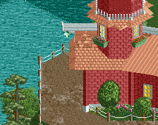
A town named after a French emperor and me? Sweet!
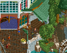
I really like this infrastructure though, especially the subtle difference in shade between road and sidewalk. It just works here.
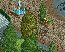
Trees are a little weird all being basically the same shape like that. Nice stuff though.
Seems like a typical boring Dutch road. So good job with that.
Not at all, actually. I've never seen a crossing like this. I've neither seen any hills. The cycle lanes would look better in red, to break up the grey.
Well, scuuuuuuuuuuse me for not being an expert on Dutch road infrastructure
It's basically an exact copy of this road here (as far as RCT2 can go), and it happens to have grey cycling paths. The hill on the left is purely there because the highway is elevated, there's a bridge going over the road further ahead.
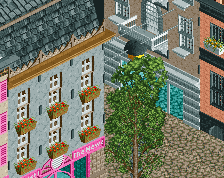
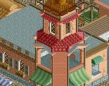
I like the roadways! They feel clean and well done. The building is nice as well, but the foliage seems a bit repetitive though.
I am looking forward to see more of this!