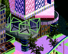
I love to seeing experiments, nice splash of the colors really. not sure about the placement of coaster though, just looks out of the place. don't like the giraffe too.
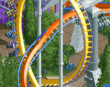
I'm also not sure about the coaster. The placement and the colours (white works, light blue not really). I'm also not sure if the omission of red is beautiful or a missed opportunity. If you go with red you also have a solid colour scheme of all the primary and secondary colours with very little inbetween.
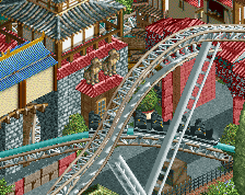
julow is smoking something good.... but in all seriousness, looking very interesting. I don't like bright red for the coaster. Maybe white with red rails? Just a thought.
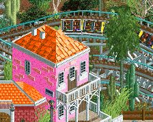
Nailed it in last screen! Such a weird/great atmosphere. Foliage of the year! The realistic details of the coaster are important for saving this from just being some kind of silly experiment.
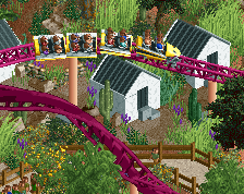
I think you need to tone down some of the coluring, I think the foliage needs to feel more natural, multi-tones of greens and some yellow/brown/orange, but none of this blue and purple, unless it is the standard colour of one of the foliage objects.
You have the uniqueness from the objects used, I think the crazy colours are pushing it too far, and is a bit over the top.
Julow is at this threshold where he's on the cusp of being fucking incredible at rct and missing the point entirely. Reminds me of me in that regard. I think H2H8 and just having a little more structure underneath him would go so far.
 21-October 17
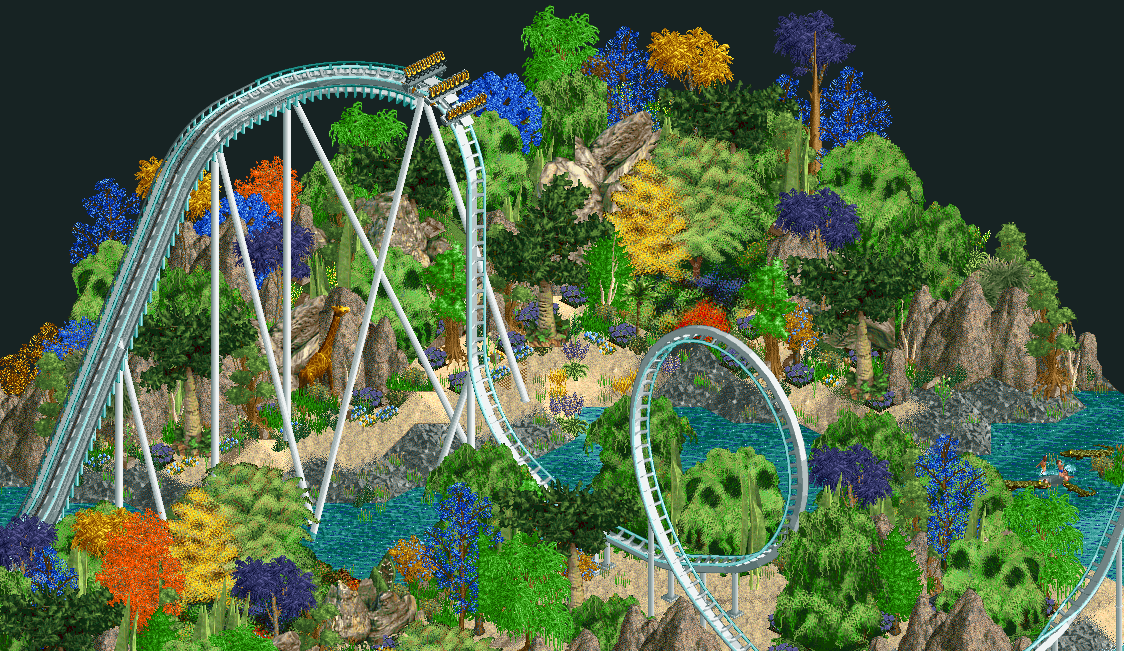
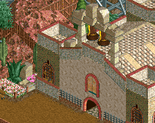
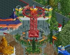
I love to seeing experiments, nice splash of the colors really. not sure about the placement of coaster though, just looks out of the place. don't like the giraffe too.
I'm also not sure about the coaster. The placement and the colours (white works, light blue not really). I'm also not sure if the omission of red is beautiful or a missed opportunity. If you go with red you also have a solid colour scheme of all the primary and secondary colours with very little inbetween.
Cool project anyhow. Multiple angles?
Thanks for the advices ! Changed the color of the water and coaster.
Great stuff. I feel the red colour for the coaster is too overpowering though. But what do I know? I'm only a beginner on scenery lol
Wow a new coaster on exoplanet no. 115?
Interesting concept. I think the trees are an odd choice but as this isn't realism it's looking promising so far.
It's okay if you're interested in dada or some sort of, but basically it's getting worse.
julow is smoking something good.... but in all seriousness, looking very interesting. I don't like bright red for the coaster. Maybe white with red rails? Just a thought.
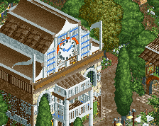
Way better in white. Lots of whimsy and I like it. The coaster does feel awkwardly placed.
These trees are fucking awful. I love them.
Yeah, would look way better if the coaster wasn't even there; plus blue water was far superior.
Interesting. But sad it has to happen through new objects.
Is this another one angle only case?
I'm working on every angle here, I'm really liking this project and I really want it to be liked. I will share other angles soon !
Here is a little update:
Nailed it in last screen! Such a weird/great atmosphere. Foliage of the year! The realistic details of the coaster are important for saving this from just being some kind of silly experiment.
This is amazing. One for the fact that it is so far forlorn than literally 95% of the site, but even more to the fact that this somehow looks good.
Impressive showing, here! I am actually quite intrigued to see where this goes
I think you need to tone down some of the coluring, I think the foliage needs to feel more natural, multi-tones of greens and some yellow/brown/orange, but none of this blue and purple, unless it is the standard colour of one of the foliage objects.
You have the uniqueness from the objects used, I think the crazy colours are pushing it too far, and is a bit over the top.
Julow is at this threshold where he's on the cusp of being fucking incredible at rct and missing the point entirely. Reminds me of me in that regard. I think H2H8 and just having a little more structure underneath him would go so far.
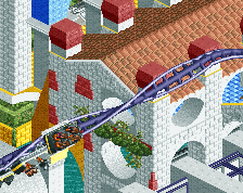
the vivid colours are kind of the point