I agree with Intamin, its just a bit too minimalist and open. Atmosphere isn't really coming though. A little more detail and depth would help this a lot I think.
The issue with being so macro is that it's hard to come off as looking good through screens. I wish the areas underneath the coaster were a bit more refined, and maybe some more detail in the pathways through foliage or small scenery.
The blandness of the architecture doesn't phase me, but I can see why it would bother some. I would love to see this in game or through larger screen to see how it all comes together, because the vastness of it does excite me.
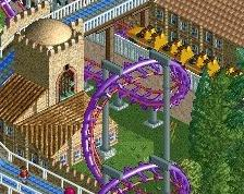
I think the composition is actually pretty messy here. You have those long balconies that separate the path in an awkward way. I'm sure it looks worse from different angles than it does here. Also not too sure on the visibility of the roto-drop nor the lines of sight.
Architecture does feel uninspired like posix said.
 04-November 17
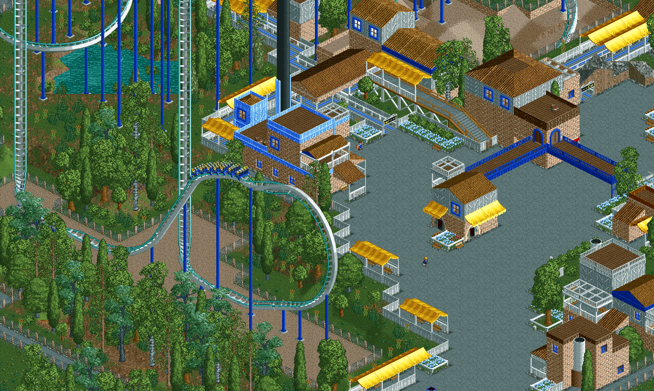
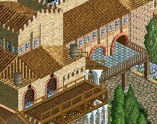

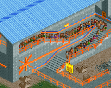
Feels like a bit of a step backwards architecturally.
I agree with Intamin, its just a bit too minimalist and open. Atmosphere isn't really coming though. A little more detail and depth would help this a lot I think.
Peeps would definetly help the atmosphere issue in my opinion
The issue with being so macro is that it's hard to come off as looking good through screens. I wish the areas underneath the coaster were a bit more refined, and maybe some more detail in the pathways through foliage or small scenery.
The blandness of the architecture doesn't phase me, but I can see why it would bother some. I would love to see this in game or through larger screen to see how it all comes together, because the vastness of it does excite me.
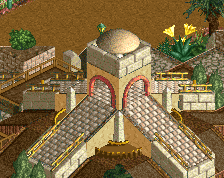
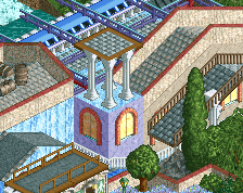
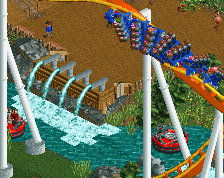
Very clean and nice composition, I like it a lot !
Good to see you active. Love the trees and the sand for the element. So tasteful.
Architecture does look somewhat uninspired.
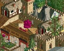
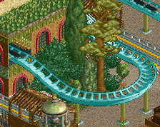
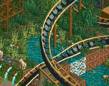
Not quite your best work, but it's interesting and different enough!
I think its lovely. Well done.
I think the composition is actually pretty messy here. You have those long balconies that separate the path in an awkward way. I'm sure it looks worse from different angles than it does here. Also not too sure on the visibility of the roto-drop nor the lines of sight.
Architecture does feel uninspired like posix said.
I think you can do a lot better than this.
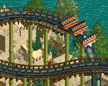
Simple but elegant.