Screenshot / Bunyip
-
 03-December 17
-
TerraVentura
-
12 of 15
- Views 1,703
- Fans 1
- Comments 14
-
Description
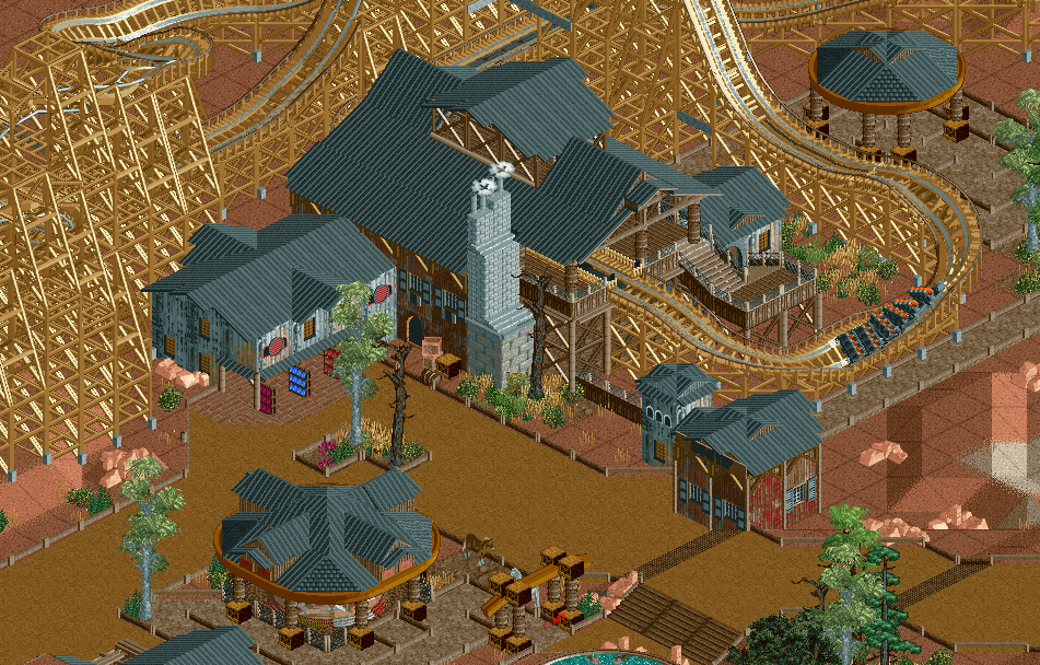
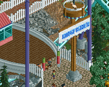
The Bunyip is a monster, living in the swamps in the Outback. The story of the beast is passed on since the aboriginals arrived in Australia. Nobody has ever survived an encounter with Bunyip...
Do you dare to encounter the Bunyip?! Come ride our RMC containg some new elements like the cork-g-roll! -
Full-Size
-
1 fan Fans of this screenshot
-
Tags
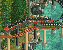

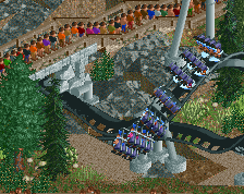
I'm confused by the choice of trains for an RMC. Are they supposed to be 4 accross? Otherwise nice scenery!
Well I tried the RMC trains but it goes slower trough the circuit which I can't seem to fix with the friction settings. But I've already put the Mack trains on it.
I think it looks kinda neat with the four across!
You have to set the friction value of the train after spawning the trains in. Itherwise they'll be given the default friction values from the .dat file.
I did Yolo. They just don't run like the twister trains. But like I said I've implemented the Mack trains and they run like I want them to run.
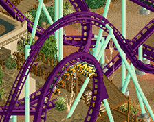
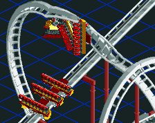
Rest is fantastic, definitely my favorite screen of yours so far. Just clean those two things up and it's a 80-85 from me.
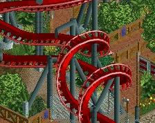
Pretty cool! I love the station structure. Maybe some variation in roof colors?
Some good stuff like the station building but all the black rooves are killing the mood a bit. The q cover is bad too. The crate object is even worse - it has a very harsh shadow on the wrong side.
Love the station itself ! Otherwise, I always have a problem with light brown coloured wooden coasters, there's always a contrast problem. Even more in this case because the NCSO supports are on their "shinny" angle and it's clearly too bright compared to the rest of the screen.
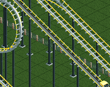
I love how this is laid out. Relatively simple architecture that simply works so well like a charm. I would only add path props.
Marvelous work, Fred!