It's unfortunate that this whole area does not work very well in my eyes. I feel as if everything here is one dimensional, or it is not exploring the potential it has.
There are some good ideas here, like the interaction is really good, and for some, this is a great screen, but to say I love this would be exaggeration. I like it, but I don't love it.
Continue with this; this may have its issues, but it is close to something really pretty good!
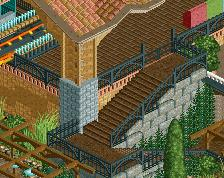
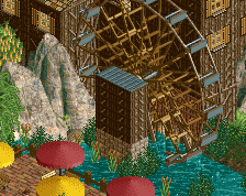
This is quite elegant in all its simplicity. You have a good thing going here. Sure there's room for improvement but I don't really think that's necessary to point out, judging from what you have here you'll figure out yourself in no time what you need to do. The interaction between the mineride and logflume in the center of the screen is the obvious high point. I think you could expand upon that without compromising the pleasant clarity of the area, maybe make the mineride an actual ride? (maybe it already is - I just get the impression it's merely a piece of theming).
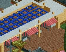
I'm not familiar with the various benches, but this one doesn't look like it has the best object selection. I've only seen those steel pipes as coaster supports in much older parks.
If you want to get the most out of whichever bench this is, take advantage of the smaller objects. The thin horizontal pieces you used to build that fence could also enhance that large brown building.
There's no shame in swapping objects out if you need more variation. Building within the confines of a bench should never come at the risk of limiting oneself.
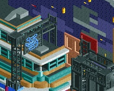
Iron Rattler: One dimensional as in that some of this lacks depth. Something to distinguish itself from more than just something bland.
For instance, you could add more detail to the buildings and give it an extra layer of depth.
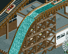
Another instance, to me, could be considered the colouring. I get the theme, but this isn't providing me with a colourful atmosphere this area would need. Everything here feels too brown, reddish. Add some contrast to it and it will add more depth.
This has some good effort, but it is not giving me a conclusive reason to want to come back and stare at this screen and like it more. The more I look, the less I like.
Switch out the paths for something less 'matching.' Add bits of detail that could add colour, or add more green trees against the harsh orange that is your mine train thing.
You are close to something lovely, but just a few more changes would help this.
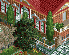
Individual elements are really nice (what can be seen of the B&M is wonderful); but the archy is a little blocky and sort of just... There. Landscaping is fantastic.
 09-December 17
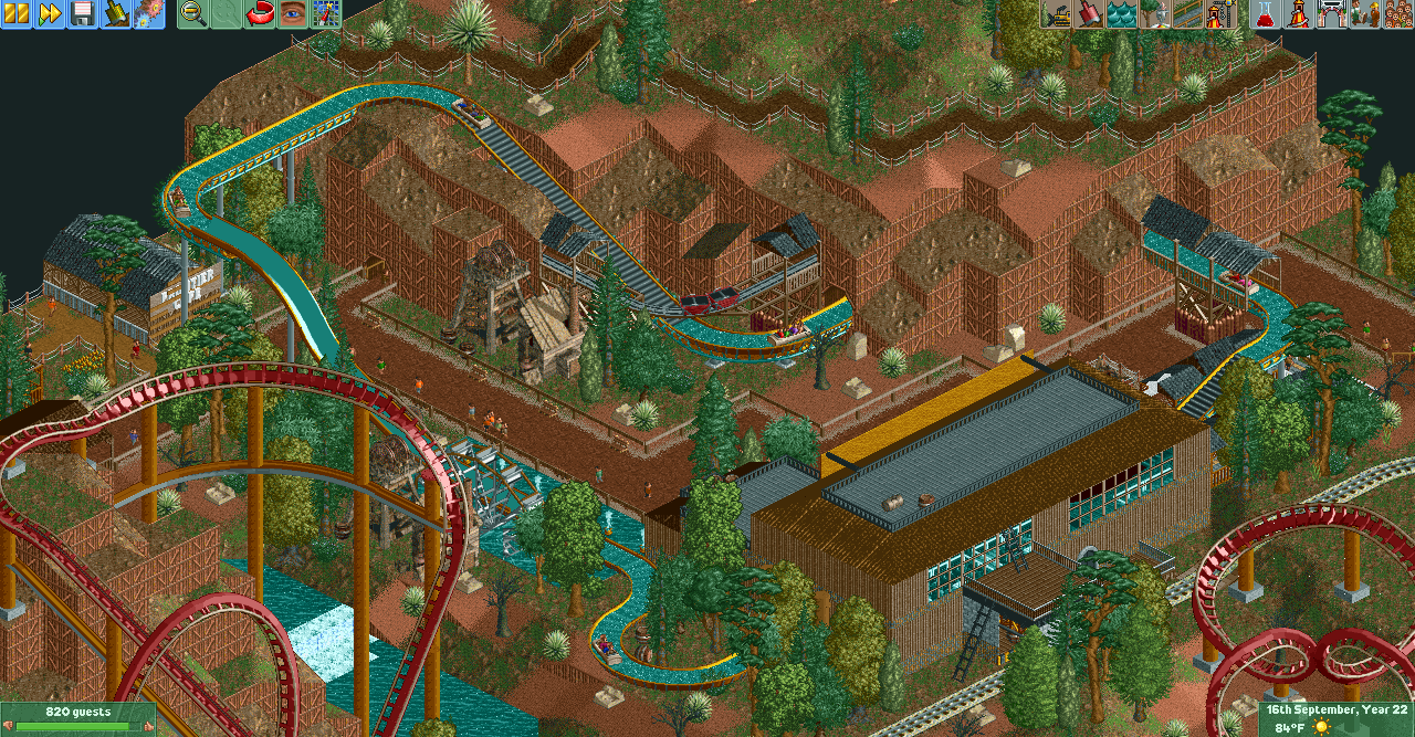
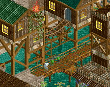
I wish the paths were a lot wider.
this is really quite aesthetically pleasing to the eye
There are some good ideas here, like the interaction is really good, and for some, this is a great screen, but to say I love this would be exaggeration. I like it, but I don't love it.
Continue with this; this may have its issues, but it is close to something really pretty good!
The foliage is really sloppy - selection is too random and too many isolated trees without under bush.
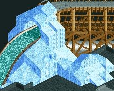
That corkscrew thing on the bottom right is awesome.
This is quite elegant in all its simplicity. You have a good thing going here. Sure there's room for improvement but I don't really think that's necessary to point out, judging from what you have here you'll figure out yourself in no time what you need to do. The interaction between the mineride and logflume in the center of the screen is the obvious high point. I think you could expand upon that without compromising the pleasant clarity of the area, maybe make the mineride an actual ride? (maybe it already is - I just get the impression it's merely a piece of theming).
Thanks for the feedback everybody.
@Poke - Yeah I think the 2 wide paths are the biggest issue with this project so far. I'm trying to modify that where I can.
@Louis - Thanks. I feel this project has a lot of problems but I think it has an interesting aesthetic
@Blazing - can you explain more what you mean by one dimensional?
@Alex - The bench I'm using for this project doesn't have many good underbrush options, but I'll see what I can do.
@mintliqeur- It currently is just scenery, but I think I can change it to make it an actual ride
I'm not familiar with the various benches, but this one doesn't look like it has the best object selection. I've only seen those steel pipes as coaster supports in much older parks.
If you want to get the most out of whichever bench this is, take advantage of the smaller objects. The thin horizontal pieces you used to build that fence could also enhance that large brown building.
There's no shame in swapping objects out if you need more variation. Building within the confines of a bench should never come at the risk of limiting oneself.
Lovely layering.
Iron Rattler: One dimensional as in that some of this lacks depth. Something to distinguish itself from more than just something bland.
For instance, you could add more detail to the buildings and give it an extra layer of depth.
Another instance, to me, could be considered the colouring. I get the theme, but this isn't providing me with a colourful atmosphere this area would need. Everything here feels too brown, reddish. Add some contrast to it and it will add more depth.
This has some good effort, but it is not giving me a conclusive reason to want to come back and stare at this screen and like it more. The more I look, the less I like.
Switch out the paths for something less 'matching.' Add bits of detail that could add colour, or add more green trees against the harsh orange that is your mine train thing.
You are close to something lovely, but just a few more changes would help this.
Individual elements are really nice (what can be seen of the B&M is wonderful); but the archy is a little blocky and sort of just... There. Landscaping is fantastic.