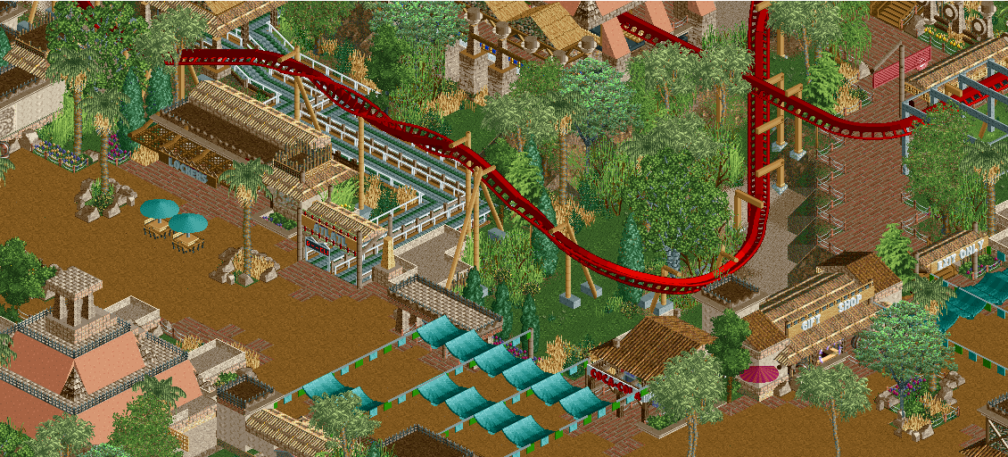
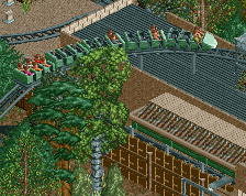
I'm in the same boat as alex, the peach sloped walls just don't have enough texture for me. Yeah, it makes them stand out, but not in a good way. It makes them look plastic and cheap, and something that an actual theme park would do, rather than what you have going with everything else.
I agree about that peach textured walls, they are kind of ruining it for me. Those two tables overthere are also feeling a bit random and senseless for me. Also that zick-zack path with the rope fence is bothering me a lot.
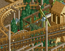
Otherwise solid stuff, definitely not bad, but like the other screen you've showed some time ago,i've also definitely seen better stuff from you.
The supports might look flimsy, but they're so pleasant to look at. Might have to either just use brown for the slopes or find a more textured object (that's the bigger issue imo, not necessarily colour)
 10-February 18


i'm either going to support everything or get rid of them completely. i dunno which yet.
I'm digging the colours. Texturally I'm not liking it as much as the mine train part of the area (the peach sloped walls in particular seem a bit off)
you see i like that it doesnt have texture because it actually makes it stand out more. that and the contrast draws your eyes to them.
About the supports, I love 'em. I think they seem to fit the scheme of what you're going for well. Much better than the regular, in-game supports.
Keep up the good work, Shogo!
I'm in the same boat as alex, the peach sloped walls just don't have enough texture for me. Yeah, it makes them stand out, but not in a good way. It makes them look plastic and cheap, and something that an actual theme park would do, rather than what you have going with everything else.
Everything else looks great.
I agree about that peach textured walls, they are kind of ruining it for me. Those two tables overthere are also feeling a bit random and senseless for me. Also that zick-zack path with the rope fence is bothering me a lot.
Otherwise solid stuff, definitely not bad, but like the other screen you've showed some time ago,i've also definitely seen better stuff from you.
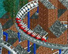
The custom supports you have here look a little too flimsy to hold up a big steel coaster. I'd stick with the default unless they're reeeally messy.
The supports might look flimsy, but they're so pleasant to look at. Might have to either just use brown for the slopes or find a more textured object (that's the bigger issue imo, not necessarily colour)
Beautiful! So well composed.
I like the supports, I really wouldn't suggest using the default here.
This is actually one of my favorite screens from this project.