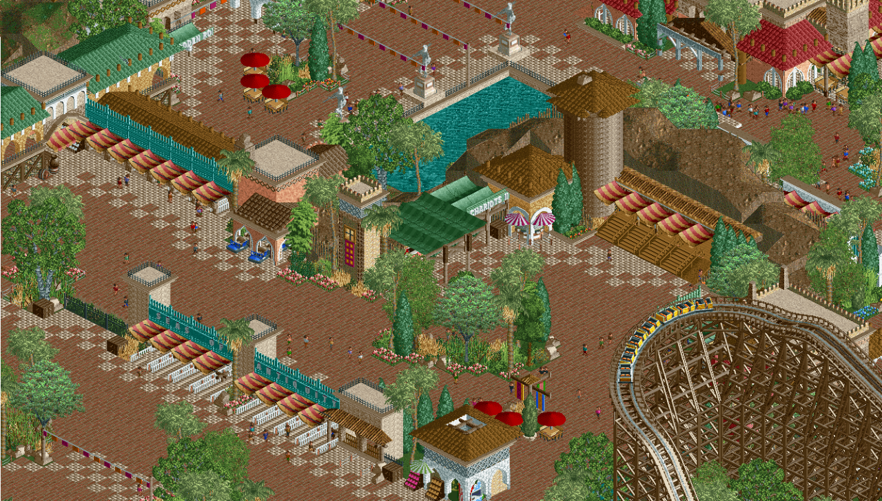
Screenshot / Departure I: The Call of Adventure
-
 12-February 18
-
Seas of Antiquity
-
8 of 14
- Views 2,542
- Fans 2
- Comments 21
Community Forum Software by IP.Board


it's so nin it hurts
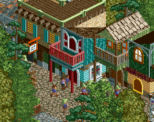
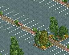
The path is a little overdone. There's cool stuff here, I like how each little building has it's own "exotic port-of-entry" character, but I'm having a hard time figuring out what all these gates are.
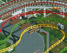
I really like this. great vibes and it seems to be layed out well. especially good work on foliage I reckon
The entry, foilage and composition are great, the buildings around the chariots sign not so much.
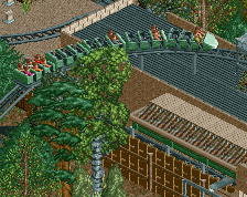
Kinda reminds me of artist's.
I don't love how squared off the underbrush is on that in that central clump of trees or the plain brown tower. Otherwise, I love it.
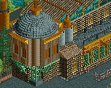
What's that tower supposed to be?
Looking interesting.
This. It is definitely some nifty, great work. I actually like the path. I think that is how some parks would do it in real life, so I don't mind it at all.
Loving the progress, Shogo. Keep it up!
I get RoB-vibes from these last two screens from this project! Something about the spaciousness of the composition... Really lovely. The one thing that bugs me here is that round, brown tower. Stacking one unit pieces gives it such an awkward texture, I think. It might look better in grey...
The bigger picture is excellent and I personally love the path tiles. That brown tube with a roof you're calling a tower however is garbage and you know it.
I decided to delete the tower and edit the right entrance gates. I'm on the fence about taking the checkerboarding tile effect away.
Keep the checkers, replace the tower with a real one. Boom, park.
beak up the paths with some foliage and BOOOM!
edit wtf NIN said Boom too.
fuckit... do what we both said
This is totally my RCT so absolutely love it. So tasteful and well composed in hundreds ways that just come natural to you. Always beautiful to see.
Only criticism I might have is the colour contrast. The reddish paths blurs the overall saturation by a lot. Not that it should be crazy vibrant, but although the path is red, it make the screen greyer overall, if that makes sense.
Why does this have a 53% rating? Really people?
the lower the score goes the better the screen is... feed me those 30%'s hahaha
I love it