I think if you applied a little more structure and planning to your areas, you could have some nice parks. It's a bit of a mess now, but it's still cohesive and readable. Keep working at it, I think you're off to a great start.
Take the heedings of Ion and Cocoa; but I will also add to it. Try your best most of all, but take a peek at the surrounding images floating to and fro' here on NE. See how your work could look if you gave it more thought.
On the plus side, chaotic, sure, but it is readable.
It seems like a helluva lot of fun for sure! There definitely is thought behind this, even if it is very chaotic. Like IonZe0 and Blazing said, if you'd take care in the future to organise stuff a bit more and make it more cohesive, you'll end up with some great work!
Yeah It seems like the motif is color and chaos, but I guess that's just how it came out in my park. I'm glad the park is liked, and I appreciate the info, hopefully I can improve upon my designs next time
Park has been submitted, so hopefully it will go public soon, please check it out! XD
 21-February 18
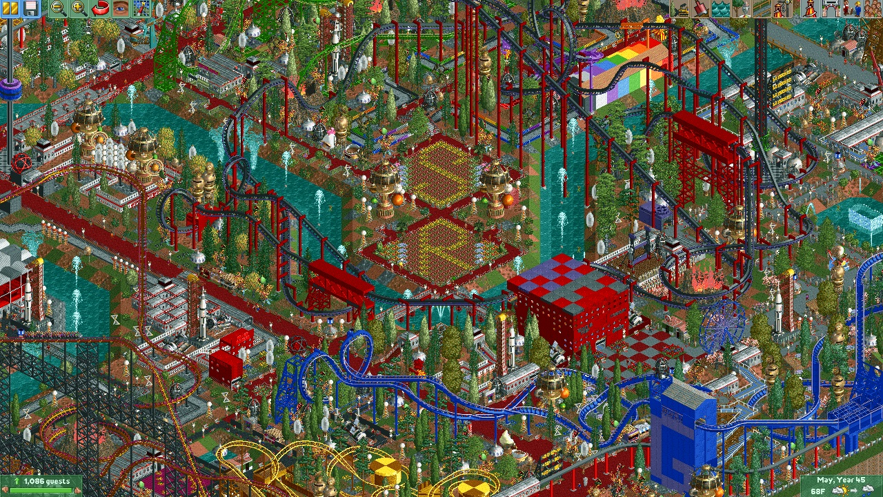
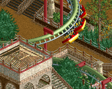
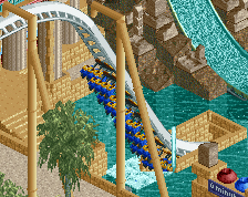
its very colorful and chaotic. definitely not ne "style/standard" but you do you, dude. i like space
I think if you applied a little more structure and planning to your areas, you could have some nice parks. It's a bit of a mess now, but it's still cohesive and readable. Keep working at it, I think you're off to a great start.
Take the heedings of Ion and Cocoa; but I will also add to it. Try your best most of all, but take a peek at the surrounding images floating to and fro' here on NE. See how your work could look if you gave it more thought.
On the plus side, chaotic, sure, but it is readable.
It seems like a helluva lot of fun for sure! There definitely is thought behind this, even if it is very chaotic. Like IonZe0 and Blazing said, if you'd take care in the future to organise stuff a bit more and make it more cohesive, you'll end up with some great work!
Yeah It seems like the motif is color and chaos, but I guess that's just how it came out in my park. I'm glad the park is liked, and I appreciate the info, hopefully I can improve upon my designs next time
Park has been submitted, so hopefully it will go public soon, please check it out! XD