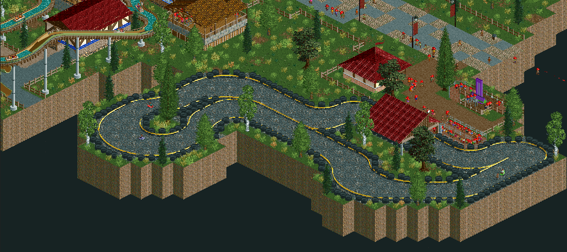
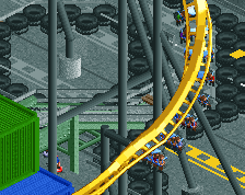
Screenshot / Sherwood Racers
-
 22-February 18
-
Regicide
-
1 of 4
- Views 1,459
- Fans 0
- Comments 10
-
Description
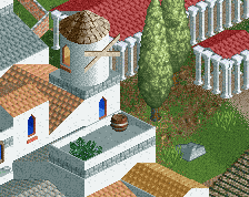
Have you ever wondered what it would be like to race through part of Sherwood Forest? So did management when they commissioned this go-kart track. Unfortunately, they forgot that in order to race through Sherwood Forest the forest itself still needs to be standing.
-
Full-Size
-
No fans of this screenshot
-
Tags
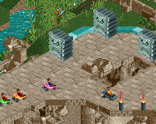
Not bad. Watch for sporadic grass placement. It may be random in real life, but in RCT clumps of foliage tend to look a bit better. Look to improve your architecture by observing real buildings more closely, but so far you seem to be on the right track.
Definitely needs some work but I see potential.
Architecture seems fine if maybe a bit basic, but it's hard to tell from this distance. Maybe don't zoom your screens out in the future.
Cocoa has the right idea when talking about foliage. Don't just scatter foliage, clump it together to form underbrush. Stuff like grass, bushes and flowers under the trees make them look more convincing, like in this screen. I would also suggest to stick with the game's default colour for the trees as for the most part they look the best.
Apart from that, you do have skill and potential. So if you keep working and take tips from criticism, you'll keep getting better and better.
Welcome to New Element!
What's with the pixelation? Is this an RCT Classic screen?
@Jappy- I've just zoomed in as close as I could get in full screen with everything at a 1:1 view ratio and then cropped the image to remove the GUI from the screenshot.
I'm still trying to figure out why the screens look pixelated on here while they look pristine on my laptop, hopefully I find the issue before I upload the rest of the project.
This isn't RCTC either, it's OpenRCT2.
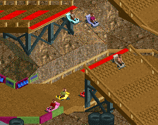
Nice little gokart track!
You messed with my head here, haha. I thought the screen was at normal scale, but it turns out to be a little zoomed out. The screen itself is good, however, it's a little bare. Try to add more details, perhaps. Keep it up!
Welcome to NE Chris! I agree about the foliage, but I want to add one more thing: the white trunks should be grey. That makes them look so much better.
Apart from the foliage you're showing potential. It is only the grass that's holding this from a better screen.
+1 for the foliage comments. Textures in general are kinda off, but I think most importantly you have the right mindset for good design. Keep working hard and show us some more!
About this project, or more specifically, the foliage, clumping the bits and pieces together, perhaps the grass, or maybe adding more trees and whatnot could really liven the atmosphere.
Definitely not a bad screen, but it does beg for some work. Keep it up!
Except for the foliage i see some potential here. looking forward to see more from you!