Path/planters is definitely something that I need to work on, hopefully this H2H will give me someone to work with who excels at that and can give me some pointers on it.
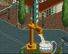
Fountain is a very good idea, not sure why I didn't think of that sooner.
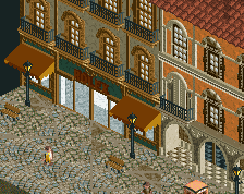
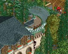
I really love that line of three-ish buildings. Reminds me of old Steve or Turtle work, which is high praise! the planters/trees/paths could be a bit more interesting perhaps- its not the amount of path, but how you use it that determines whether its overwhelming and boring.
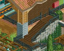
The "too much path"-issue could probably be solved by adding peeps, stalls, benches, light posts, bins, etc.
Really like what is there so far.
Good job.
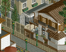
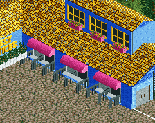
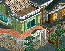
Everything is good here, apart from the planters. They seem bare and a tad uninteresting, to be fair. Perhaps changing that wooden post fence for a different type of fence would work. Though, I like your archy a lot.
 03-March 18
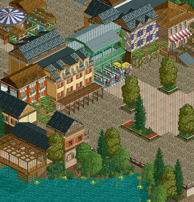
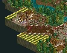
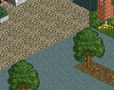
Too much path.
I think it looks nice except for the yellow trees. Painful! Everything about the square could use some love. Path, planters, trees, et cetera.
Path/planters is definitely something that I need to work on, hopefully this H2H will give me someone to work with who excels at that and can give me some pointers on it.
Fountain is a very good idea, not sure why I didn't think of that sooner.
this looks sick dude. i dont think there is too much path yet. us leeds bois need to have a meet up at some point
I love this. Perfect amount of path, imo! Keep it up!
I really love that line of three-ish buildings. Reminds me of old Steve or Turtle work, which is high praise! the planters/trees/paths could be a bit more interesting perhaps- its not the amount of path, but how you use it that determines whether its overwhelming and boring.
The "too much path"-issue could probably be solved by adding peeps, stalls, benches, light posts, bins, etc.
Really like what is there so far.
Good job.
Everything is good here, apart from the planters. They seem bare and a tad uninteresting, to be fair. Perhaps changing that wooden post fence for a different type of fence would work. Though, I like your archy a lot.