Screenshot / B&M Sit down
-
 16-May 18
- Views 1,608
- Fans 1
- Comments 15
-
Description
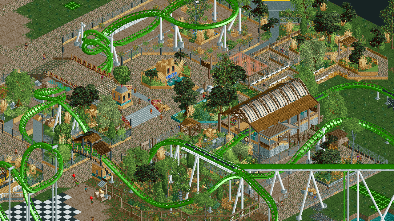
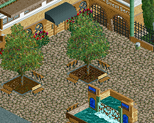
VERY Unfinished**** foliage is poor i know, just wanting to post this as an incentive to myself to play this game lol. in and out for the past year or so n feel like playing. don't know how long this will last. Anyways feedback is always loved.
-
Full-Size
-
1 fan Fans of this screenshot
-
Tags
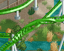
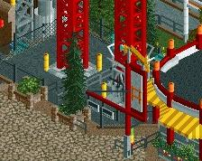
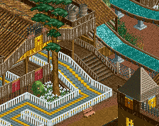
Change the coaster colours and it looks way better already. Foilage is oke def not as poor as you think it is.
Nice work!
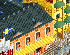
The applegreen works out so damn good here.
The foliage feels a little... uhh... too diverse, I think? It doesn't look all that natural. I love the station though.
Good to have you back on the site again. Keep it up.
I remember this
Try it with the Mekong palette.
Hmm. Interesting. I think I remember this. The interaction is nice, but the area composition is a little weird. The placement of the sign doesn't make much sense to me personally; I'm not sure why so much path behind it other than to look at the turnaround. Bridge thing over the path is a little bit messy, but the colors are nice.
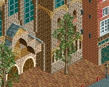
Some serious composition talent in this. Very good foliage too.