The title is wrong. Why would you put yourself down this way? Have more confidence in your stuff, that would make you build better too!
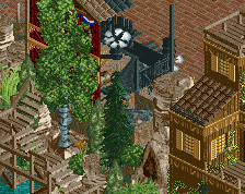
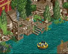
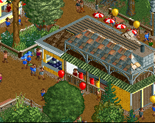
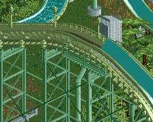
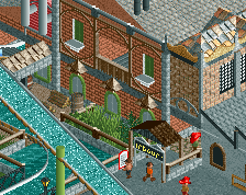
The foliage is good and the paths are interesting. The stations look okay to me, but the layout of the fume is so spread out. You could've made it more compact. Oh, and the transfer track still needs some work, but overall it's a nice screenshot man!
Sens, you need to stop with this "I suck and you should pity me" bullshit. You build good stuff, and I think you'd build even better if you let go of this self-doubt and just fucking built stuff. Not that I'm saying that you're not good (because I think this screen is really good), you are NEVER going to get better if you keep telling yourself you're so terrible at the game when you're really not.
It's like you're about to go out on a kayak and you've flipped the thing on purpose just after getting in it, before even trying to paddle anywhere.
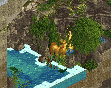
That being said, I think the foliage needs some work, watch SSSammy's foliage tutorial for a good primer. Your scale seems a bit small to me, but it's consistent, so I'd just keep being consistent at it. As myself and others mentioned on discord, I'd change the railroad crossing to all brick, get rid of that weird looking dirt. I don't mind the flume layout, but you need something in that queue and the flume to spice it up a bit. How about a building or two that the flume and queue go through? The green queue railings could also be a bit more contrasty, and some bright accent colors here and there would help the screen as well.
There's a ton of good stuff in this screen too, I'm just pointing out things that you might want to work on and fix. I'm sure I'm not the only one who has seen this with you, but that railroad crossing is a great example of something that someone has told you to fix before, and you just didn't do it. What's the point in us giving you advice if you don't use it? It's okay to not change some things if you feel strongly, but your work would be better received if you took the time to make some changes and upload an updated screen in the comments here. Changing shit is part of building good RCT, ask any parkmaker!
Sorry for the novel here, I just see potential in you that can turn into something great. Keep up the good work and let's see this park released!
"Better than I expected" isn't self-deprecating. Get off Sens' ass everyone.
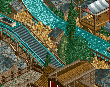
@Sens, the flume meanders quite a bit, and I think meandering flumes work best in pretty dense foliage. If you can thicken this up and compose it well, leaving nice pockets of visiblity for both the queue and the flume, it'll help elevate this area.
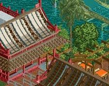
A solid screen. My critiques would be to give the queue with the green fence more of a purpose, right now it's just kind of wandering the woods by itself, away from the action
A real Ethiopian would call his work better than geewhzz's and Pacificoaster's, even if it's the worst ever. Never seen such arrogance before.
Anyways, I actually think the foliage is pretty strong. Only the palm tree looks a bit out of place, but it gives the screen a unique atmosphere too. Architecture and paths are pretty good too, but a bit plain. The biggest problem I have with your work is all the dead space. Everything is so spread out, it makes things very boring to look at. Have you ever seen a queue like the one of your GCI in real life before? Or a flume like this? Your work needs more interaction between rides, landscape, buildings and paths.
 17-May 18
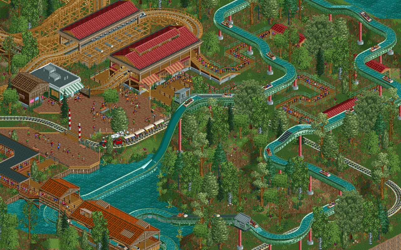
This is accolade quality work. The foliage needs work but that’s the hardest and most frustrating thing in the game to master.
Stop with the negativity.
The title is wrong. Why would you put yourself down this way? Have more confidence in your stuff, that would make you build better too!
The foliage is good and the paths are interesting. The stations look okay to me, but the layout of the fume is so spread out. You could've made it more compact. Oh, and the transfer track still needs some work, but overall it's a nice screenshot man!
Sens, you need to stop with this "I suck and you should pity me" bullshit. You build good stuff, and I think you'd build even better if you let go of this self-doubt and just fucking built stuff. Not that I'm saying that you're not good (because I think this screen is really good), you are NEVER going to get better if you keep telling yourself you're so terrible at the game when you're really not.
It's like you're about to go out on a kayak and you've flipped the thing on purpose just after getting in it, before even trying to paddle anywhere.
That being said, I think the foliage needs some work, watch SSSammy's foliage tutorial for a good primer. Your scale seems a bit small to me, but it's consistent, so I'd just keep being consistent at it. As myself and others mentioned on discord, I'd change the railroad crossing to all brick, get rid of that weird looking dirt. I don't mind the flume layout, but you need something in that queue and the flume to spice it up a bit. How about a building or two that the flume and queue go through? The green queue railings could also be a bit more contrasty, and some bright accent colors here and there would help the screen as well.
There's a ton of good stuff in this screen too, I'm just pointing out things that you might want to work on and fix. I'm sure I'm not the only one who has seen this with you, but that railroad crossing is a great example of something that someone has told you to fix before, and you just didn't do it. What's the point in us giving you advice if you don't use it? It's okay to not change some things if you feel strongly, but your work would be better received if you took the time to make some changes and upload an updated screen in the comments here. Changing shit is part of building good RCT, ask any parkmaker!
Sorry for the novel here, I just see potential in you that can turn into something great. Keep up the good work and let's see this park released!
Looks nice, reminds me a bit of that log flume in that realism NE group park.
"Better than I expected" isn't self-deprecating. Get off Sens' ass everyone.
@Sens, the flume meanders quite a bit, and I think meandering flumes work best in pretty dense foliage. If you can thicken this up and compose it well, leaving nice pockets of visiblity for both the queue and the flume, it'll help elevate this area.
I did change the title, it used to be 'not a very good screenshot'
I called it that because I felt that this wasn't a particularly good screen. Competent, but not standoutish or noteworthy
A solid screen. My critiques would be to give the queue with the green fence more of a purpose, right now it's just kind of wandering the woods by itself, away from the action
A real Ethiopian would call his work better than geewhzz's and Pacificoaster's, even if it's the worst ever. Never seen such arrogance before.
Anyways, I actually think the foliage is pretty strong. Only the palm tree looks a bit out of place, but it gives the screen a unique atmosphere too. Architecture and paths are pretty good too, but a bit plain. The biggest problem I have with your work is all the dead space. Everything is so spread out, it makes things very boring to look at. Have you ever seen a queue like the one of your GCI in real life before? Or a flume like this? Your work needs more interaction between rides, landscape, buildings and paths.