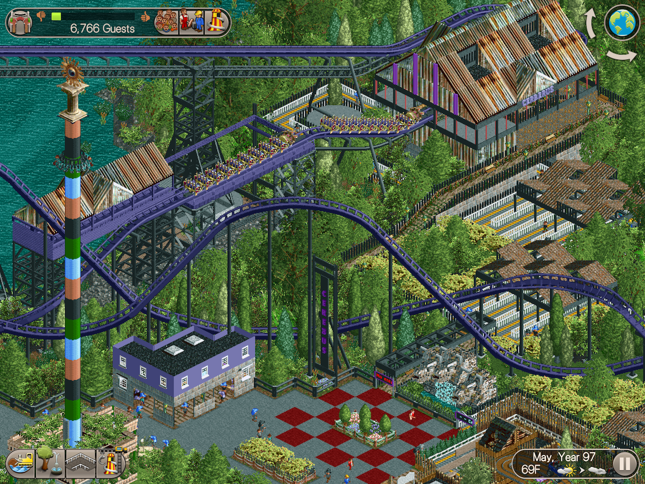
Structurally, this is some great work. You clearly have a grasp of realistic parkmaking, that much is obvious.
Sadly however, you are being let down by those objects. The WW and TT objects are generally viewed as ugly as their textures don't match the original ones from the game.
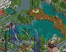
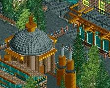
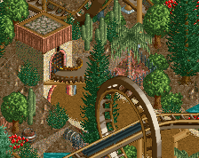
A pleasant RCT motif placed in the forest. Forest well made, deciduous. Good vegetation / (shrubs) yellowish-green - fit to green greens.
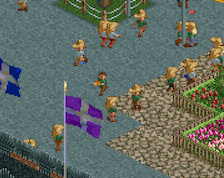
There is an inscription on the station building:
"Cerberus", while on the board by the fountain "Cerebus"
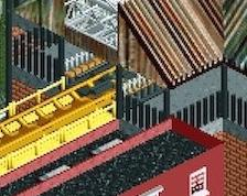
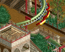
The roofs made of sheet metal are cool and atmospheric. RCT really looks like "intense." Roto-Drop - interesting (also original idea for the station building)
Great work so far. I generally agree with the consensus here. A lot of the WW/TT theming works, but some of it doesn't. Also, unfortunately, the majority of us don't have WW/TT so judging this could be rather difficult.
 28-November 18
Structurally, this is some great work. You clearly have a grasp of realistic parkmaking, that much is obvious.
Sadly however, you are being let down by those objects. The WW and TT objects are generally viewed as ugly as their textures don't match the original ones from the game.
A pleasant RCT motif placed in the forest. Forest well made, deciduous. Good vegetation / (shrubs) yellowish-green - fit to green greens.
There is an inscription on the station building:
"Cerberus", while on the board by the fountain "Cerebus"
The roofs made of sheet metal are cool and atmospheric. RCT really looks like "intense." Roto-Drop - interesting (also original idea for the station building)
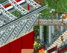
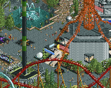
You've actually managed to use the WW/TT objects pretty well. Specifically in the roto-drop and the entrance to the coaster.
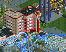
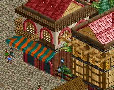
I'm not a fan of the objects used in the rooves and shop. They look off but hey, that's just me. Station is quite blocky.
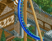
The coaster interaction is pretty cool and the details are nice (well done on the transfer and theming in general).
Still, this is some pretty great work!
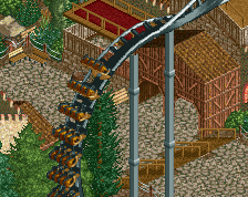
I totally don't mind the WWTT objects. They look mostly integrated here. Also compositionally quite convincing. Good theme dedication too.
It was very cool