Screenshot / More horrible crops
-
 18-January 19
-
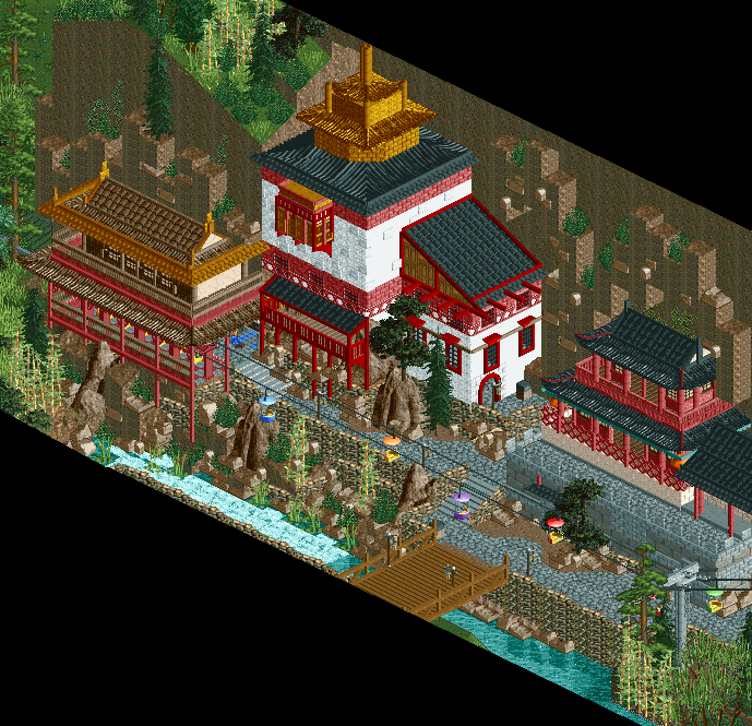
Yangshou Valley Thrill & Water Park
-
3 of 10
- Views 1,772
- Fans 1
- Comments 17
Community Forum Software by IP.Board
I must admit that I'm indeed not entirely satisfied by the blocky terrain on the wall. However I felt like the wall would become extremely flat if I didn't add some form of terrain. Do you have a suggestion on how to make it look better?
Use the land textured arches on the undersides, and then smooth out the top with more naturally angled pieces. You can use the ruins too in places to give it a more layered look. Have some pieces extend out further than just one quarter tile.
Just use the sloped, rounded, or diagonal land blocks instead of just the square ones, mix in a few angles and stuff and it will look fine.
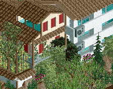
Pretty sweet. Only suggestion is that it feels like the heights of floors are a little inconsistent.
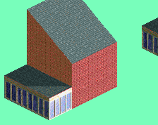
The texture work on the middle building in particular is fantastic.
yes
There are smaller land blocks (half a quarter tile or 1/16 tile). I'd use them.
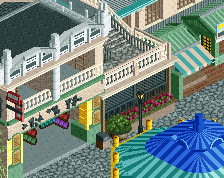
So good
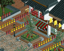
Something like this maybe for the land wall? Or is this too over the top?
That looks a lot better for the cliff for sure.
It's not an improvement, it's just more clutter.
You have to actually design the cliff, not fill it.
That looks amazing!
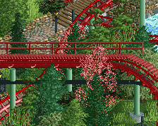
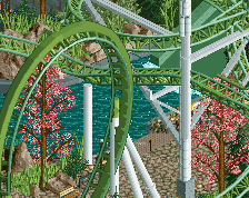
Second screen looks better already. I hope you're going to improve the left cliff too. Especially the harsh transition between the rockwork and the grass on top doesn't look natural. I'm also disliking that rock wall under and next to the bridge. The texture doesn't look right. I think there's also a 2 clearence high object of that wall that will make it look better. The architecture is great.
Yea I will probably make all the cliffs in the park like this unless I find a better way to do it. Luckily this park isn't a 150x150 long valley with cliffs stretching the entire park "cries in object limit T_T".
Also you can't see it here but in the park the transition between the rockwork and the top of the cliff is very gradual for the parts that are finished
Good suggestion, didn't know that object existed. I replaced it and mixed it up a bit and while I'm not 100% convinced yet I think it looks better.
Can you give a bit more direction as to what you mean exactly? Do you maybe have an example in mind? Especially for some of the other cliffs in the park that might be valuable. The main problem at this particular spot is that I have very little space to really make a cliff and shifting stuff to make more room is not really possible at this point anymore.
Thanks to everyone else for the comments as well .
.