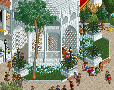
This is actually a very good debut screen! The coaster isn't entirely RMC-esque per se (the long diagonal hill is most out of character) but the track layering you did pays off, very good way of doing it. I'm digging the unique colour choices too.
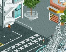
The architecture and infrastructure need some work. I notice that most paths have straight or diagonal edges, but then there are some super curvy monorail edges as well. Angular and curvy never mixes well, I'd just stick to angular unless you're really dedicated to curves and implement them consistently.
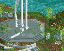
Also consider adding some colour. It doesn't have to be a lot, but right now even the flowers are drab.
Looking forward to seeing you in Micro Madness! You were kind of a big question mark for me, but now I've seen your work and I'm glad you signed up.
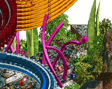
Really good first screen! I agree that the monorail sticks a bit out, and the screen feels a bit empty. Last one can be solved by giving more color to the station building and the flowers for example.
 30-March 19
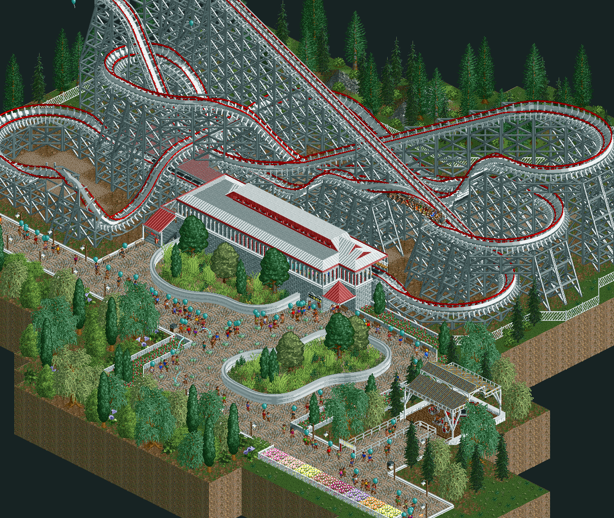
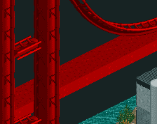
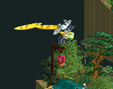
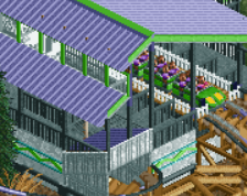
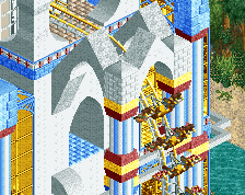
This is a pretty nice RMC! I'd suggest lowering the monrail tracks one unit though.
This is actually a very good debut screen! The coaster isn't entirely RMC-esque per se (the long diagonal hill is most out of character) but the track layering you did pays off, very good way of doing it. I'm digging the unique colour choices too.
The architecture and infrastructure need some work. I notice that most paths have straight or diagonal edges, but then there are some super curvy monorail edges as well. Angular and curvy never mixes well, I'd just stick to angular unless you're really dedicated to curves and implement them consistently.
Also consider adding some colour. It doesn't have to be a lot, but right now even the flowers are drab.
Looking forward to seeing you in Micro Madness! You were kind of a big question mark for me, but now I've seen your work and I'm glad you signed up.
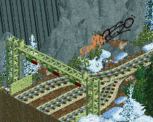
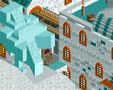
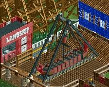
Wow, side friction track looks dope. I always use wooden, but might switch after seeing this. Nice work!
Really good first screen! I agree that the monorail sticks a bit out, and the screen feels a bit empty. Last one can be solved by giving more color to the station building and the flowers for example.
Neat! Hybrid coasters are so interesting to look at.
Side friction track is indeed an interesting choice but it pays off well. I love it! Very clean, good job!
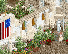
A lot of well executed elements to the ride and park, I would say improving your archy should be a main focus.