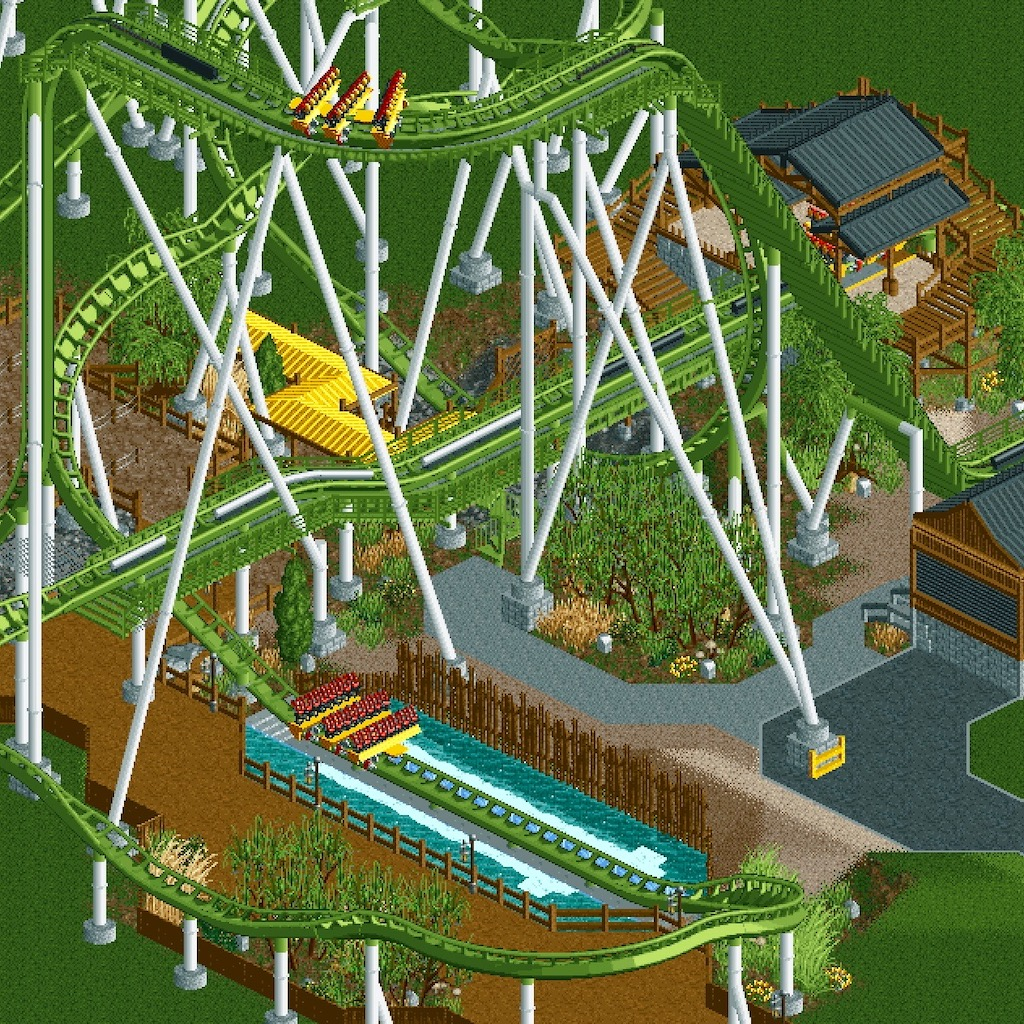
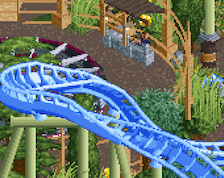
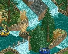
Beside the screen being hard to look at, what you have looks like a quality solid base. Green coasters can be very hit-miss IMO, but this looks good. I would reverse that barrel roll toward the upper left of your screen though, would have better flow the other way.
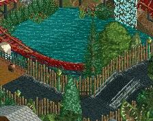
pretty good, maybe add some taller trees. Could change the coaster colors, ive never been a fan of green ones in game. It does match good with the yellow now though.
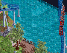
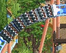
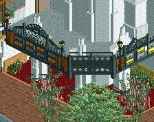
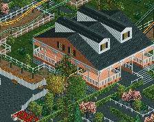
Looks really good, and I think the tiny station works! Indeed puts too much focus on the brake run though. Maybe you can add a patch of trees that obscures the brake run a bit?
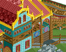
Name isn't final, the color scheme just matches the real-life Parrot Coaster (and I love that there's a ride named Parrot Coaster) so that's the project name I'm going with. Having a lot of fun with this one!
 02-April 19
Holy Moly Aspect Ratio.
Beside the screen being hard to look at, what you have looks like a quality solid base. Green coasters can be very hit-miss IMO, but this looks good. I would reverse that barrel roll toward the upper left of your screen though, would have better flow the other way.
pretty good, maybe add some taller trees. Could change the coaster colors, ive never been a fan of green ones in game. It does match good with the yellow now though.
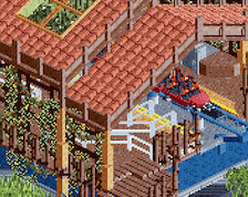
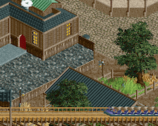
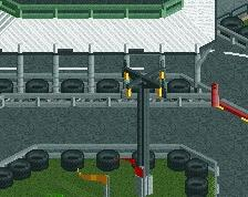
why is the station so stubby? it looks great but you have all that brake run and then like 2 tiles of station
Looks really good, and I think the tiny station works! Indeed puts too much focus on the brake run though. Maybe you can add a patch of trees that obscures the brake run a bit?
Continue here
https://www.nedesign...parrot-coaster/