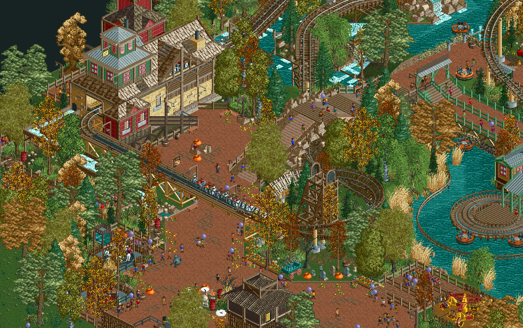
Screenshot / Grizzly Gulch - Dynamite Runner
-
 21-April 19
-
Everland Discovery Kingdom
-
3 of 10
- Views 1,638
- Fans 3
- Comments 12
-
Description
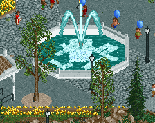
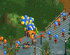
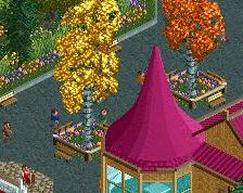
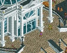
Autumn has come to Grizzly Gulch! Take a ride on Dynamite Runner, the most rattlin' ride in the Rockies! Or visit Miner's Revenge, our Walk-through haunted house made for the Halloween season... For the littlest ones, we also have a selection of kiddie rides.
-
Full-Size
-
3 fans Fans of this screenshot
-
Tags
Looks amazing, but why is there a rapid river boat on the path in the upperright corner?
For people to test out! Glad you like it
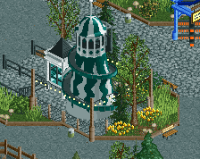
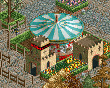
I love the station actually. If anything, change the green layer to the tower to be narrower instead of a layer of 3x3 and 1x1 on top. This park looks so cool
The pathside pumpkins and fallen leaves are a nice detail. You've got a green wood stair block where the rapids queue is.
I'd definitely swap out the grey steel roof on the station for something a bit more natural. Perhaps the Spanish roofs or other eave style pieces, definitely would paint them brown to match the rest though.
Everything else is really nice, love the atmosphere here and the different textures and objects you've integrated into the area. Looking forward to seeing more.
Hmm, I want to like this more than I do. I think you have a nice atmosphere going on. But the issue I have with this is some of your texture-, and colour choices. Some of the foliage and colour combinations make the picture a little blurry for me - especially the lower left of the screen. I wish the picture was a bit more clear. I'd suggest to play around with some foliage and see what might work best for you and this park.
Your use of different textures and colours for the roofs are not very convincing either. Steel, tile, wooden roofs; brown, dark brown, grey. I think you would get a better result if you just went for one texture and one or two colours.
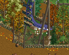
The bridge looks a bit forced. It's not bad, but if you could find a way to make it less awkward that would be great.
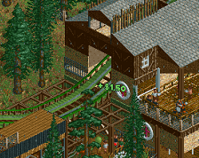
Something you always tend to do right is your mine coasters. They are phenomenal! Can't wait to see what the rest of the layout looks like. Keep it up, man!
Great paths and nice composition. I actually like the blockyness of the station.
The bridge has a weird structure, make it less akward indeed.
This looks great, I love the autumn vibe!
Imagine the sound everytime a train runs into the brakes on top of that pathway! Great atmosphere, I actually quite like the composition and the different textures on the station. Only downside is the weird bridge. It feels too high to climb and the design is a bit messy.
Thank you all for the very nice comments ad suggestions! They definitely were useful.
About the station, I wanted that feel of an old mill/mine that has expanded over the years, but not necesarrily with the same style of archy. That's why I added in the steel roofs. But to compromise and make them stick out less, I coloured those brown as well now.
The bridge has been replaced. It turned out to be easier to make the path go under the coaster than over it...
@Lagom: shame you're not a fan of the foliage... Autumn stuff isn't easy, I admit, but I do believe the current mix works. That's why I think I'm gonna stick with it for the time being.