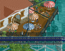
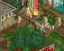
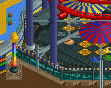
I also suggest some small details on the paths like map racks or stalls. It feels to me they lack something.
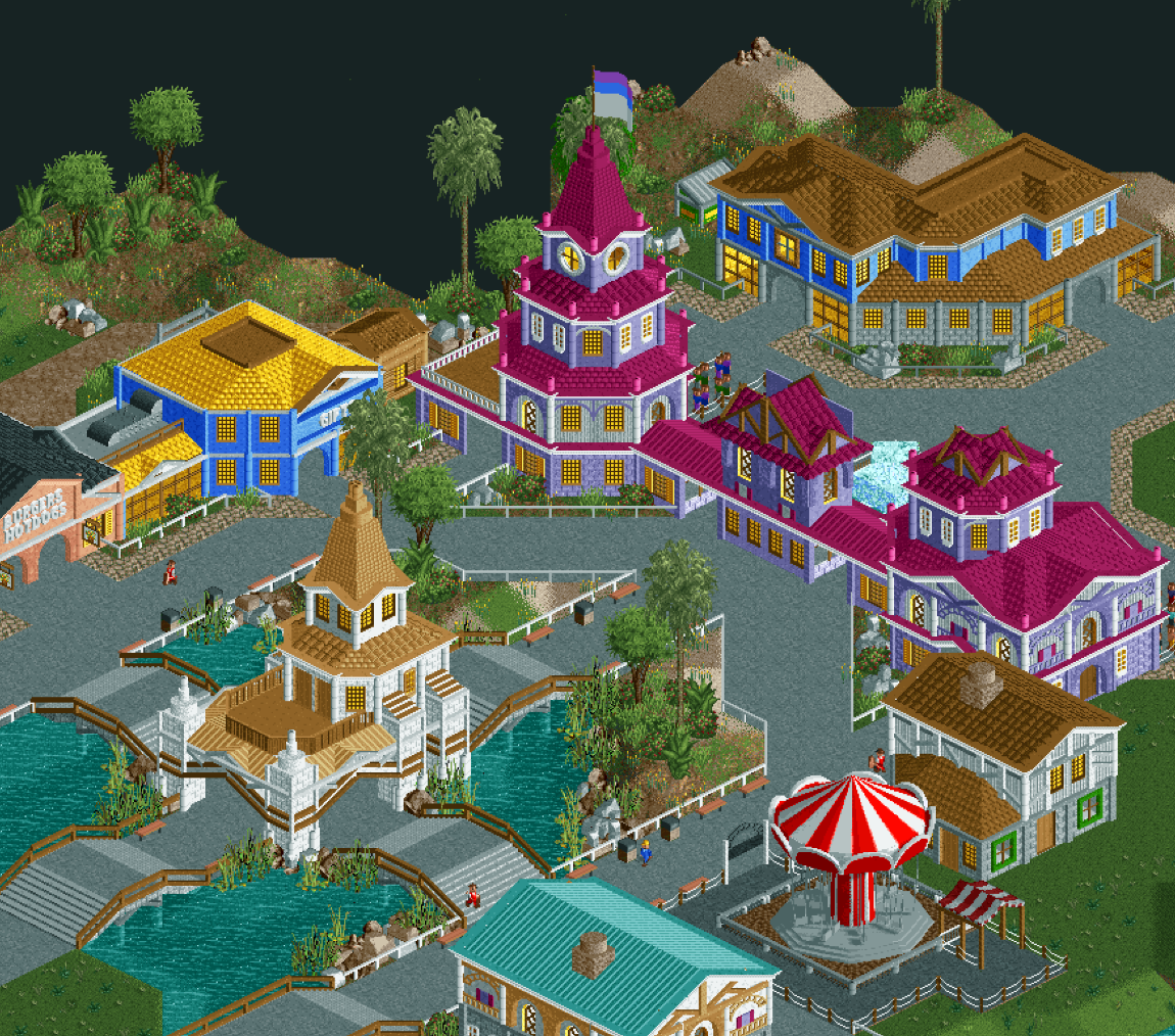
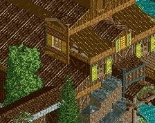
The color scheme originally included a lot more dark brown on the roofs however I changed it up to contrast with the bright pink entrance building. I may have to take another look at this.
I will definitely add some path detailing as well!
 28-April 19
Alfy Offline
this looks amazing! love what I see so far
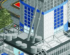
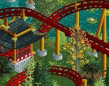
The archy looks great, the building shapes are very well done. But something about the colours is off IMO. Perhaps too many different colours.
I also suggest some small details on the paths like map racks or stalls. It feels to me they lack something.
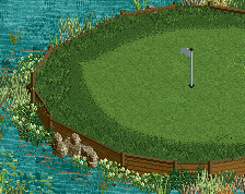
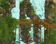
The foliage however is spot on, as is the tower in the middle of that pond. So atmospheric. Good job!
thanks for the comments
The color scheme originally included a lot more dark brown on the roofs however I changed it up to contrast with the bright pink entrance building. I may have to take another look at this.
I will definitely add some path detailing as well!