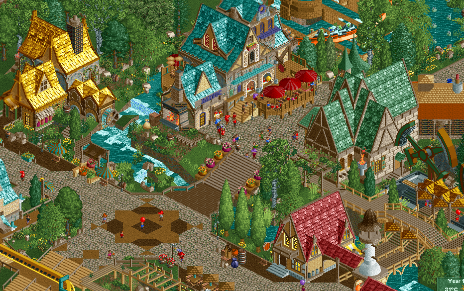
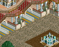
Screenshot / Quinlan's Village
-
 23-June 19
-
The Conquests of Quinlan Quinto
-
7 of 10
- Views 3,221
- Fans 3
- Comments 20
Community Forum Software by IP.Board
Marry me please. This is gold.
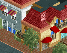
Everything here is great except for two things. The path/bridges around the flat ride on the right side are sorta sloppy, might just be the tan railings but I think you can probably do better. The stairs in the bottom left are a little messy too, I'd probably just make them the same as the ones in the middle of the screen.
Great stuff though, probably your best archy yet.
I think the landscaping here is a notch below the rest which makes it almost great to me. I'd try to make it more flowing and smooth, especially near the river. But good work obviously.
I just wish you'd make roofs in natural tile colors with some sort of homogeneity in texture/color scheme. It would go up 10% in my books and the atmosphere would shine through
I can't help but feel that I enjoyed the first several screens much more than this and its associated ones. The desert one is phenomenal as was the looping mine train, and entrance. Here, I think we're missing some important points that made the others great.
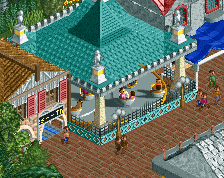
One was mentioned which is the cohesiveness of colors, textures, etc. The common thread here is the roof shape which is very cool, but the various colors would work if the walls/windows/doors etc was all the exact same across the board.
The thing that jumps out to me is the actual forms of the buildings, which are somehow boxy despite the up curved roofs. There's tons of details to them, but it's like caking on make-up to an ugly face. Sort of on the same point, an easy way to counteract this is just to put some large trees right up against the buildings. Having rectangular structures in clearings accentuates it quite a bit. Large trees up against it and the structure blends into something more organic.
My god, it's demotivating how fun this is! Almost makes me wanna quit
But the others do have some valid points that are worth taking a look into. Especially the paths could use some work.
So good
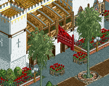
Version 2.0... the diagonal building in the upper right will probably be replaced... still need to change a few things (maybe the color of the red umbrellas, not sure yet)... and adjust the foliage
Attached Thumbnails
Minor changes, massive improvement. Love this.
Appreciate the tips guys... didn't want all black roofs Liam, but the general idea was great. I especially love the building on the left with the black roof.
The black on the left I like, the purple instead of teal is tough, both look good to me. The extra black on whatever is on the top right adds nice accents to that diagonal building.
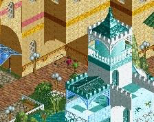
Looks so much better with the purple rooves. I do think you should change the text color on the sign though - it blends a little too much with the purple. Maybe something with a little more contrast?
Great work!
This screen is awesome and the adjustments make it even better in terms of admosphere! I am wondering though, how that centre right building would look with red(dish) roof and some color accents in the flowers around it. Maybe it would bring a little bit of that frivolity in the colors back from your first screen that is now less present??