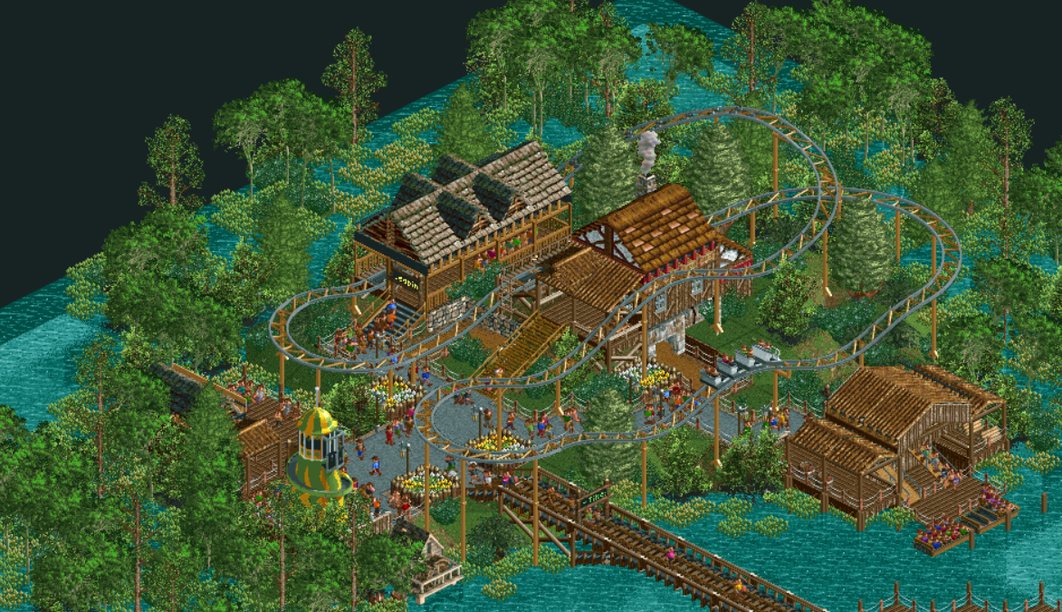
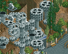
this looks fantastic! i would take out the expansion objects, though, as most agree that they don't fit the aesthetic of the game, and they make the park less accessible (to people who don't have the expansions) and generally, they're just ugly.
I'd love to see pirate roof pieces instead of those ones. keep up the good work!
Agreed with Sammy. I love your usage of NCSO, but it's universally agreed WW/TT objects are distracting and just don't look right. As for positives, the bridge and the boat station especially stand out to me. The junior coaster feels a little high off the ground, but I do like your use of the articulated wooden train. I've done that track/train combination to represent a Vekoma roller skater.
I think even though you are using expansion objects you have used ones that still fit into the original aesthetic of rct. I really like how simple the composition is as well.
Yeah, I kinda agree with Scoop on this... the roofs don't look bad and would fit better than, say, the log cabin or steel shutter roof in the original game.
This is a really nice screen though, feels lush and dark. I like the swamp foliage.
 27-June 19

![screen_4899_[H2H8 R4] Park Guell](https://www.nedesigns.com/uploads/screens/4899/4899_thumb.png)
this looks fantastic! i would take out the expansion objects, though, as most agree that they don't fit the aesthetic of the game, and they make the park less accessible (to people who don't have the expansions) and generally, they're just ugly.
I'd love to see pirate roof pieces instead of those ones. keep up the good work!
Agreed with Sammy. I love your usage of NCSO, but it's universally agreed WW/TT objects are distracting and just don't look right. As for positives, the bridge and the boat station especially stand out to me. The junior coaster feels a little high off the ground, but I do like your use of the articulated wooden train. I've done that track/train combination to represent a Vekoma roller skater.
Yeah, I kinda agree with Scoop on this... the roofs don't look bad and would fit better than, say, the log cabin or steel shutter roof in the original game.
This is a really nice screen though, feels lush and dark. I like the swamp foliage.
Alfy Offline
Even if people don't have the expansions they should still be able to access the park no? I thought openrct2 automatically downloads missing objects.
I loved the bridge
I like the subtle touch(wooden track) under the ww/tt roofs. It works.
you're all heathens