Screenshot / Everland Theatre: Showtime!
-
 04-July 19
-
Everland Discovery Kingdom
-
6 of 10
- Views 1,512
- Fans 4
- Comments 15
-
Description
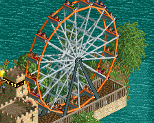
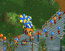
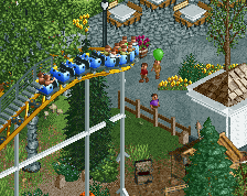
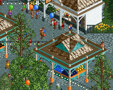
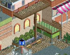
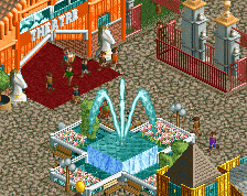
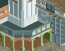
The plaza before the theatre is aplace of fun during the Halloween season, with a haunted House called Circus of Sombre, autumnal decorations and the magic show of Bartholomew Spells, the master of magic. Also, some of our older and more kid friendly rides are situated here, with the old swings, slide and kiddie coaster. For the little ones craving sugar, we have a dedicated stall selling cotton candy and caramel apples.
-
Full-Size
-
4 fans Fans of this screenshot
-
Tags
Foliage colors definitely work excellent in this area, nice job.
Looks like I forgot the finish... Whoopsies
Fuck yeah dude.
Couple of minor things though:
- Agree with Russ;
- I think the teal on the mouse ride(?) is a bit distracting. It's a little too dense and therefore hard to read with the current colours/objects. I'd consider either making the trusses/framework grey and/or using Gee's thinner trim objects.
Such a lively atmosphere. Great work
This is great Jappy! Very atmospheric and fun
I quite like the composure of this area- lively and fun, and the foliage is (mostly) working to set a cool vibe. I wish you would get a real pumpkin object though instead of the pots, which I can't help but still picture as orange pots.
I have one gripe though, which is in some of your work actually, which is your use of colors in ornamentation and the correlation of the colors of object with their real-life form/function. The major problem I'm having here is the use of the turqoise and green alongside each other on the main building and around. On their own, either is a perfectly good oxidized-bronze sort of color that I'd be happy to use depending on the mood I want to build. But I think you need to choose and be consistent with that choice in the whole park- is green the copper color? or blue? The consistency will sell the detail to me. When you put both on top of each other, I lose the meaning of both of them and it ends up looking like just painted green/blue, which is something you could do in real life but I don't think it would be particularly attractive. Since you're using green copper roof tiles, by the look of it, I'd say stick to that as your rust color and really be careful with your use of turqoise, especially since you use it everywhere to sort of 'trim' your buildings.
I think you have a really good grasp of how to build in rct, I just personally would want to see a bit more care with what exactly the details you're putting on are meant to portray in real life. Its easy to build in rct-aesthetic mode only and just use the things that have worked in the game for 15 years but I think in a realistic context its easy to slip away and forget that we should think about why railings are blue or why roofs are dark brown in the first place- and then it makes it harder to appreciate the details and the atmosphere.
If you genuinely intended the railings to be painted blue and the green to be copper, I guess thats fine too- I'm just not a fan! I think its not particularly complimentary to the atmosphere you're trying to build.
is that a good enough treatise? lol
Cocoa does a good job explaining that. There's more examples of poor consistency in the screen, although maybe less convincing.
1. Street lights are white. Lanterns are yellow. What colour are lamps in your universe?
2. You have to different canvas looks, compare the ride entrance to the circus wagon. Not just the canvas look is different, but also the general feel. Black + purple = gloomy; yellow + red = bright.
3. The decorative grey walls with yellow potted flowers do not rhyme with anything in the area. The general brick colour is brown.
4. You have two entirely different pumpkin looks. The quartertile pots, and the default RCT full tile pumpkin. Both can work, but not together.
It's a super atmospheric screen though.
Thanks for the feedback guys! I'll try to reply to most of them.
@Stoksy: I'll see if another colour fits better. They're swings btw, those old ones you could find on Victorian steam fairs.
@Cocoa: I'm gonna let this sink in for a while... I think I have a solution, but I do actually like the use of both on the main theatre building. I'll experiment a bit though.
@Liam:
1) I'll check for consistency, but generally those lanterns are Halloween decorations. For me, they can have a different colour.
2) The canvas thing might be true, but I'm gonna keep the colour. THe cheerful one is a permanent kiddie coaster open all-year round, the other a gloomy, scary temporary haunted house open for just this season. I don't think they would go for a happy colour for that sort of thing.
3) Didn't even really notice the brick, I'll recolour it. Consider it done.
4) Unless someone's coming with an actual small pumpkin to peep scale in RCT, I'm keeping both. One can be a huge-ass decorational fake one, the others real ones scattered through the park.
Such a beautiful autumn atmosphere, really busy without looking cramped!
Your composition is improving, I like it. Same for your fence work.
This is awesome Jappy. Your work with colours is exceptional here. The red brick paths and autumn trees bring alot of warmth to the screen, but you balanced it with cool blues and greens on the archy.