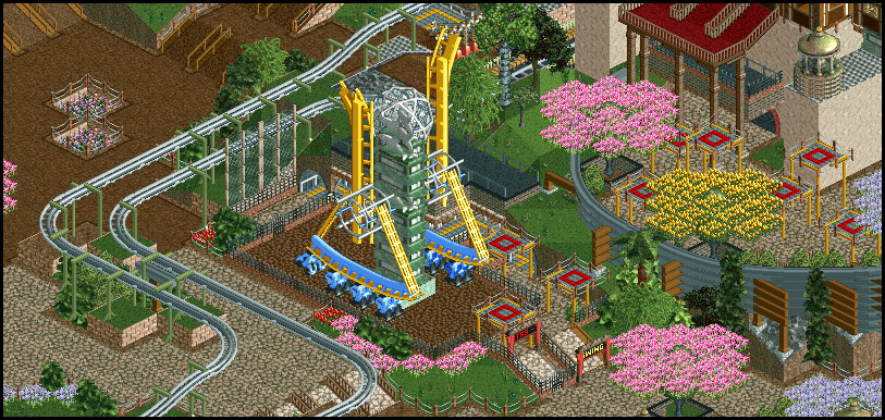
I like that idea for the structure. But I think there's just too many colors and textures for me to handle in this screen, it makes all the details blur into infrastructure and vice versa
I do agree with cocoa in some regard - it could stand to be a bit more readable. I'd suggest getting rid of that black rock land texture behind the top of the ride so that the sphere doesn't blend with it at all. The red queues look nice on the upper level, but they look a little too busy on the bottom section.
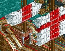
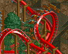
For me, screens of this project have been sort of hit or miss in many ways (may also be due to the varying states of finishedness?).. and this one is a hit.
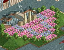
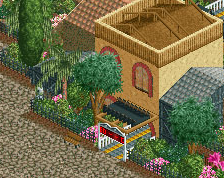
I think I mentioned it before but the big flower trees are iffy for me, mostly because it can potentially look flat. I think the tidbit Liam mentioned in his rules thread about placing strategic objects behind or in front might be very useful here and make the trees look more 3D.
 28-July 19
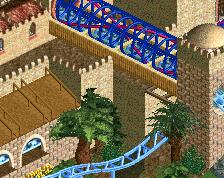
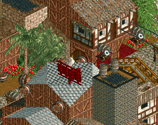
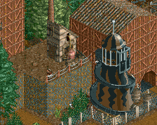
I like that idea for the structure. But I think there's just too many colors and textures for me to handle in this screen, it makes all the details blur into infrastructure and vice versa
RCTER2 Offline
I like this.
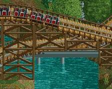
This is great.
I do agree with cocoa in some regard - it could stand to be a bit more readable. I'd suggest getting rid of that black rock land texture behind the top of the ride so that the sphere doesn't blend with it at all. The red queues look nice on the upper level, but they look a little too busy on the bottom section.
Very minor critiques though - this is awesome.
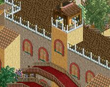
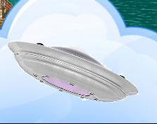
A very forced idea. The colourfulness alone though is an interesting look.
For me, screens of this project have been sort of hit or miss in many ways (may also be due to the varying states of finishedness?).. and this one is a hit.
I think I mentioned it before but the big flower trees are iffy for me, mostly because it can potentially look flat. I think the tidbit Liam mentioned in his rules thread about placing strategic objects behind or in front might be very useful here and make the trees look more 3D.
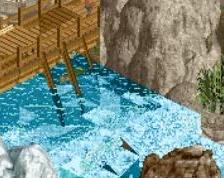
Somehow I missed this - it's great. I think the flat could use a bit more space to breathe though.