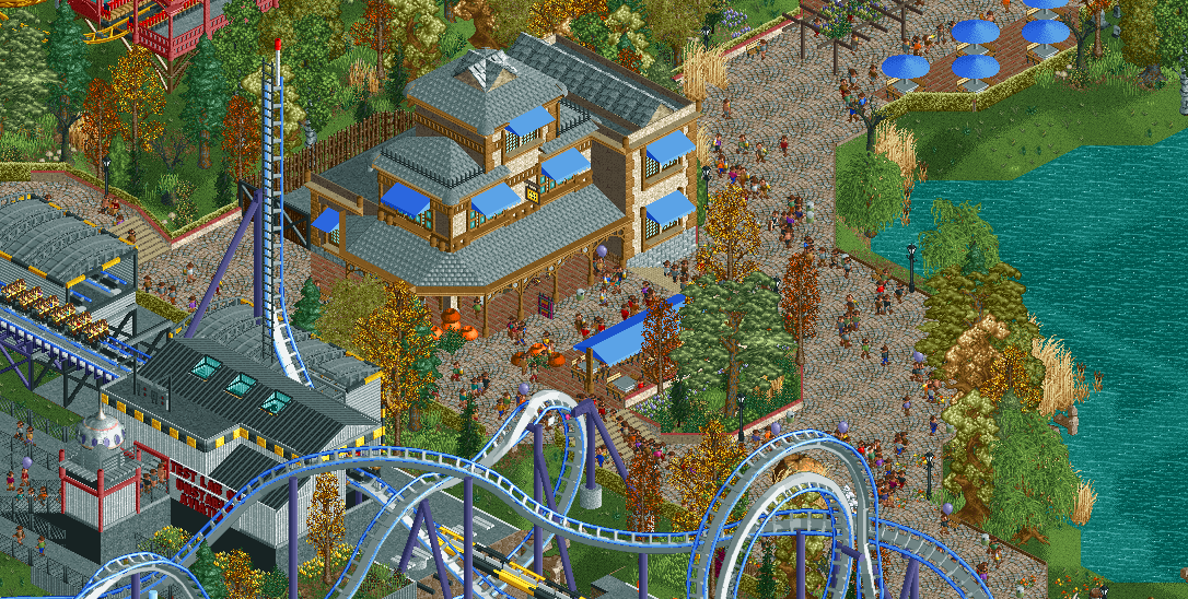
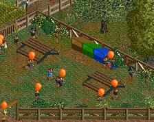
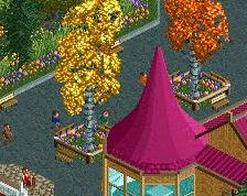
Screenshot / EDK - Lakeside restaurant
-
 15-August 19
-
Everland Discovery Kingdom
-
7 of 10
- Views 1,695
- Fans 3
- Comments 11
Community Forum Software by IP.Board
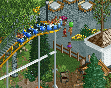
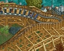
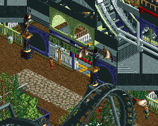
I loved this looping, super cool.
Attached Thumbnails
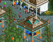
Looks great Jappy, Love the atmosphere as always. Coaster layout and supports look spot on. Have you tried the restaurant without the blue canvas covers? They kinda cover some of the detail of the windows and stuff.
I think making the coaster rails grey instead of blue will help the area a lot. There's currently a ton of blue here, with the awnings and coaster, so making the rails grey would help unify things a bit more.
Otherwise, great stuff, the theme of the coaster and layout work really well together.
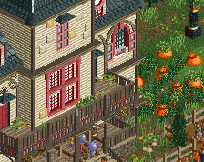
Nice archy, I think this area would benefit from either less grass or more strategically framed grass. At the moment it looks a bit too simplistic, comes across as "the ground is grass by default and I've added things on top of that" rather than intentionally having grass sections to accentuate other features.
Maybe experiment with some other land textures or use foliage a bit more strategically/obviously manicured around the coaster.
Looks lovely, great job! Definitely makes me wanna see the B.O.O.M-Machine in its full pride! Maybe try changing some of the awnings to a different color, i think it's a bit too much blue.
Is the blue on the building tied to the theme of the coaster?
Looking forward to this park ever since the red/black - mansion was it?
I like this project a lot, more with each screen. The autumnal atmosphere is really well executed, compared to other attempts at simulating fall in RCT.
I wonder if the foliage along the lakefront ought to be pruned and groomed a bit, or if not thinned, maybe thickened? Or maybe more cattails would make a better vibe along that waterfront?
As is, it doesn't seem to be taking the best advantage of guest POV, with that big clump of slightly repetitive woods there where would otherwise be a good vantage for peeps.
Likewise, underbrush could grow thicker on the left side.
Otherwise, BOOM looks like a fun ride w/ creative layout, and that building featured is really lovely. Looking forward to seeing it in-game!
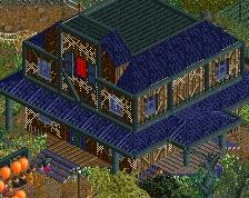
Thats a really nice building, but like Matt say's I think you'd be better off without the awnings.
can we get better awning objects? these ones always look flat as hell, they barely fit the rct aesthetic
The awnings are a bit too much but aside from that, that's one of the best buildings you've made!