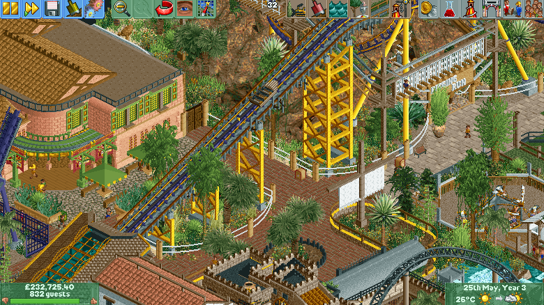
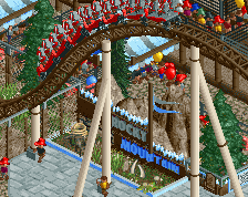
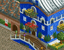
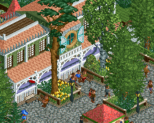
WTF! nice details, yellow support was 10, the windows in green with the details are beautiful, the roof is in harmony with the building, the paths are charming, despite the small screen it looks good to rock/stone in the background fun screen
Love your style man. Definitely see what G means about the thick supports, but it's not terrible. The use of curves here and there is great. Breaks up the grid quite nicely.
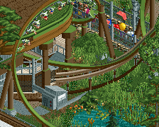
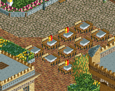
Total fence chaos and anarchy. I like how you put the lifthill in the centre rather than hiding its ugly structure behind theming. Makes it very realistically themepark-y.
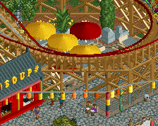
You can see the Pirates of Tripoli lift hill, bits of Rigging Run, tiny bit of Cannonball Run (black coaster), swashbuckler twister and a subway restuarant.
 04-September 19
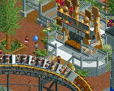
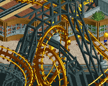
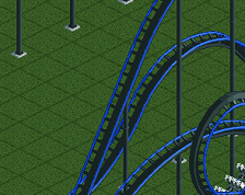
Another good screen, the curves definitely help a lot.
Two suggestions.
The green in the windows on the salmon building is a bit distracting, probably should be a more earthy color.
The supports are a bit thick, might look better with thinner pieces, deco trim or even thin rails should do the trick.
Love your style man. Definitely see what G means about the thick supports, but it's not terrible. The use of curves here and there is great. Breaks up the grid quite nicely.
I don't know what objects you're using for landscaping (upper part of the screen) but they look really good.
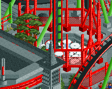
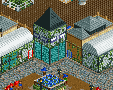
Man this is so good. Absolutely love everything.
the road line rope fences are so nice
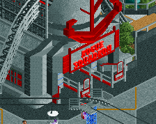
I love your unique style. Great work.
Total fence chaos and anarchy. I like how you put the lifthill in the centre rather than hiding its ugly structure behind theming. Makes it very realistically themepark-y.