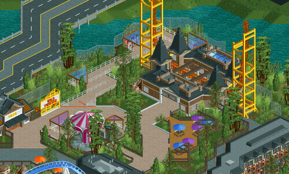
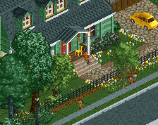
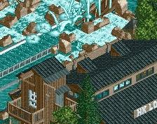
This has a lot more color and life to it than the last few screens which I really like. I'd probably like to see the station be a different color though that doesn't clash so much with the ride itself.
Looks good! Liking the color choices a lot. The canopies for the queue lines are really neat, they work perfectly. And love the peeps queueing in the bottom right corner, really gives it life.
Four small suggestions that I would try out -
- For the queue line to Wild Twister, delete the diagonal orange line where the diagonal fences are, so that it only extends between where you can enter the queue line. If it looks empty in front of the fences, try adding a white diagonal deco piece, just like the one you're using on the planter to the right.
- Hide the queue line entrance banner with the Tile Inspector so that you don't have a hovering, scrolling transparent sign.
- Add some walls, or something else like a counter or some souvenir shelves, to the visible part of the interior of the Ride photos building. Right now, the building looks a bit "thin" and empty - you'd expect the brick wall to be a bit thicker than it seems. Maybe it could work to simply add a wall that extends from the 1/16 white brick pillars and inwards, so that you can't see as much of the interior, if that makes any sense.
- Perhaps try to add some additional color and detail with some small flowers here and there, unless it's at odds with your theme/landscape setting somehow.
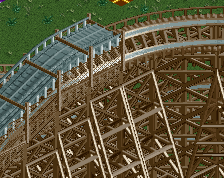
I like what you're doing with the supports, but I think it might look a little nicer with the round pieces. Or even some pieces with different thickness. It's not really my area of expertise though haha.
I do agree with bill about the station colors though. It looks nice, but it's dragging the area down a little bit by staying so dark. I'd try for a different color combination, and leave the black and brown for the entrance areas. Give this ride it's own identity
Love your work as always though. I still feel that our styles would work very well together if we ever pair up for a park in the future!
I don't disagree with the station color being dark compared to ride, but at the same time the recurring color theme in the preceding screenshots from the hotel to random park structures to entrances are at least a black roof, if not grey walls with it, the non grey walls have black roofs too. I love tho the blue skylights, from hotel to stations...nice consistent theme paired with dark roofs.
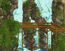
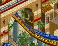
Decent structure here, not sure if I favor the zig zag road, but isometric is rough on that. The supports are realistic? but hide a lot of the spike. Hope you're having fun building it!
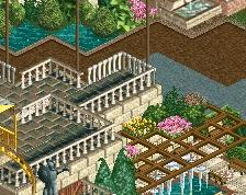
this is one of my favorites from you yet- not putting poles to "box in" your buildings is doing wonders, and making the semi-american-realism theme fit better. The bright pops of colors are working well, although I think the foliage could be tidied up. For example, that big jungle tree thing (can't remember) is one of my favorite trees but it needs to be dense in a cluster of smaller trees and not on its own- plus I think you've got the colors wrong and possibly it belongs in more of an asian/lush vibe. Instead of random overgrown brushes in the grass, I'd either leave it bare or use some carefully groomed flowers/hedges or even woodchip mounds to really give it that constructed-planter look
-splitvision: those suggestions are super helpful, I will be making changes based on them
-In:Cities: I tried to use the B&M supports but I just couldn't get them to look right, I'll prob throw in some of the thin deco pieces to get some more variation (I'd love to do a park with you in the future btw)
-Cocoa: Thanks for the tips with the foliage, I'll prob make some changes based on them
Kai: Yea I had a tough time figuring out how to do the supports to make them not look aweful, I'm prob guna add some more detail though
Coaster bill: when I started building the station I was trying all sorts of different colors but everything seemed out of place. I'm guna give it another shot, I'm guna try to make the building more white and brighter.
I actually really like the mixture of the newer style ride and the more classic style station Almost like it was re-used from a previous ride. Very effective!
 17-October 19
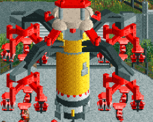
This has a lot more color and life to it than the last few screens which I really like. I'd probably like to see the station be a different color though that doesn't clash so much with the ride itself.
Looks good! Liking the color choices a lot. The canopies for the queue lines are really neat, they work perfectly. And love the peeps queueing in the bottom right corner, really gives it life.
Four small suggestions that I would try out -
- For the queue line to Wild Twister, delete the diagonal orange line where the diagonal fences are, so that it only extends between where you can enter the queue line. If it looks empty in front of the fences, try adding a white diagonal deco piece, just like the one you're using on the planter to the right.
- Hide the queue line entrance banner with the Tile Inspector so that you don't have a hovering, scrolling transparent sign.
- Add some walls, or something else like a counter or some souvenir shelves, to the visible part of the interior of the Ride photos building. Right now, the building looks a bit "thin" and empty - you'd expect the brick wall to be a bit thicker than it seems. Maybe it could work to simply add a wall that extends from the 1/16 white brick pillars and inwards, so that you can't see as much of the interior, if that makes any sense.
- Perhaps try to add some additional color and detail with some small flowers here and there, unless it's at odds with your theme/landscape setting somehow.
I like what you're doing with the supports, but I think it might look a little nicer with the round pieces. Or even some pieces with different thickness. It's not really my area of expertise though haha.
I do agree with bill about the station colors though. It looks nice, but it's dragging the area down a little bit by staying so dark. I'd try for a different color combination, and leave the black and brown for the entrance areas. Give this ride it's own identity
Love your work as always though. I still feel that our styles would work very well together if we ever pair up for a park in the future!
Decent structure here, not sure if I favor the zig zag road, but isometric is rough on that. The supports are realistic? but hide a lot of the spike. Hope you're having fun building it!
this is one of my favorites from you yet- not putting poles to "box in" your buildings is doing wonders, and making the semi-american-realism theme fit better. The bright pops of colors are working well, although I think the foliage could be tidied up. For example, that big jungle tree thing (can't remember) is one of my favorite trees but it needs to be dense in a cluster of smaller trees and not on its own- plus I think you've got the colors wrong and possibly it belongs in more of an asian/lush vibe. Instead of random overgrown brushes in the grass, I'd either leave it bare or use some carefully groomed flowers/hedges or even woodchip mounds to really give it that constructed-planter look
Thanks for the feedback everyone
-splitvision: those suggestions are super helpful, I will be making changes based on them
-In:Cities: I tried to use the B&M supports but I just couldn't get them to look right, I'll prob throw in some of the thin deco pieces to get some more variation (I'd love to do a park with you in the future btw)
-Cocoa: Thanks for the tips with the foliage, I'll prob make some changes based on them
Kai: Yea I had a tough time figuring out how to do the supports to make them not look aweful, I'm prob guna add some more detail though
Coaster bill: when I started building the station I was trying all sorts of different colors but everything seemed out of place. I'm guna give it another shot, I'm guna try to make the building more white and brighter.
I actually really like the mixture of the newer style ride and the more classic style station Almost like it was re-used from a previous ride. Very effective!