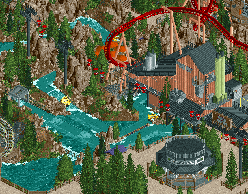
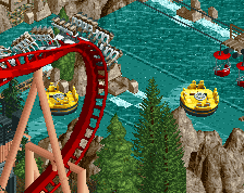
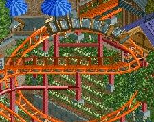
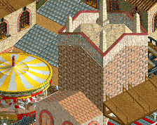
Looks fantastic! Interactions and overall composition are A+. Same for landscaping, you're working the 1K ruins/LOTR mountains combo to perfection here I think. Throw in some path objects, change the chairlift color from red to something else (got the notion that white or a dark blue/purple might do the trick), and perhaps make the orange umbrellas two-colored so that they don't stand out as much (but keep the orange, I like the boldness of it against the deep red coaster), and this is almost a 100% screen for me.
The foliage in the top half is fine but around the path bits its quite bland and wild. Doesn't seem very themepark like. More clean and upkept gardens and planters would fit better I think.
Like this a lot though, the different levels really add a lot of depth.
Composition of the area truly is excellent. It has a great sense of height and everything has a good amount of space to breathe while still feeling cohesive and lived-in.
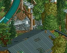
One thing I will say is that I am not sure how I feel about the rapids track being visible. It's such an old school quality, which I love, but it's in an incredibly modern RCT style that it almost feels misplaced. It's not a knock, but something to consider. Also I think you could find a better alternative to the graveyard wall separating the rapids maybe?
I will say the colors are great though. Keep this up, dude!
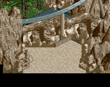
The coaster interaction and colours are great, and the fishery is very well done I also love that little rockfall gallery where the rapids emerge.
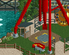
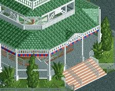
Just two things; do the chairlift cars have to be travelling in pairs? And I understand the black and white covering for the carousel, and I think it's pretty perfect, but a black and white carousel too? Looks a little macabre.
Thanks for the comments y’all! Regarding the foliage, the foliage near the area that inspired this is very wild and pine heavy, and I wanted to emulate that wild feeling with the foliage here. Some areas could use some cleaning up though.
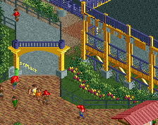
Path details are coming; thanks for reminding me as I always forget!
Regarding the rapids being visible, it’s on my to do list I just forgot how to do it.
Is this a new Baker Lake park? Or are you _still_ working on the same park?!
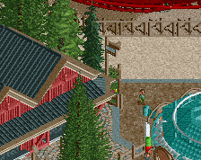
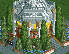
Whatever the answer is, the screen looks good. A lot of interaction with the rides crossing or near eachother. Foliage can be better, I do think some colorful flowers near the carousel would do wonders for atmosphere in that corner.
Also, I think you might want to add some rails near the waterfall and the drop. If you want to keep it realistic.
 05-January 20
Damn this looks amazing
when are you going to make something else.
I like this, feels like a departure from what you've been doing lately in a good way.
Looks fantastic! Interactions and overall composition are A+. Same for landscaping, you're working the 1K ruins/LOTR mountains combo to perfection here I think. Throw in some path objects, change the chairlift color from red to something else (got the notion that white or a dark blue/purple might do the trick), and perhaps make the orange umbrellas two-colored so that they don't stand out as much (but keep the orange, I like the boldness of it against the deep red coaster), and this is almost a 100% screen for me.
This is great except for the foliage, which is very mediocre 2010 style.
Needs some path details as said earlier by Spiltvision. Don't really see the problem with the foliage though. Rest is great work!
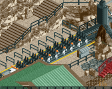
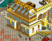
The fishery building is really cool.
The foliage in the top half is fine but around the path bits its quite bland and wild. Doesn't seem very themepark like. More clean and upkept gardens and planters would fit better I think.
Like this a lot though, the different levels really add a lot of depth.
Composition of the area truly is excellent. It has a great sense of height and everything has a good amount of space to breathe while still feeling cohesive and lived-in.
One thing I will say is that I am not sure how I feel about the rapids track being visible. It's such an old school quality, which I love, but it's in an incredibly modern RCT style that it almost feels misplaced. It's not a knock, but something to consider. Also I think you could find a better alternative to the graveyard wall separating the rapids maybe?
I will say the colors are great though. Keep this up, dude!
can't spell carousal without arousal
The coaster interaction and colours are great, and the fishery is very well done I also love that little rockfall gallery where the rapids emerge.
Just two things; do the chairlift cars have to be travelling in pairs? And I understand the black and white covering for the carousel, and I think it's pretty perfect, but a black and white carousel too? Looks a little macabre.
Great screen overall. Kudos!
Path details are coming; thanks for reminding me as I always forget!
Regarding the rapids being visible, it’s on my to do list I just forgot how to do it.
Awesome comments y’all! Thanks for the support
Is this a new Baker Lake park? Or are you _still_ working on the same park?!
Whatever the answer is, the screen looks good. A lot of interaction with the rides crossing or near eachother. Foliage can be better, I do think some colorful flowers near the carousel would do wonders for atmosphere in that corner.
Also, I think you might want to add some rails near the waterfall and the drop. If you want to keep it realistic.